Chapter 16 — The Data Cycle and Boxplots
Standard: 8.PS.2 — The student will apply the data cycle (formulate questions; collect or acquire data; organize and represent data; and analyze data and communicate results) with a focus on boxplots.
By the end of this chapter you will be able to:
- Name the four stages of the data cycle and run all four on a question of your own, with boxplots as the display (8.PS.2a, b)
- Formulate a question whose answer needs a numeric data set, and decide what data you need and how to get it (8.PS.2a, b)
- Explain how statistical bias can keep a sample from representing the population, and name the bias in a flawed collection plan (8.PS.2c)
- Organize a numeric data set of no more than 20 items and represent it with a boxplot, by hand and with technology (8.PS.2d)
- Identify and describe the lower extreme, upper extreme, median, lower quartile, upper quartile, range, and interquartile range of a data set or its boxplot (8.PS.2e)
- Describe how an extreme data point (outlier) changes the shape and spread of a boxplot (8.PS.2f)
- Analyze a boxplot by making observations and drawing conclusions in context (8.PS.2g)
- Compare and analyze two data sets shown in boxplots (8.PS.2h)
- Justify which graphical representation best fits a situation (8.PS.2i)
- Identify components of a graphical display that can be misleading (8.PS.2j)
Lessons: 16.1 The Data Cycle, Pointed at Boxplots · 16.2 Asking the Question, Getting the Data, and Statistical Bias · 16.3 The Five-Number Summary · 16.4 Building and Reading a Boxplot · 16.5 Extreme Data Points · 16.6 Comparing Boxplots, Choosing a Display, and Spotting a Misleading One
Numbering note. Item numbers run straight through the chapter, from 1 in Lesson 16.1 to 150 at the end of the review. They do not restart at each lesson.
Quartile convention used in this book. Different textbooks compute quartiles differently, so this one states its rule once and uses it everywhere. Put the data in order. The median splits the set into a lower half and an upper half. When the count is odd, the median itself belongs to neither half. The lower quartile is the median of the lower half, and the upper quartile is the median of the upper half. Every boxplot, answer, and figure in this chapter follows that rule. A graphing calculator or spreadsheet may use a different interpolation rule and report a slightly different quartile; that is a difference in convention, not an error, but on Virginia assessments and in this book use the rule stated here.
What a boxplot does not show. A boxplot shows five numbers and the gaps between them. It does not show the individual data values, it does not show how many values there are, and it does not show the mean. Two very different data sets can have the same boxplot. Keep this in mind every time you are tempted to say "the middle line is the average" — it is the median, and that is a different statistic.
Size limit. Every data set in this chapter has no more than 20 items, which is the limit the standard places on Grade 8 work.
Lesson 16.1 — The Data Cycle, Pointed at Boxplots
The same four stages as last year
In Grade 6 and Grade 7 you learned the data cycle — the four-stage process statisticians repeat whenever they want to answer a question using data (the measurements, counts, or responses gathered to answer that question). The four stages have the same names this year:
- Stage 1 — Formulate questions. Decide what you want to know, and word it so that data can answer it.
- Stage 2 — Collect or acquire data. Decide what data you need, then gather it yourself or find a data set someone else already gathered.
- Stage 3 — Organize and represent data. Put the data in order, compute the summary numbers, and draw the display.
- Stage 4 — Analyze data and communicate results. Read the display, draw conclusions, and say what you found — including what you still do not know.
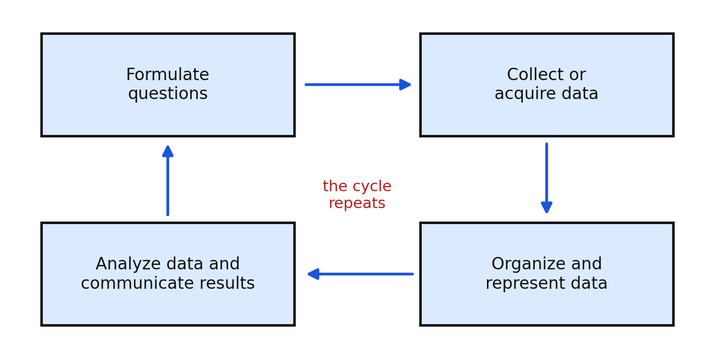
The cycle is drawn as a loop because stage 4 usually hands you a new question, which starts stage 1 again.
What is different this year
Only the display in stage 3 changes. Grade 6 used tables, dot plots, and circle graphs. Grade 7 used histograms, which group values into intervals and show the shape of the distribution. Grade 8 uses boxplots, which throw away every individual value and show exactly five numbers: the smallest value, the lower quartile, the median, the upper quartile, and the largest value.
That sounds like a loss, and in one sense it is — you cannot recover the data from a boxplot. What you get in exchange is a display so compact that two or three of them stack on one axis, which makes comparing groups easy in a way no histogram is. Most of the reason Grade 8 studies boxplots is that comparison.
A second change: the questions you formulate this year should be ones a boxplot can answer. A boxplot answers questions about center ("what is a typical value?"), spread ("how much do the values vary?"), and position ("is this value unusually high?"). It cannot answer "how many students said 20 minutes?" — that is a dot-plot or histogram question.
One project, four stages
Here is the whole cycle on one question, the way you will run it yourself.
Stage 1 — Formulate. Nadia wonders, "How long do eighth graders at my school spend reading for pleasure on a school night?" This is a statistical question: it expects a set of numbers that vary, not one fixed answer.
Stage 2 — Collect. The data she needs is one number per student: minutes spent reading last night. She surveys 15 eighth graders chosen at random from the school roster and records:
Stage 3 — Organize and represent. She orders the values (already done above), finds the five-number summary, and draws a boxplot.
Stage 4 — Analyze and communicate. She reports that a typical eighth grader reads about minutes, that the middle half of students read between and minutes, and that the whole group ranges from to minutes. Then she notices the upper whisker is long, which raises a new question: are the students at the high end in a book club? Stage 1 begins again.
Worked examples
Example 1 — Naming the stage
"A coach downloads last season's game scores from the league website." Which stage is this?
Downloading data someone else gathered is acquiring data, which is part of stage 2.
Answer: Stage 2, collect or acquire data
Example 2 — A question a boxplot can answer
Rewrite "Do students like the new lunch menu?" as a question a boxplot could answer.
The original question produces opinions, not numbers, so no boxplot is possible. Ask for something measured.
Answer: "How many minutes do students spend in the lunch line?" or "How many of the 5 lunch items do students eat?" — either produces a numeric data set that a boxplot can summarize.
Example 3 — Choosing the display in stage 3
Two eighth-grade classes each recorded how many push-ups they could do. The question is whether one class is stronger overall. Which display?
The question compares two groups on center and spread, which is exactly what a pair of boxplots on one axis shows.
Answer: Two boxplots drawn on the same scale, one for each class
Example 4 — The loop
Nadia's boxplot shows a long upper whisker. Describe the next turn of the cycle.
Stage 4 produced a new question — why do a few students read so much longer? — so the cycle returns to stage 1: formulate "Do students in a book club read longer on a school night?" Then collect data from book-club and non-book-club students, represent both groups as boxplots, and compare.
Answer: The new question restarts the cycle at stage 1
Guided practice
- Name the four stages of the data cycle in order.
- Which stage includes computing the five-number summary?
- Which stage includes deciding whom to survey?
- A student says the cycle is finished the moment the boxplot is drawn. Correct the statement in one sentence.
- Name two things a boxplot shows and two things it does not show.
- Which stage does "acquiring existing data from a website" belong to?
Independent practice
- Classify each activity by stage: a) writing the survey question; b) sorting 14 numbers from least to greatest; c) emailing your conclusion to the principal; d) recording 18 measurements in a notebook.
- Explain in one sentence why the data cycle is drawn as a loop.
- Write a statistical question about your class that a boxplot could summarize.
- Write a question about your class that a boxplot could not answer, and say why not.
- For your question in item 9, state exactly what one piece of data you would record from each person.
- A boxplot is drawn from 16 test scores. Can you tell from the boxplot how many students scored exactly ? Explain.
- Can you find the mean of a data set from its boxplot? Explain.
- Application. A school nurse wants to know whether eighth graders get enough sleep. Run stages 1 and 2 on paper: state the question, state the data needed, and state how you would collect it from no more than 20 students.
- Reasoning. Grade 7 used histograms and Grade 8 uses boxplots for the same four-stage cycle. Name one thing a boxplot does better than a histogram, and one thing a histogram does better.
Exit ticket 16.1
- Name the four stages of the data cycle in order.
- In which stage is the boxplot actually drawn?
- State one question about center and one question about spread that a boxplot can answer.
- Give one reason a finished boxplot might send you back to stage 1.
Lesson 16.2 — Asking the Question, Getting the Data, and Statistical Bias
A question worth collecting data for
A statistical question anticipates variability: the answers are expected to differ from person to person or day to day. "How tall is Marcus?" is not statistical; it has one answer. "How tall are the eighth graders on the team?" is statistical.
For a boxplot you need one more thing: the answers must be numeric. "What is your favorite sport?" produces categories, which a boxplot cannot display. "How many hours a week do you practice a sport?" produces numbers, which it can.
A well-formulated question says four things:
- Who — the group you want to describe, called the population
- What — the exact quantity measured, with units
- When — the time frame
- Why it varies — a reason to expect a spread of answers
Compare a vague question with a sharpened one:
| Vague | Sharpened |
|---|---|
| Do students use their phones a lot? | How many minutes of screen time did each of 20 randomly chosen eighth graders at Lee Middle School log yesterday? |
| Is the bus slow? | How many minutes did Route 7 take on each of its last 15 morning runs? |
Deciding what data you need, and getting it
Once the question is sharp, the data it needs is usually obvious: one number per member of the group, in the units named. Then choose a method:
- Survey or questionnaire — ask people, when the quantity is something only they know (hours of sleep, minutes of practice).
- Direct measurement — measure it yourself with a tool, when you can (height in centimeters, seconds on a stopwatch).
- Observation and counting — watch and tally, when the behavior is public (cars through an intersection per minute).
- Acquiring existing data — download it, when someone reliable already collected it (league statistics, weather records, census tables).
Each method has a trade-off. Surveys depend on honest answers. Measurement is accurate but slow. Acquired data is fast and often large, but you did not control how it was gathered, so you must ask who gathered it and how.
Because this chapter caps data sets at 20 items, most collection plans here take one sample of at most 20 members from a larger population.
Statistical bias
The population is the whole group you want to describe. A sample is the part of it you actually collect data from. A sample is useful only when it is representative — when its values look like the population's values would.
Statistical bias is any feature of how the data was collected that pushes the sample away from the population in a predictable direction. The word does not mean the researcher was unfair on purpose. A biased plan produces a boxplot whose center, spread, or both are shifted, and no amount of careful arithmetic afterward can repair it.
Four kinds of bias are worth naming:
- Selection bias — the way members are chosen favors part of the population. Surveying students in the library about reading time overrepresents readers.
- Response bias — the wording or setting pushes answers one way. "Don't you agree the new lunch is delicious?" collects agreement, not opinion. Asking students their screen time in front of a teacher collects lower numbers.
- Nonresponse bias — the people who decline differ from the people who answer. If an online survey about internet speed is answered only by people with fast internet, slow-internet homes drop out.
- Voluntary response bias — people who choose to participate usually have stronger feelings than the population as a whole. A "call in with your opinion" poll gathers the annoyed and the enthusiastic.
The fix for most bias is random selection: every member of the population has an equal chance of being chosen, so no group is systematically favored. Random selection does not guarantee a perfect sample — a random sample can still be unlucky — but it removes the systematic push.
Bias is about the method, not the numbers. You cannot look at a data set and see bias in it. You detect bias by asking how the data was collected, and who could not possibly have ended up in it.
Worked examples
Example 1 — Sharpening a question
Sharpen "Do eighth graders exercise?" into a question a boxplot can answer.
Name who, what with units, and when.
Answer: "How many minutes did each of 20 randomly chosen eighth graders at our school exercise yesterday?"
Example 2 — Naming the population and the sample
A principal wants to describe study time for all eighth graders and surveys of them.
Answer: Population: all eighth graders. Sample: the surveyed.
Example 3 — Identifying bias
To find typical daily reading time for the school, a student surveys 20 people leaving the library. Is the sample representative?
People leaving a library read more than the school average, and students who never enter the library have no chance of being chosen. The center of the boxplot would sit too high.
Answer: No — selection bias. The sample overrepresents heavy readers, so both the median and the quartiles would be pulled upward.
Example 4 — Fixing a biased plan
Repair the plan in Example 3.
Give every student a chance of selection: number the whole roster and use a random number generator to pick 20 students, then survey those 20 wherever they are.
Answer: Choose the 20 students at random from the full roster instead of from library traffic.
Example 5 — Response bias in wording
A survey asks, "How many minutes did you waste on your phone yesterday?" Name the problem and rewrite the question.
The word waste judges the behavior, so students will underreport.
Answer: Response bias. Rewrite as "How many minutes of screen time did your phone report yesterday?"
Guided practice
- Write the definition of population and sample in your own words.
- State whether each is statistical and numeric: a) "How many pets does each student have?" b) "What is the school mascot?" c) "How many minutes did each bus run take?"
- Name the population and the sample: a coach measures the vertical jump of 15 of the 60 students who tried out.
- Name the bias: a survey about school lunch is given only to students who buy school lunch.
- Name the bias: "Wouldn't you agree that our library needs more computers?"
- Explain how random selection reduces bias, in one sentence.
Independent practice
- Sharpen each question so a boxplot could answer it. a) Do students sleep enough? b) Is the walk to school long? c) Do eighth graders read?
- For each question in item 26, name the exact quantity you would record and its units.
- For each question in item 26, name the collection method you would use and why.
- Name the bias in each plan and say which direction it pushes the results. a) Asking about exercise habits only at a gym. b) Emailing a survey about internet speed. c) Asking students their grades out loud in class. d) Letting anyone who wants to fill out a form about school spirit.
- A student says a sample of 20 is biased just because 20 is small. Correct the statement.
- A student wants to describe typical bus-ride times for all riders and records the times for the 12 riders on her own bus. Is her sample representative? Explain.
- Describe a way to choose 20 students at random from a roster of 340.
- Give an example of acquiring existing data for a question about temperatures, and name one thing you should check about the source.
- Application. You want to know how many minutes eighth graders spend on homework on a school night. Write the sharpened question, name the population, describe a random sampling plan for at most 20 students, and name one bias your plan avoids.
- Error analysis. A student collects reading times from 20 friends and writes, "Since I asked 20 people, my sample represents the school." Explain what is wrong.
Exit ticket 16.2
- Define statistical bias in one sentence.
- Name the population and the sample: 18 of the 200 band members are timed on a scale exercise.
- Name the bias and suggest a fix: a survey about how far students travel to school is handed out in the car-rider line.
- Explain why bias cannot be detected by looking only at the list of numbers collected.
Lesson 16.3 — The Five-Number Summary
Five numbers, in order
A boxplot is drawn from exactly five statistics, and every one of them is a position in the ordered data. Order the data first, every single time. Almost every mistake in this chapter comes from computing a quartile on an unsorted list.
The five statistics, using the standard's own names:
| Statistic | What it is |
|---|---|
| lower extreme (minimum) | the smallest value |
| lower quartile () | the median of the lower half |
| median | the middle value of the whole set |
| upper quartile () | the median of the upper half |
| upper extreme (maximum) | the largest value |
Two more statistics are computed from those five and describe spread:
The range measures the whole spread, edge to edge. The IQR measures the spread of the middle half of the data, which is the part a single unusual value cannot easily disturb.
Finding the median
The median is the middle value once the data is in order. With an odd count , it is the single value in position . With an even count, it is the mean of the two middle values, and it may not be a member of the data set at all.
Finding the quartiles — the rule this book uses
Split at the median. When the count is odd, the median belongs to neither half. Then is the median of the lower half and is the median of the upper half.
Here is that rule carried out on Nadia's 15 reading times.
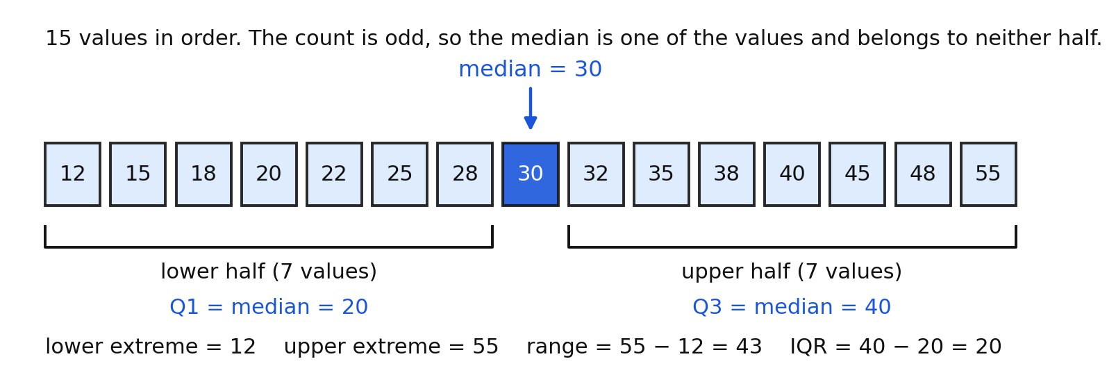
The count is , which is odd, so the median is the th value, . Removing it leaves seven values on each side. The lower half is , whose median is , so . The upper half is , whose median is , so . The five-number summary is
With an even count the split is cleaner: the two halves are simply the bottom values and the top values, and nothing is left out.
What each quartile means
Roughly one quarter of the data lies below , one quarter between and the median, one quarter between the median and , and one quarter above . So half the data lies between and — that is the middle half the IQR measures. Say "about," not "exactly": with 15 values you cannot split into four groups of equal size.
Worked examples
Example 1 — Odd count
Find the five-number summary, range, and IQR of .
The nine values are already in order, so the median is the th, . The lower half is , whose median is . The upper half is , whose median is .
Answer: ; range ; IQR
Example 2 — Even count
Find the five-number summary of (minutes riding the bus).
Twelve values, so the median is the mean of the th and th: . The lower half is the first six values, , whose median is . The upper half is , whose median is .
Answer: ; range ; IQR
Example 3 — Data given out of order
Find the median and quartiles of .
Sort first: . Eight values, so the median is . Lower half gives . Upper half gives .
Answer: ; range ; IQR
Example 4 — Range and IQR compared
For the data in Example 3, explain what the range and the IQR each tell you.
The range, , says the whole data set spans 17 units from smallest to largest. The IQR, , says the middle half of the values is packed into a span of units — half the width of the whole spread.
Answer: Range describes the total spread; IQR describes the spread of the middle half
Example 5 — Working backward
A data set of 8 values has , median , and . What is the IQR, and what fraction of the data lies between and ?
Answer: IQR ; about half the data lies between and
Guided practice
- Put in order and find the median: .
- For the set in item 40, find and .
- For the set in item 40, find the range and the IQR.
- Find the five-number summary of .
- Find the range and the IQR for item 43.
- Find the five-number summary of .
- In item 45, explain why the value is in neither half when you find the quartiles.
- State the quartile rule used in this book in your own words.
Independent practice
- Find the five-number summary, range, and IQR of .
- Find the five-number summary, range, and IQR of .
- Find the five-number summary, range, and IQR of .
- Find the five-number summary of , and explain how repeated values are handled.
- Find the five-number summary of .
- Find the median of and of .
- A data set has range and lower extreme . Find the upper extreme.
- A data set has and IQR . Find .
- Explain why the IQR can never be larger than the range.
- Give two different data sets of 5 values each with the same median but different IQRs.
- Application. A trainer records seconds for a 40-meter dash: . Find the five-number summary, the range, and the IQR.
- Error analysis. A student finds the quartiles of by taking and from the list as written. Identify the error and give the correct summary.
Exit ticket 16.3
- Find the five-number summary of .
- Find the range and the IQR for item 60.
- Find the five-number summary of .
- State in one sentence what the IQR measures that the range does not.
Lesson 16.4 — Building and Reading a Boxplot
From five numbers to a picture
A boxplot (also called a box-and-whisker plot) draws the five-number summary above a number line, so every horizontal position on the picture is a real value on that scale.
To build one:
- Step 1. Order the data and find the five-number summary.
- Step 2. Draw a number line long enough to hold the lower and upper extremes, with evenly spaced, labeled ticks. Label the scale with units.
- Step 3. Draw the box from to .
- Step 4. Draw the median line inside the box, at the median.
- Step 5. Draw the whiskers from each edge of the box out to the extremes, and mark each extreme with a short vertical segment.
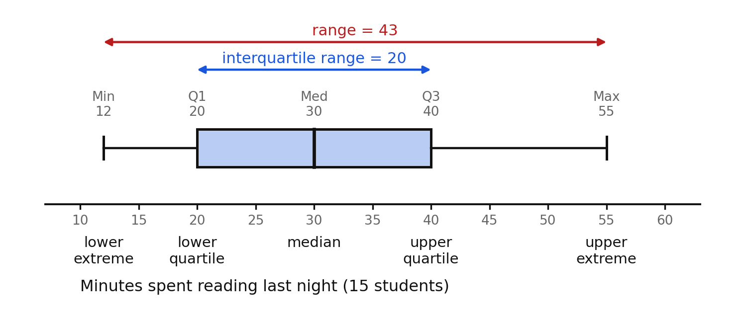
Every feature of this picture is a length you can read off the axis:
- The box spans to , so the width of the box is the IQR and contains about the middle half of the data.
- The line inside the box is the median. It is usually not in the center of the box.
- The whiskers reach the extremes, so the full width of the picture is the range.
- A long whisker or a wide box means values are spread out there; a short one means they are packed together.
Reading the density of the data
Each of the four sections — lower whisker, left part of the box, right part of the box, upper whisker — holds about a quarter of the values. So a long section means about a quarter of the data is spread thinly across a wide interval, and a short section means about a quarter of the data is crowded into a narrow interval.
In the figure above, the lower whisker runs from to , a span of , while the upper whisker runs from to , a span of . Each holds about four students. So the four shortest readers are packed tightly and the four longest readers are spread widely — the distribution is stretched toward the high end.
What the picture leaves out
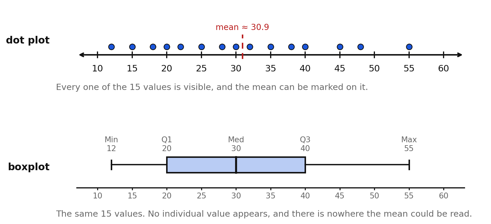
The dot plot and the boxplot above show the same 15 numbers. The dot plot shows every value and lets you mark the mean at about . The boxplot shows neither. You cannot read from a boxplot:
- any individual data value (other than the two extremes),
- how many values there are,
- whether any value repeats,
- the mean.
That is why a boxplot is always labeled with what it displays and how many values it summarizes — that count must be written in words, because the picture cannot carry it.
An even count
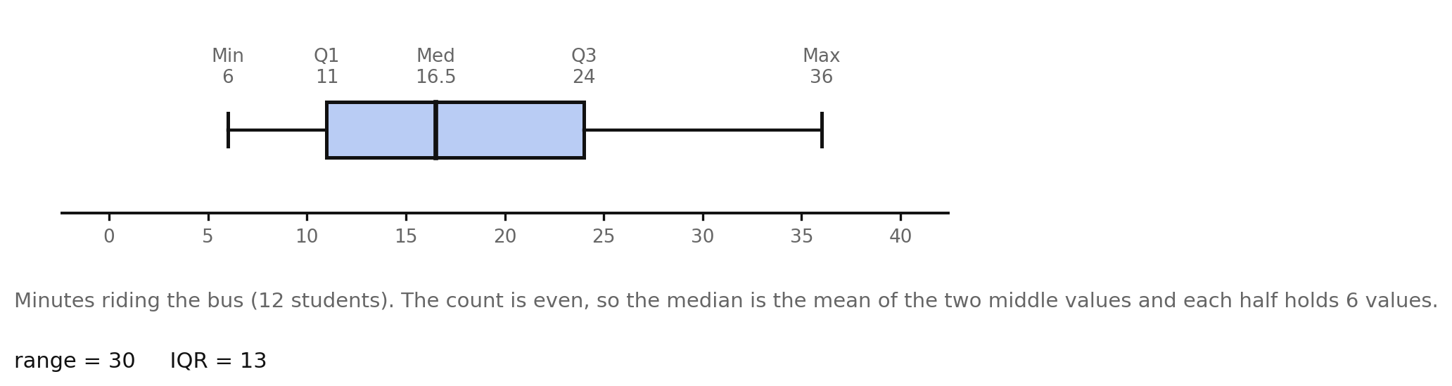
This boxplot shows the 12 bus-ride times from Lesson 16.3. The median line sits at , which is not one of the recorded times — with an even count the median is the mean of the two middle values, and a boxplot happily draws a line at a value nobody recorded.
Making observations and drawing conclusions
An observation is something you read directly off the plot. A conclusion is what that means for the question you asked. Analysis needs both, in that order.
| Observation | Conclusion |
|---|---|
| Median | A typical bus ride takes about minutes. |
| About a quarter of rides take longer than minutes. | |
| IQR , range | The middle half is far more consistent than the full set; a few long rides stretch the top. |
| Upper whisker ( to ) is longer than the lower whisker ( to ) | The long rides vary much more than the short ones, so a rider planning around the bus should budget for the top of the range. |
Worked examples
Example 1 — Building a boxplot
Describe the boxplot for .
Five values, so the median is . The lower half is giving ; the upper half is giving .
Answer: Box from to , median line at , whiskers to and ; range , IQR
Example 2 — Reading statistics off a plot
A boxplot has its left whisker end at , box edges at and , median line at , and right whisker end at . List all seven statistics.
Answer: Lower extreme , , median , , upper extreme , range , IQR
Example 3 — Interpreting a section
In Example 2, what fraction of the days had more than books checked out, and over what span?
Above lies about a quarter of the data, spread from to .
Answer: About one quarter of the days, spread across a span of books
Example 4 — An observation and a conclusion
For the bus data, write one observation and the conclusion that follows.
Answer: Observation: the box runs from to . Conclusion: about half of all rides take between and minutes, so a rider who leaves 25 minutes before the bell will usually arrive on time.
Example 5 — A claim the plot cannot support
A student looks at the bus boxplot and says, "Two students rode for exactly minutes." Evaluate the claim.
The median of an even-count set is the mean of the two middle values, and no boxplot reports individual values at all.
Answer: Unsupported. The median is a computed midpoint; the two middle recorded times were and , and neither the count at any value nor any individual value is visible in a boxplot.
Guided practice
Use the labeled boxplot figures from this lesson where a figure is named.
- In the labeled reading-times boxplot, name all five plotted statistics.
- In that same plot, find the range and the IQR.
- In that same plot, which whisker is longer, and what does that tell you?
- In the bus-ride boxplot, name all five plotted statistics.
- In the bus-ride boxplot, about what fraction of rides took longer than minutes?
- Describe the boxplot you would draw for : give the box edges, the median line, and the whisker ends.
- Describe the boxplot you would draw for .
Independent practice
- Draw a boxplot for on a scale from to with ticks every .
- Draw a boxplot for on a scale from to with ticks every .
- Draw a boxplot for on a scale from to with ticks every .
- A boxplot has whisker ends at and and box edges at and , with the median line at . List all seven statistics.
- In item 74, which is longer, the part of the box below the median or above it? What does that say about the data?
- In item 74, about what fraction of the data lies between and ?
- Two data sets have the same range but different IQRs. Sketch what that difference looks like in two boxplots.
- Explain why a boxplot alone cannot tell you how many values are in the data set.
- A boxplot is drawn with the median line exactly in the middle of the box. What does that say about the data between and ?
- Application. A café records the number of customers in the first hour on 8 days: . Find the five-number summary, describe the boxplot, then write one observation and one conclusion for the manager.
- Application. Daily high temperatures for 12 days are degrees Fahrenheit. Write two observations and one conclusion a gardener could use.
- Error analysis. A student says, "The line inside the box is always exactly halfway between the box edges, because it is the middle." Explain the error using a data set of your own.
Exit ticket 16.4
- Give the box edges, the median line, and the whisker ends for a boxplot of .
- A boxplot has whisker ends at and and box edges at and . Find the range and the IQR.
- About what fraction of the data lies between the two box edges?
- Name two statistics you cannot read from a boxplot.
Lesson 16.5 — Extreme Data Points
What an extreme data point is
An extreme data point, or outlier, is a value far away from the rest of the data. A basketball team that usually scores in the twenties and thirties scores in one wild game; a class of readers who all read 10 to 40 minutes has one student who read .
Outliers are not mistakes to delete. Sometimes an outlier is a recording error, and sometimes it is the most interesting value in the set. Either way, you must notice it and say what it did to your summary — which is exactly what bullet (f) of this standard asks.
How an outlier changes the five statistics
Look at 11 games where a team scored , then a th game where it scored .
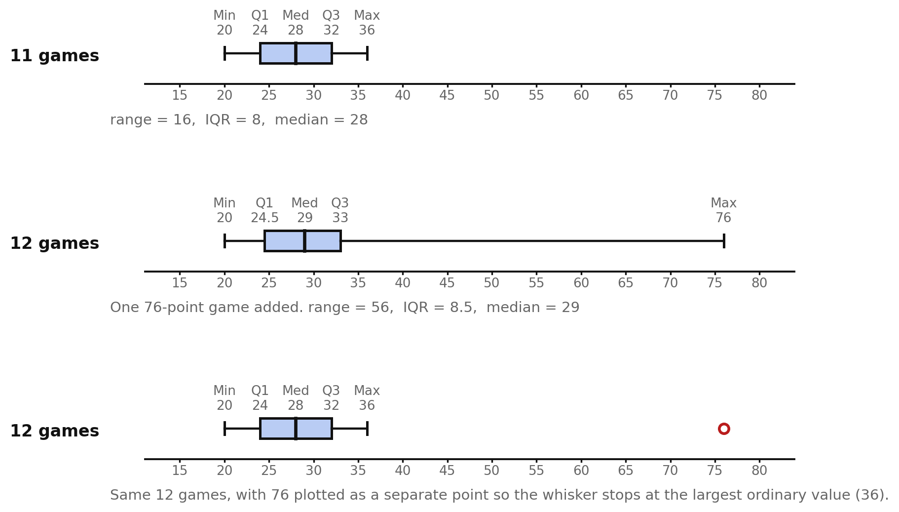
| Statistic | 11 games | With the -point game | Effect |
|---|---|---|---|
| lower extreme | unchanged | ||
| barely moved | |||
| median | barely moved | ||
| barely moved | |||
| upper extreme | jumped by | ||
| range | more than tripled | ||
| IQR | barely moved |
Two lessons live in that table.
Shape. A single extreme value stretches the picture toward itself. The box barely moves, but the whisker on that side becomes very long, so the plot looks lopsided, or skewed, toward the outlier. The three-quarters of the plot occupied by that whisker holds a single game.
Spread. The range is extremely sensitive to an outlier, because it is computed from the two most extreme values and an outlier is an extreme value. The IQR is barely affected, because it is computed from and , which sit deep inside the ordered data where one distant value cannot reach. This is why the IQR is called a resistant measure of spread and why statisticians reach for it when a data set has an outlier.
The median is also resistant, for the same reason: adding one enormous value shifts the middle position by half a step, not to the outlier. The mean is not resistant at all — the mean of the 11 games is about , and adding the raises it to about . A boxplot does not show the mean, but this is worth knowing when you decide which measure of center to report.
Drawing an outlier separately
The third panel of the figure shows the common alternative: plot the outlier as its own point and stop the whisker at the largest ordinary value, . The box and median are computed from the other eleven games. This version tells the reader two things at once — the shape of the ordinary data, and the existence of one far-away value — so it is usually the more honest picture. Both versions are correct as long as you say which you drew.
Deciding what to do about it
Ask, in this order:
- Is it an error? A reading time of minutes is impossible in one night. Check the record; correct it or remove it, and say that you did.
- Is it real but unusual? The -point game really happened. Keep it, and report both the range (which includes it) and the IQR (which does not).
- Does it change the answer to the question? If the question is "what is a typical game?", the outlier barely matters — the median moved by one point. If the question is "what is the best the team can do?", the outlier is the whole answer.
Worked examples
Example 1 — Effect on range and IQR
For , find the range and IQR. Then add the value and recompute.
Nine values: median ; lower half gives ; upper half gives . So range and IQR .
With added there are ten values: median ; lower half gives ; upper half gives . So range and IQR .
Answer: Range jumps from to ; IQR stays at
Example 2 — Describing the shape change
Describe how the boxplot in Example 1 changes.
The box shifts a little to the right and keeps almost exactly its width, and the median line moves from to . The upper whisker stretches from ending at to ending at , so most of the width of the picture is now one whisker holding a single value.
Answer: The box is nearly unchanged; the upper whisker becomes very long and the plot looks strongly stretched to the right
Example 3 — Which measure to report
A reporter asks for one number describing a typical game for the 12-game season including the . Median or mean?
The mean, about , is higher than of the games — it is not typical of anything. The median, , sits in the middle of the ordinary games.
Answer: The median, because it is resistant to the one extreme game
Example 4 — An outlier that is an error
A data set of daily temperatures in degrees Fahrenheit reads . What should you do?
is impossible; it is almost certainly typed with an extra zero.
Answer: Treat it as a recording error — correct it to if the original record confirms it, or drop it and note the removal. Do not silently keep it.
Example 5 — Outlier at the low end
A set of 10 quiz scores is . Describe the effect of the .
Sorted: . The lower whisker now stretches from all the way down to , so the plot is stretched to the left, the range is , and the lower extreme no longer resembles any other score. The box, running from to with median , still describes the ordinary scores well.
Answer: The low outlier stretches the plot leftward and inflates the range to , while the box and median still describe the other nine scores
Guided practice
- Define extreme data point (outlier) in your own words.
- In the three-panel figure of this lesson, what is the upper extreme in the first panel, and in the second?
- In that figure, compare the IQR before and after the -point game, and explain why it barely changed.
- In that figure, compare the range before and after, and explain why it changed so much.
- In the third panel, why does the whisker stop at ?
- Which is more resistant to an outlier, the range or the IQR? Why?
Independent practice
- For , find the range and IQR. Then add and find them again.
- Describe in words how the boxplot in item 93 changes shape.
- For , find the median and IQR. Then add a score of and find them again.
- In item 95, say which of the seven statistics changed the most and which did not change at all.
- A data set has an outlier at the high end. Which will be larger, the upper whisker or the lower whisker? Explain.
- Explain why the median moves so little when one very large value is added to a data set.
- Compute the mean of and of that set plus . Compare the change in the mean to the change in the median, which is from to .
- Application. A pizza shop's delivery times in minutes over 10 orders are . Find the five-number summary. Then say what happened on the -minute delivery, what the range says, what the IQR says, and which one you would quote to a customer.
- Error analysis. A student sees an outlier and deletes it, saying, "It ruins the graph." Explain what is wrong with that reasoning and what to do instead.
Exit ticket 16.5
- Adding one very large value to a data set: does the range change a lot or a little? Does the IQR? Explain each.
- Describe in one sentence how a high outlier changes the shape of a boxplot.
- Give one situation in which you would remove an outlier and one in which you would keep it.
Lesson 16.6 — Comparing Boxplots, Choosing a Display, and Spotting a Misleading One
Two boxplots, one axis
The reason boxplots earn their place is comparison. Stack two of them on the same scale and differences in center and spread are visible instantly.
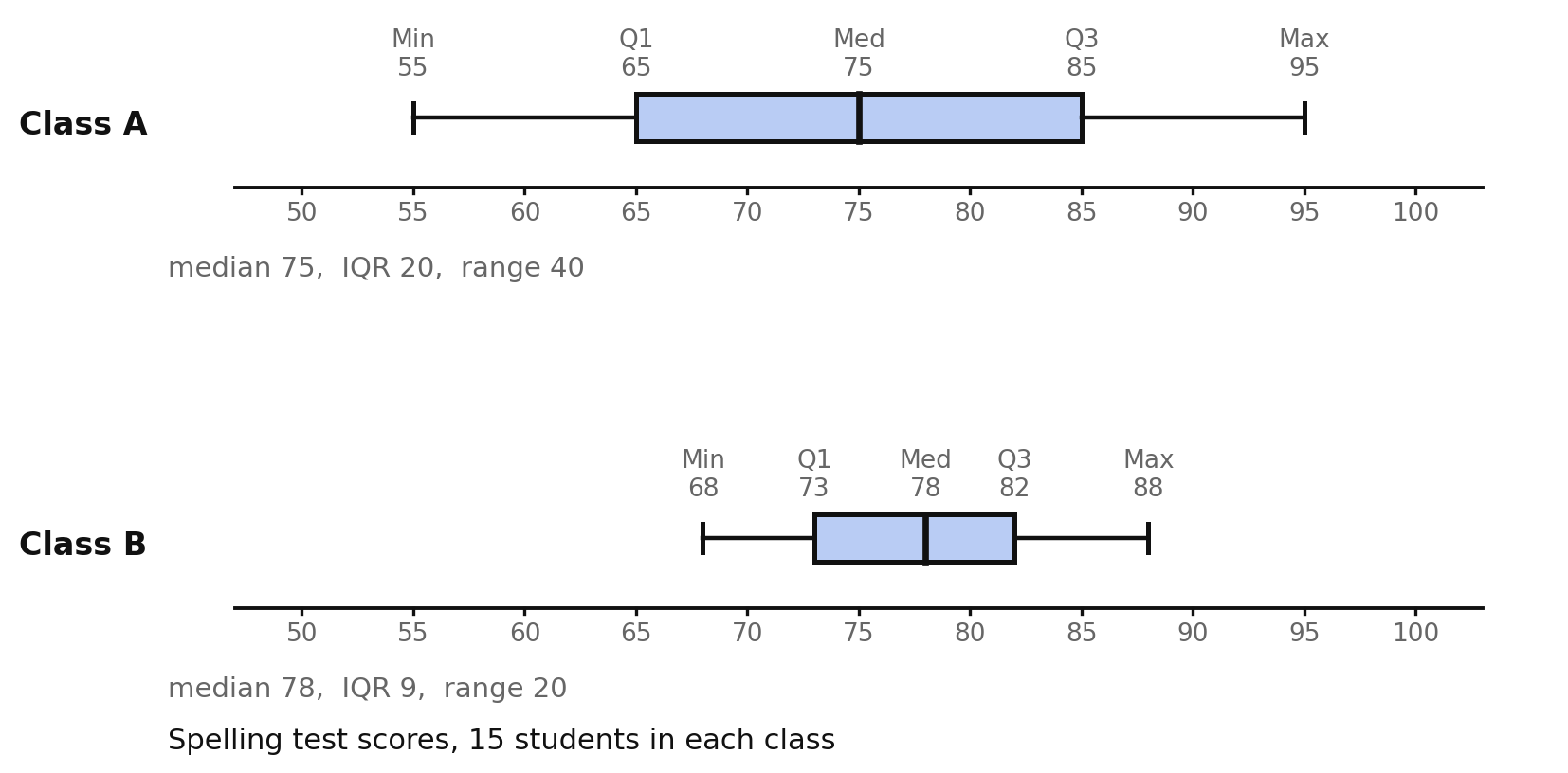
| Class A | Class B | |
|---|---|---|
| lower extreme | ||
| median | ||
| upper extreme | ||
| range | ||
| IQR |
Compare in three passes, always in this order:
- Center. Class B's median, , is higher than Class A's, . A typical Class B student scored a little higher.
- Spread. Class A's IQR is and its range is ; Class B's are and . Class A's scores are about twice as spread out by either measure. Class B is far more consistent.
- Position and overlap. Class B's lower extreme, , sits above Class A's of , so about a quarter of Class A scored below every single Class B student. At the other end, Class A's upper extreme of is above Class B's . Class A holds both the weakest and the strongest students, which is exactly what a bigger spread means.
A useful sentence pattern for the conclusion: Class B scored higher on average and much more consistently, but the highest individual scores were in Class A.
Equal medians do not mean equal data
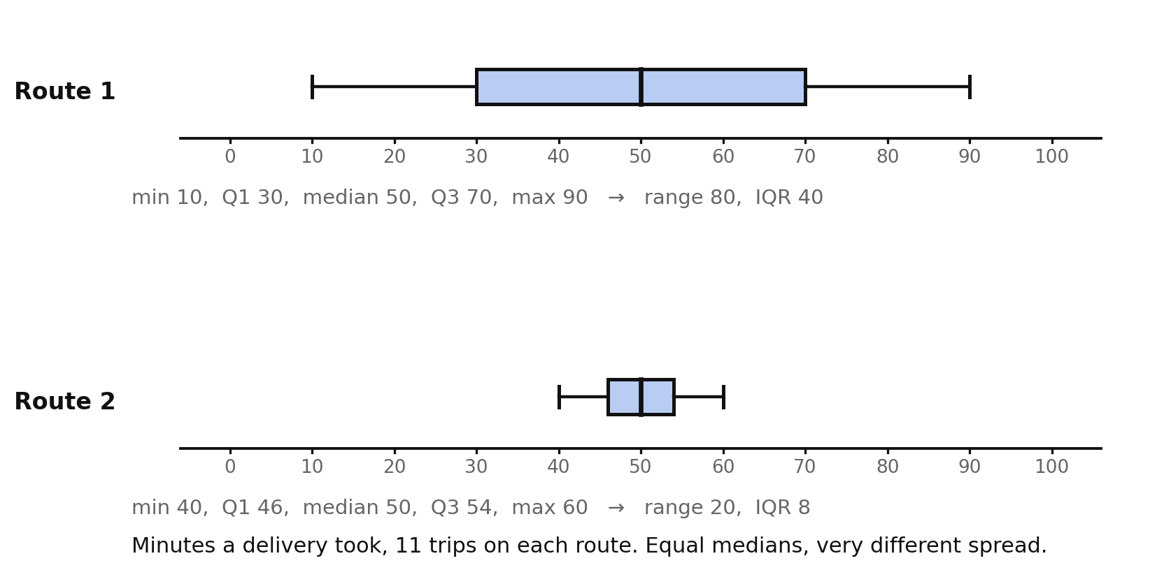
Both routes have a median of minutes. If you compared only centers you would call them identical. But Route 1 has range and IQR , while Route 2 has range and IQR . A driver who must arrive on time should choose Route 2 every day: half its trips fall between and minutes, while half of Route 1's fall anywhere between and . Always compare spread, not just center.
Choosing the right graphical representation
Given a situation, which display should you make? Match the display to the question.
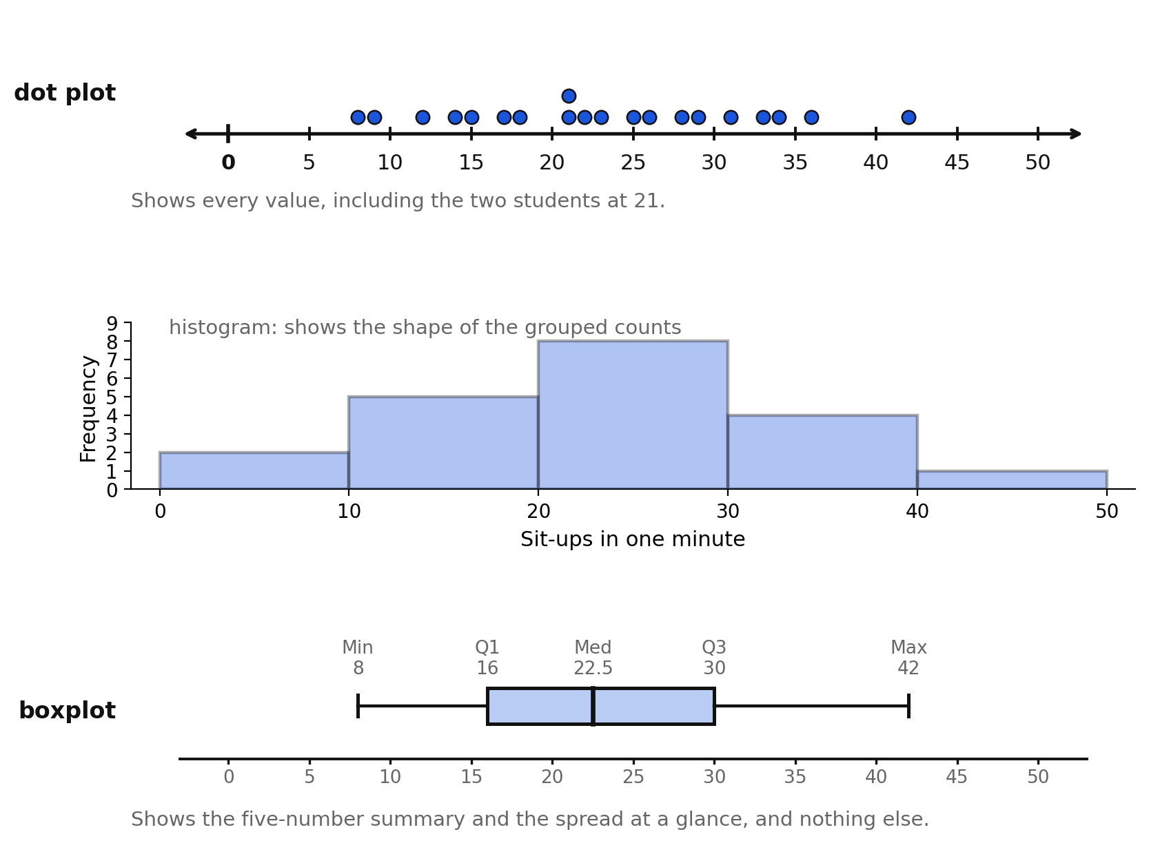
| Display | Shows | Best when the question is |
|---|---|---|
| dot plot | every individual value, and repeats | "What exact values occurred, and which are most common?" — small data sets |
| histogram | counts within intervals; the shape of the distribution | "What is the shape? How many fall between 20 and 30?" |
| boxplot | the five-number summary and spread | "What is typical, how spread out is it, and how do two groups compare?" |
| circle graph | parts of a whole | "What share of the total is each category?" — categorical data |
| line graph | change over time | "How did this quantity change from month to month?" |
Some rules that decide most cases:
- Categorical data (favorite sport, eye color) can never go in a boxplot, a histogram, or a line graph. Use a bar graph or a circle graph.
- Change over time for one quantity wants a line graph, not a boxplot; a boxplot would throw away the order the values came in.
- Exact values matter (the two students who did 21 sit-ups) — dot plot.
- Comparing two or more groups on center and spread — boxplots, every time.
When you justify a choice, name the feature of the question that forces it: "The question asks which of two teams is more consistent, and consistency is spread, so I chose two boxplots on one axis."
Misleading components of a graphical display
A graph can be technically accurate and still leave a false impression. The features to check:
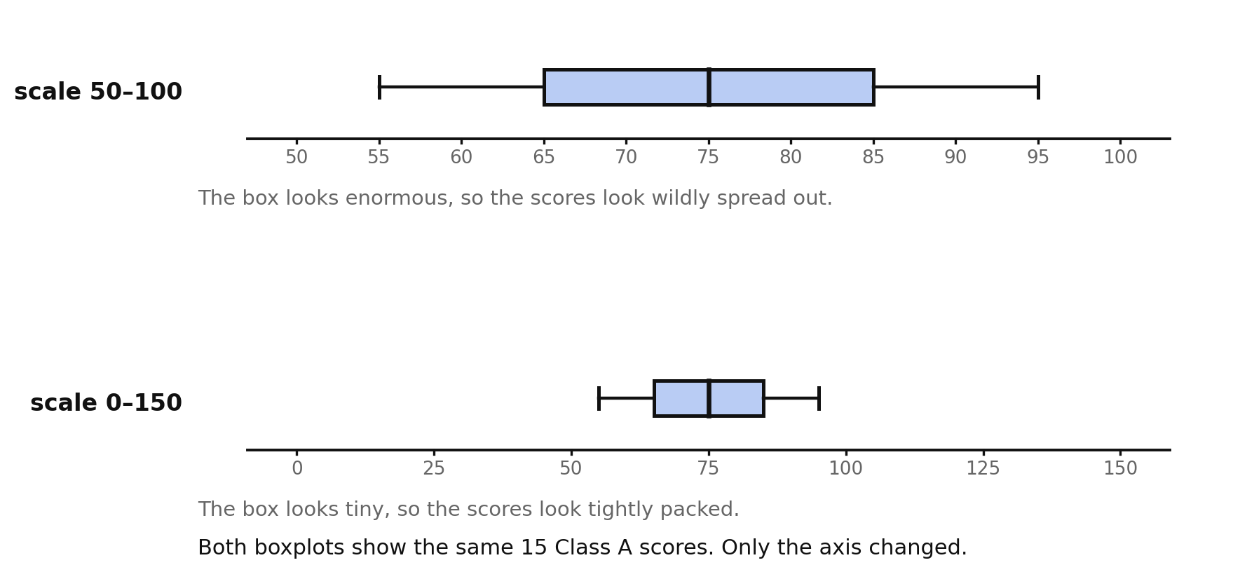
- A stretched or squeezed scale. Both plots above show the same 15 Class A scores. On the narrow axis the box looks enormous; on the wide axis it looks tiny. Nothing about the data changed. Always read the axis before judging a spread, and when comparing two groups, insist that both be drawn on one axis with one scale.
- Two boxplots on different scales. The single most common trick with boxplots. Side-by-side plots with different axes cannot be compared by eye at all.
- A missing or unlabeled axis. With no numbers, a boxplot conveys nothing but a shape.
- No units, or no statement of what was measured. "Median 78" of what? Points? Percent? Seconds?
- The sample not described. A boxplot cannot show its own sample size or how the sample was chosen. A plot of 6 self-selected volunteers looks exactly as authoritative as a plot of 20 randomly chosen students.
- A truncated whisker or hidden outlier. If an extreme value is dropped without a note, the range shown is not the real range.
- Reading a boxplot as if it showed counts. Because the four sections each hold about a quarter of the data, a long section is thin data spread wide — not "more values here." Claiming the wide section has more data points is a misreading built into the display.
How to check a display in ten seconds. Read the axis and its scale. Read the units. Read how many values are summarized and how they were collected. Only then look at the boxes.
Worked examples
Example 1 — Comparing centers and spreads
Compare with .
: median , , , range , IQR . : median , , , range , IQR .
Answer: has the higher median ( vs ) and about half the spread by either measure, so is both higher and more consistent; contains both the smallest value () and the largest ().
Example 2 — A conclusion that does not follow
From the Class A / Class B plots, a student concludes, "Class B has more students who scored above ." Evaluate.
Boxplots do not show counts. Both classes have 15 students, and about a quarter of each class scored above its own , but the plot cannot tell you how many exceeded a particular score like .
Answer: Not supported — a boxplot shows positions, not counts
Example 3 — Justifying a representation
A student wants to show how her town's monthly rainfall changed across last year. Which display, and why?
The question is about change across ordered months, and a boxplot discards order entirely.
Answer: A line graph, because the question is about change over time and a boxplot would lose the month-by-month order
Example 4 — Justifying a representation
A coach wants to know whether the varsity or junior varsity team is more consistent in points scored. Which display, and why?
"More consistent" is a question about spread, comparing two groups.
Answer: Two boxplots on one shared axis, because the question compares two groups on spread, which the box width and whisker lengths show directly
Example 5 — Finding what is misleading
A club's poster shows one boxplot labeled "Our members read a lot!" with a box from to , no axis numbers, and no note of how many members were surveyed. Name three problems.
Answer: (1) No labeled axis or scale, so the numbers cannot be verified or compared; (2) no units — minutes? pages? per day or per week?; (3) no sample size or sampling method, and members who chose to respond are a voluntary-response sample likely to read more than average.
Guided practice
Use the figures in this lesson where a figure is named.
- From the two-class figure, list the median and IQR of each class.
- From that figure, which class is more consistent, and how do you know?
- From that figure, which class contains the single highest score?
- From the two-routes figure, state the medians and explain why the routes are not equivalent.
- From the two-routes figure, which route would you choose to guarantee arriving within an hour? Justify with two statistics.
- From the three-display figure, name one thing the dot plot shows that the boxplot does not.
- From the two-scale figure, explain how the same data can look so different.
Independent practice
- Compare and : give both five-number summaries, then compare center, spread, and overlap in three sentences.
- Two boxplots have the same median but very different IQRs. Write one sentence describing what that means in context, choosing your own context.
- Two boxplots have the same range but different medians. What can you conclude, and what can you not?
- Justify the best display for each situation, naming the feature of the question that decides it. a) The share of eighth graders choosing each of four electives. b) A city's population each year from 2015 to 2024. c) Whether morning or afternoon bus routes take longer, and which is more reliable. d) Which of recorded quiz scores occurred most often.
- A newspaper prints two boxplots of house prices side by side, one on a – axis and one on a – axis. Explain why the comparison is invalid.
- Name three components you would check on any boxplot before believing a claim made from it.
- A boxplot's box is very wide and its whiskers are very short. Describe the data.
- Explain why "the wider section of the box contains more data values" is a misreading.
- A display shows a boxplot with no sample size given. Give two different data sets, one of 6 values and one of 20, and explain why the omission matters.
- Application. Team X scored points per game and Team Y scored . Give both five-number summaries and decide which team a coach should call more reliable, justifying with the IQR and the range.
- Application. You must present to the school board whether eighth graders or seventh graders spend more time on homework, and how much the two groups vary. Say which display you would use, why, and what you would label on it.
- Error analysis. A student compares two boxplots and writes, "Group 1's box is wider, so Group 1 has more students." Explain the error and write a correct statement.
Exit ticket 16.6
- Two boxplots share an axis. Group 1 has median and IQR ; Group 2 has median and IQR . Write one sentence comparing them.
- Name the display you would choose to compare the spread of two groups, and why.
- Name two components of a graphical display that can mislead a reader.
- Explain why two boxplots must share one axis to be compared.
Chapter 16 Review
Vocabulary. data cycle · data · statistical question · population · sample · representative · statistical bias · selection bias · response bias · nonresponse bias · voluntary response bias · random selection · five-number summary · lower extreme (minimum) · upper extreme (maximum) · median · lower quartile () · upper quartile () · range · interquartile range (IQR) · boxplot · box · whisker · extreme data point (outlier) · resistant · skewed
Part A — The data cycle, collecting data, and bias (8.PS.2a, b, c)
- Name the four stages of the data cycle in order, and say what happens in each in one phrase.
- Sharpen this into a question a boxplot can answer, then name the population and the data you would record: "Do eighth graders carry heavy backpacks?"
- For item 129, describe a collection method for at most 20 students and say why you chose it.
- Name the bias in each plan and the direction it pushes results. a) Measuring backpack weight only on Fridays, when lockers are cleaned out. b) Asking for volunteers to have their backpacks weighed. c) Weighing only backpacks in the athletics hallway.
- Explain what "representative sample" means and why bias prevents it, in two sentences.
Part B — Organizing, representing, and describing (8.PS.2d, e)
- Find the five-number summary, range, and IQR of .
- Find the five-number summary, range, and IQR of .
- State the quartile rule this book uses, and apply it to .
- Use the blank axes below. On the middle axis, draw a boxplot for .
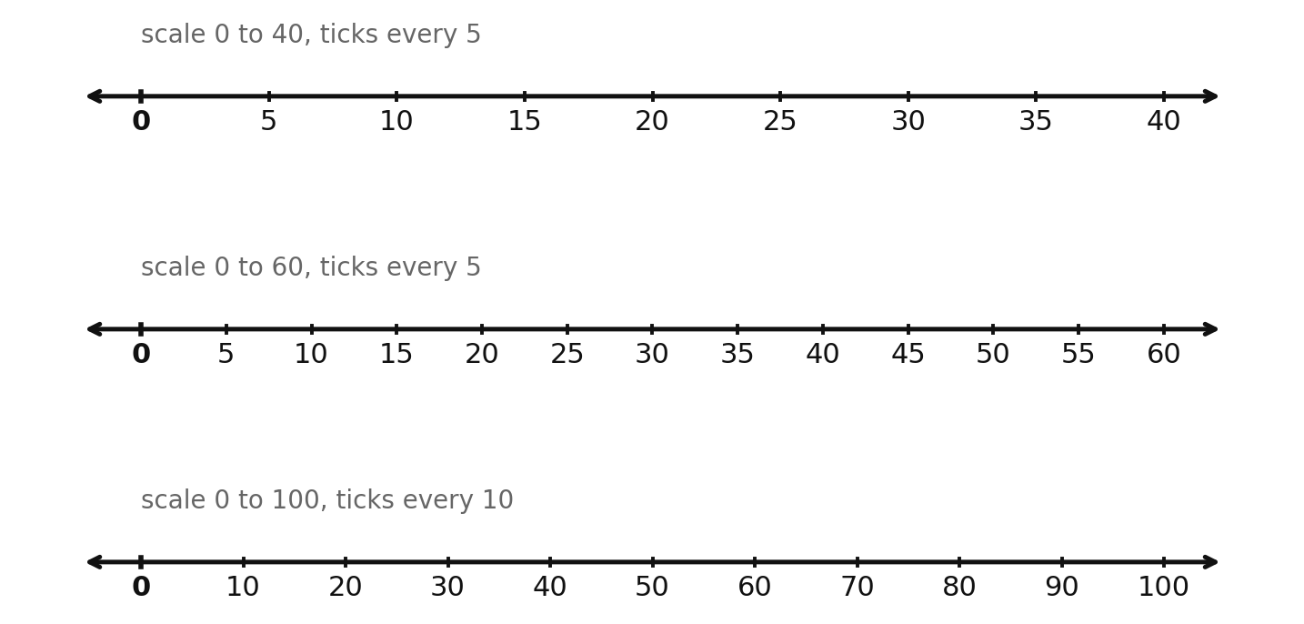
- On the top axis of that figure, draw a boxplot for .
- Use the boxplot below. Identify the lower extreme, , median, , and upper extreme.
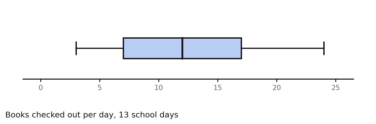
- From that same boxplot, find the range and the IQR, and say what each measures.
Part C — Outliers, analysis, and comparison (8.PS.2f, g, h)
- From the books-checked-out boxplot in item 138, write two observations and one conclusion a librarian could act on.
- From that same boxplot, explain what the length of the upper whisker tells you compared with the lower whisker.
- A data set of values has range and IQR . One value of is added, making the range while the IQR stays . Explain, in terms of how each is computed, why one changed and the other did not.
- Describe in two sentences how a single very large value changes the shape of a boxplot.
- Use the two boxplots below. Give the five-number summary of each team from the plot, then compare the two teams on center and on spread.
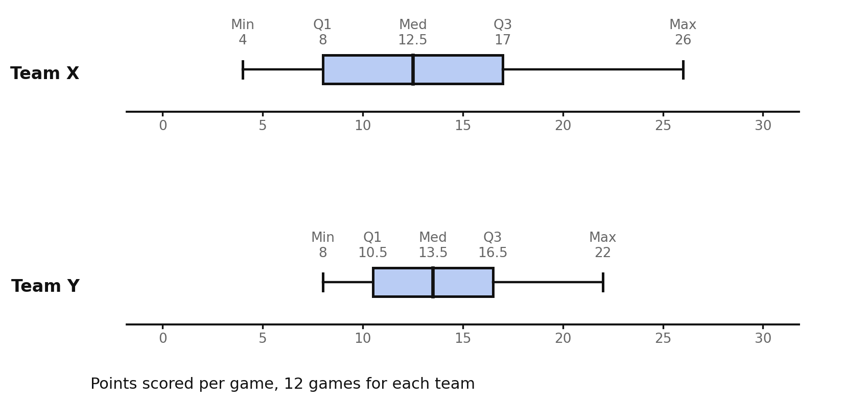
- From that same figure, which team would a coach call more reliable, and which team produced the single best game? Justify both answers with statistics.
Part D — Choosing a display and spotting a misleading one (8.PS.2i, j)
- Justify the best display for each. a) Comparing the spread of scores in two classes. b) Showing what fraction of students chose each of three field trips. c) Showing every one of 15 recorded times, including repeats. d) Showing a store's daily sales across two weeks.
- Explain why categorical data can never be shown in a boxplot.
- A poster shows one boxplot with no axis labels and no sample size. Name three questions you would ask before believing it.
- Two boxplots of the same quantity are printed on different scales. Explain the false impression this creates and how to fix it.
- Reasoning. A club claims, "Our members read more than the average student," and supports it with a boxplot of reading times from 12 members who volunteered. Name the bias in the collection, name one misleading feature of presenting a boxplot alone here, and describe a collection and display plan that would actually settle the claim.
Standards coverage check — Chapter 16
| Knowledge and Skill | Where it is taught | Where it is practiced |
|---|---|---|
| 8.PS.2a — formulate questions that require the collection or acquisition of data with a focus on boxplots | 16.1 (statistical questions a boxplot can answer, stage 1), 16.2 (who / what / when / why it varies; sharpening a vague question) | Items 1, 3, 9, 10, 14, 18; 21, 26, 34, 36; Review 128, 129 |
| 8.PS.2b — determine the data needed to answer a formulated question and collect the data (or acquire existing data) using various methods | 16.1 (stage 2, acquiring versus collecting), 16.2 (survey, measurement, observation, acquisition, and the trade-offs) | Items 6, 7, 11, 14; 22, 27, 28, 32, 33, 34, 37; Review 129, 130 |
| 8.PS.2c — determine how statistical bias might affect whether the data collected from the sample is representative of the larger population | 16.2 (population and sample; selection, response, nonresponse, and voluntary response bias; random selection as the fix) | Items 20, 23, 24, 25, 29, 30, 31, 32, 35, 36, 38, 39; Review 131, 132, 150 |
| 8.PS.2d — organize and represent a numeric data set of no more than 20 items, using boxplots, with and without technology | 16.3 (ordering the data), 16.4 (the five construction steps, by hand and with technology) | Items 40, 43, 45; 69, 70, 71, 72, 73, 77, 80, 81, 83; Review 133, 136, 137 |
| 8.PS.2e — identify and describe the lower extreme (minimum), upper extreme (maximum), median, upper quartile, lower quartile, range, and interquartile range given a data set, represented by a boxplot | 16.3 (all seven statistics and the quartile convention), 16.4 (reading each one off the drawn plot) | Items 40–63; 64, 65, 67, 68, 74, 75, 76, 79, 84, 85, 86; Review 133, 134, 135, 138, 139 |
| 8.PS.2f — describe how the presence of an extreme data point (outlier) affects the shape and spread of the data distribution of a boxplot | 16.5 (effect on each statistic; range versus IQR resistance; drawing the outlier separately; what to do about it) | Items 87–104; Review 142, 143 |
| 8.PS.2g — analyze data represented in a boxplot by making observations and drawing conclusions | 16.4 (observation versus conclusion, section-by-section reading), 16.5 (what the outlier means for the question), 16.6 (claims a boxplot cannot support) | Items 12, 13, 66, 68, 75, 76, 78, 79, 80, 81, 82; 100; 119, 123; Review 140, 141 |
| 8.PS.2h — compare and analyze two data sets represented in boxplots | 16.6 (compare center, then spread, then overlap; equal medians with unequal spread) | Items 105–109, 112, 113, 114, 121, 124; Review 144, 145 |
| 8.PS.2i — given a contextual situation, justify which graphical representation best represents the data | 16.1 (choosing the display in stage 3), 16.6 (dot plot, histogram, boxplot, circle graph, line graph, and the question each answers) | Items 5, 15; 110, 115, 118, 122, 125; Review 146, 147 |
| 8.PS.2j — identify components of graphical displays that can be misleading | 16.4 (what a boxplot cannot show), 16.6 (scale, mismatched axes, missing labels, missing sample size, hidden outliers, misreading section width as count) | Items 12, 13, 78, 86; 111, 116, 117, 119, 120, 123, 126, 127; Review 148, 149, 150 |
Every data set in this chapter has at most 20 items, and every five-number summary quoted in the text, the figures, and the answer key is computed with the single quartile rule stated in the chapter opening: quartiles are the medians of the halves, with the overall median excluded from both halves when the count is odd.
Answer keys for every set in this chapter are in Appendix A.