Chapter 17 — The Data Cycle and Scatterplots
Standard: 8.PS.3 — The student will apply the data cycle (formulate questions; collect or acquire data; organize and represent data; and analyze data and communicate results) with a focus on scatterplots.
By the end of this chapter you will be able to:
- Formulate questions that require the collection or acquisition of data with a focus on scatterplots (8.PS.3a)
- Determine what data are needed to answer your question, and collect or acquire a set of no more than 20 paired values using observation, measurement, survey, or an existing source (8.PS.3b)
- Organize and represent numeric bivariate data in a scatterplot, with and without technology (8.PS.3c)
- Describe the points in a scatterplot as showing a positive linear relationship, a negative linear relationship, or no relationship (8.PS.3d)
- Analyze and justify the relationship a scatterplot shows, using the points themselves as your evidence (8.PS.3e)
- Sketch a line of best fit for data shown in a scatterplot, and use it honestly to estimate (8.PS.3f)
Lessons: 17.1 The Data Cycle with Two Variables · 17.2 Asking a Bivariate Question and Collecting the Data · 17.3 Building a Scatterplot · 17.4 Positive, Negative, or No Relationship · 17.5 Sketching the Line of Best Fit
Numbering note. Item numbers run straight through the chapter, from 1 in Lesson 17.1 to 112 at the end of the review. They do not restart at each lesson.
The 20-pair limit. Every data set in this chapter is bivariate — each item in the set is a pair of numbers — and no set has more than 20 pairs. That bound is part of the standard, and it is also a kindness: 20 points is few enough to plot by hand and still enough to show a trend.
Lesson 17.1 — The Data Cycle with Two Variables
The same four stages you already know
In Grade 7 you applied the data cycle to histograms, and in Chapter 16 you applied it to boxplots. The four stages have not changed and will not change:
- Formulate questions.
- Collect or acquire data.
- Organize and represent data.
- Analyze data and communicate results.
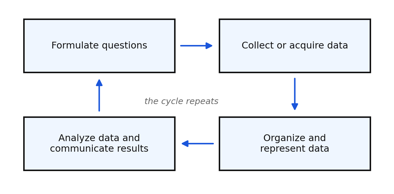
The arrows come back around, which is why it is a cycle rather than a checklist. Answering one question almost always raises the next one, and the next question sends you back to the beginning.
What is new this year: two measurements per item
Every data set you have graphed so far was univariate — one number per person or object. One reading time per student. One test score per student. A histogram and a boxplot both live on a single number line, because a single number line is all one measurement needs.
This chapter uses bivariate data: two numbers recorded for each item in the set. Not the reading times of 12 students and, separately, the quiz scores of 12 students, but the reading time and the quiz score of the same student, kept together as an ordered pair .
That pairing is the entire point. Once the two measurements are locked together, you can ask a question no single-variable graph can answer: when one of these goes up, what tends to happen to the other?
| Univariate data | Bivariate data | |
|---|---|---|
| What is recorded | one number per item | two numbers per item, kept paired |
| A typical entry | ||
| Graph | histogram, boxplot, dot plot | scatterplot |
| Question it answers | how are the values distributed? | how do the two quantities move together? |
The stages, pointed at a scatterplot
| Stage | With a histogram (Grade 7) | With a scatterplot (Grade 8) |
|---|---|---|
| Formulate questions | "How many minutes do students read each night?" | "Is there a relationship between hours studied and quiz score?" |
| Collect or acquire data | one measurement per student | two measurements per student, kept paired |
| Organize and represent data | group into intervals, draw a histogram | plot each pair as a point on a coordinate grid |
| Analyze and communicate | where values pile up, how spread out they are | whether the points trend up, trend down, or show no pattern |
One project, four stages
Mr. Alvarez's class wanted to know whether studying actually pays off on quizzes. Here is the whole cycle in one table.
| Stage | What the class did |
|---|---|
| Formulate questions | Wrote the question: "For eighth graders in our class, is there a relationship between the number of hours a student studied in a week and that student's score on Friday's quiz?" |
| Collect or acquire data | Recorded two numbers for each of 12 volunteers — hours studied that week, and quiz score — keeping each student's pair together |
| Organize and represent data | Plotted the 12 ordered pairs on a coordinate grid with hours on the horizontal axis and score on the vertical axis |
| Analyze data and communicate results | Observed that the points trend upward from lower left to upper right, described the relationship as positive linear, and reported it to the class |
Then someone asked whether where students studied mattered too. The cycle starts again.
Which variable goes on which axis
Bivariate data needs one more decision that univariate data never did: which of the two measurements is and which is .
- The independent variable goes on the horizontal axis. It is the quantity you think of as the input, the one that is set first or that you suspect is doing the explaining.
- The dependent variable goes on the vertical axis. It is the quantity you think of as responding.
You met these names in Chapter 8, for linear functions, and they mean the same thing here. Hours studied is the input and quiz score is the response, so hours studied is . Nothing in the mathematics breaks if you swap them, but the graph will be harder to talk about, and everyone who reads it will expect the input on the horizontal axis.
Worked examples
Example 1 — Naming a stage
A class writes the question "Is there a relationship between how many minutes an eighth grader sleeps and that student's reaction time?" Which stage is this?
The class is deciding what it wants to know and putting it in words.
Answer: Formulate questions.
Example 2 — Univariate or bivariate
A class records the height of each of 15 students. A second class records the height and the arm span of each of 15 students. Which set is bivariate, and why?
The first records one number per student; the second records two, kept together.
Answer: The second set is bivariate, because each student contributes an ordered pair (height, arm span). The first is univariate.
Example 3 — Naming a stage
The class measures both the wingspan and the flight distance of each of 14 paper airplanes and writes the two numbers side by side in a table. Which stage is this, and by what method?
They are gathering the numbers themselves with a measuring tool.
Answer: Collect or acquire data, by measurement.
Example 4 — Naming a stage
The class plots each airplane's (wingspan, distance) pair as a point on a coordinate grid. Which stage is this?
Making the pairs visible is the third stage.
Answer: Organize and represent data.
Example 5 — Why the pairing matters
A student says, "I have all 12 study times on one list and all 12 quiz scores on another list, so I have bivariate data." What is wrong?
Two separate lists are two univariate data sets unless you know which score belongs to which study time.
Answer: The data are bivariate only if each study time stays matched to the score of the same student. Without the pairing you cannot plot a single point, because a point needs both coordinates from one student.
Example 6 — Choosing the axes
A class studies whether the number of hours a phone is charged relates to the percent of battery it shows. Which quantity goes on the horizontal axis?
Charging time is the input; battery percent is the response.
Answer: Hours charged goes on the horizontal axis as the independent variable; battery percent goes on the vertical axis as the dependent variable.
Guided practice
- Name the four stages of the data cycle in order.
- What makes a data set bivariate?
- A class records only the height of each student. Is this data set univariate or bivariate? Explain.
- Which stage are you in when you plot each ordered pair on a coordinate grid?
- In a study of hours practiced and free throws made, which quantity belongs on the horizontal axis, and what is that variable called?
- A student says the data cycle ends as soon as the scatterplot is drawn. Correct the statement.
Independent practice
- Name the stage for each action. a) Measuring both the length and the width of each of 16 leaves b) Writing "Is there a relationship between a student's shoe length and height?" c) Plotting 16 ordered pairs on a coordinate grid d) Telling the class that the points trend upward, so longer leaves tend to be wider
- These stages are scrambled. Put them in the correct order: organize and represent data; analyze data and communicate results; formulate questions; collect or acquire data.
- For each, state whether the data described are univariate or bivariate. a) The number of minutes each of 20 students exercised yesterday b) The age and the resting heart rate of each of 20 people c) The mass of each of 12 backpacks d) The mass of each of 12 backpacks together with the number of books in each
- For each pair of quantities, name the independent variable and the dependent variable. a) Hours of practice and number of free throws made b) Age of a used car and its price c) Days since a seed was planted and the height of the plant
- Write one question about your class that would need bivariate data, and name the two quantities you would record for each student.
- Application. The school nurse wants to know whether eighth graders who sleep longer have lower resting heart rates. Describe what she would do in each of the four stages, one sentence per stage.
- Reasoning. Explain why a histogram cannot answer the question "Do students who study more score higher?" even if you have every study time and every quiz score. Say what a histogram loses.
Exit ticket 17.1
- Name the four stages of the data cycle in order.
- Give one example of a bivariate data set and one example of a univariate data set.
- In a study of days since planting and plant height, which variable goes on the vertical axis, and what is it called?
- Explain in one sentence why the two measurements in a bivariate data set must be kept paired.
Lesson 17.2 — Asking a Bivariate Question and Collecting the Data
A question that needs two measurements
A statistical question is one you expect to answer with data that vary. For a scatterplot the question has to do more: it must ask about the relationship between two numerical quantities.
Compare three questions.
| Question | What data it needs | Scatterplot? |
|---|---|---|
| How many hours did Maya study this week? | one number, one person | No — a single value, nothing to graph |
| How many hours did each eighth grader study this week? | one number per student | No — univariate; use a histogram or boxplot |
| Is there a relationship between hours studied and quiz score for eighth graders? | two numbers per student, paired | Yes |
The third question has the shape every question in this chapter has: is there a relationship between _____ and _____?, with a numerical quantity in each blank.
Both quantities must be numerical. "Is there a relationship between favorite subject and quiz score?" cannot be plotted, because favorite subject is categorical — there is no number to move along the horizontal axis.
Sharpening the question
A sharp bivariate question names four things. Leave any one out and the data you collect will be hard to use.
- The population — exactly whose pairs you want. "Eighth graders in our class," not "kids."
- The first quantity and its units — "hours studied in the week before the quiz, to the nearest half hour."
- The second quantity and its units — "score on Friday's quiz, in points out of 100."
- The time frame or condition — the single week, the single quiz, the same conditions for everyone.
| Weak question | What is missing | Sharper question |
|---|---|---|
| Does studying help? | Both quantities; units; a population | For the 12 eighth graders in our class, is there a relationship between hours studied in a week and score on Friday's quiz out of 100 points? |
| Are tall people faster? | Units; a population; a precision | For members of our track team, is there a relationship between height in centimeters and 100-meter time in seconds? |
| Does cold weather sell hot chocolate? | Which two numbers; units | For the school store, is there a relationship between the outside temperature at noon in degrees Fahrenheit and the number of cups of hot chocolate sold that day? |
Deciding what data you need
Before collecting anything, ask what exactly would answer your question. For a scatterplot the answer is always the same shape: one ordered pair per item, both numbers measured the same way for every item.
Three rules keep the collection usable.
- Keep the pairs together. Record the two numbers on the same row of one table. A pair that loses its partner is a pair you cannot plot.
- Stop at 20. This standard limits a data set to no more than 20 items. Twenty pairs is plenty to see a trend and few enough to plot by hand.
- Watch for missing partners. If a student reports a study time but was absent for the quiz, you have half a pair. Half a pair is not a data point, and inventing the missing half is not collecting data.
Methods, and acquiring instead of collecting
The four methods are the same ones you have used since Grade 7, and each one has to produce both numbers of every pair.
| Method | What you do | A bivariate example |
|---|---|---|
| Observation | Watch and record without asking | For each of 15 days, record the noon temperature and the number of students wearing coats |
| Measurement | Use a tool to find both amounts | For each of 18 students, measure shoe length in centimeters and height in centimeters |
| Survey | Ask people both questions | For each of 20 students, ask hours of sleep last night and minutes spent on homework |
| Experiment | Change one thing on purpose and record the result | For each of 10 ramp heights, release a car and record how far it rolls |
You may also acquire existing data. Weather records, a school store's sales log, a census table, or a published study may already hold paired values. Acquiring saves enormous effort, and it costs you control: you inherit somebody else's definitions. Before you use acquired data, ask who collected it and from whom, when and by what method, and — new for bivariate data — are the two columns really matched to the same item? A table of monthly temperatures next to a table of yearly sales cannot be paired at all.
Worked examples
Example 1 — Does the question need a scatterplot?
Is "How many minutes did each eighth grader sleep last night?" a question a scatterplot could answer?
It asks for one number per student.
Answer: No. The data are univariate, so a histogram or boxplot fits. A scatterplot needs two paired quantities.
Example 2 — Repairing a question
Rewrite "Does sleep affect grades?" so a scatterplot could answer it.
It names no population, no units, and no measurable quantities.
Answer: "For the eighth graders in our class, is there a relationship between the number of hours of sleep, to the nearest half hour, a student got last night and that student's score out of 100 on today's math quiz?"
Example 3 — A quantity that will not plot
Why can a scatterplot not display "Is there a relationship between a student's favorite sport and the number of hours they exercise?"
Favorite sport is a name, not a number.
Answer: One of the two quantities is categorical, so there is nothing to place along the horizontal number line. Both quantities in a scatterplot must be numerical.
Example 4 — Choosing a method
You want to know whether colder days sell more hot chocolate at the school store. Name the two measurements and the method.
You can record the thermometer reading and read the sales total off the register without asking anyone anything.
Answer: For each day, record the noon temperature in degrees Fahrenheit and the number of cups sold that day. The method is observation, and the store's sales log means part of the data can simply be acquired.
Example 5 — Half a pair
A class collects study hours from 14 students, but 2 of them were absent on quiz day. How many points can be plotted?
Only students with both numbers contribute a point.
Answer: 12 points. The 2 students with a study time but no score cannot be plotted, and their study times should not be paired with anyone else's score.
Example 6 — Judging acquired data
A student finds an online table of the average temperature of each month last year and a table of the school store's total sales for each of the last five years. Can these be paired into a scatterplot?
One table has monthly rows; the other has yearly rows.
Answer: No. The two tables do not describe the same items, so no ordered pair can be formed. Pairing requires both numbers to come from the same item — here, the same day or the same month.
Guided practice
- What shape does a question take when it calls for a scatterplot? Fill in the blanks: "Is there a relationship between ______ and ______?"
- Why must both quantities in a scatterplot be numerical?
- Name the four things a sharp bivariate question states.
- Rewrite "Does studying help?" as a question a scatterplot could answer.
- A class collects 22 pairs of values. What does the standard for this chapter say about the size of the data set?
- A student has a study time for a classmate but no quiz score. Can that student be plotted? Explain.
Independent practice
- For each question, state whether a scatterplot could answer it. If not, say why. a) How many hours did each eighth grader sleep last night? b) Is there a relationship between hours of sleep and minutes of homework? c) Is there a relationship between favorite subject and quiz score? d) Is there a relationship between the age of a used car and its price?
- Sharpen each question so that it names a population, both quantities with units, and a time frame. a) Are tall people faster? b) Does cold weather sell hot chocolate?
- Name the best collection method — observation, measurement, survey, or experiment — for each, and name the two numbers recorded for each item. a) Whether taller students have longer arm spans b) Whether colder days bring more students wearing coats c) Whether students who sleep more spend less time on homework d) Whether a steeper ramp makes a toy car roll farther
- A class wants to know whether cities with more rainfall have more days of cloud cover, for 15 U.S. cities. Explain why they should acquire the data rather than collect it, and name two questions they should ask about data they did not collect.
- A table lists the average temperature of each month of last year. A second table lists the school store's total sales for each of the last five years. Explain why these cannot be combined into a scatterplot.
- Application. The PE teacher wants to know whether students who practice more make more free throws. Write the sharpened question, name exactly what two numbers are needed from each student, name the collection method, and explain why that method fits.
- Reasoning. A student surveys 20 classmates and writes all the sleep hours on one page and all the homework minutes on another, in whatever order people answered. Explain why the data can no longer be plotted, and describe how the recording should have been organized.
Exit ticket 17.2
- Write a question about your class that a scatterplot could answer.
- Name the two quantities your question in item 31 requires, with units for each.
- Explain in one sentence why "favorite subject" cannot be one of the two quantities in a scatterplot.
- What is the largest number of data items a set in this chapter may have?
Lesson 17.3 — Building a Scatterplot
What a scatterplot is
A scatterplot is a graph of bivariate data in which each item in the data set is shown as a single point, placed at the ordered pair formed by its two measurements.
Nothing is grouped and nothing is summarized. Twelve students give twelve points. That is the trade a scatterplot makes: it keeps every individual pair visible, so the pattern between the two quantities is the thing you see.
Plotting one pair
Plotting a point works exactly as it did in Chapter 8. Start at the origin, move across to the -value, then up to the -value, and mark the point.
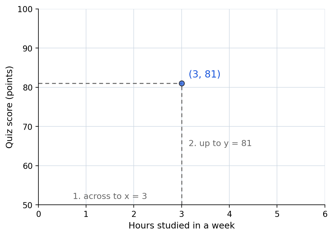
The student who studied hours and scored is the point . The dashed lines are guides, not part of the graph; erase them once the point is marked.
Two coordinates, one student, one dot. Repeat 11 more times and the graph is finished.
From a table to a plot
Here are Mr. Alvarez's 12 pairs, sorted by hours studied.
| Student | Hours studied () | Quiz score () | Ordered pair |
|---|---|---|---|
| A | 0 | 63 | |
| B | 0 | 57 | |
| C | 1 | 68 | |
| D | 1 | 62 | |
| E | 2 | 77 | |
| F | 2 | 70 | |
| G | 3 | 81 | |
| H | 3 | 75 | |
| I | 4 | 88 | |
| J | 4 | 80 | |
| K | 5 | 92 | |
| L | 5 | 87 |
Twelve rows, twelve pairs, twelve points — well inside the 20-item limit.
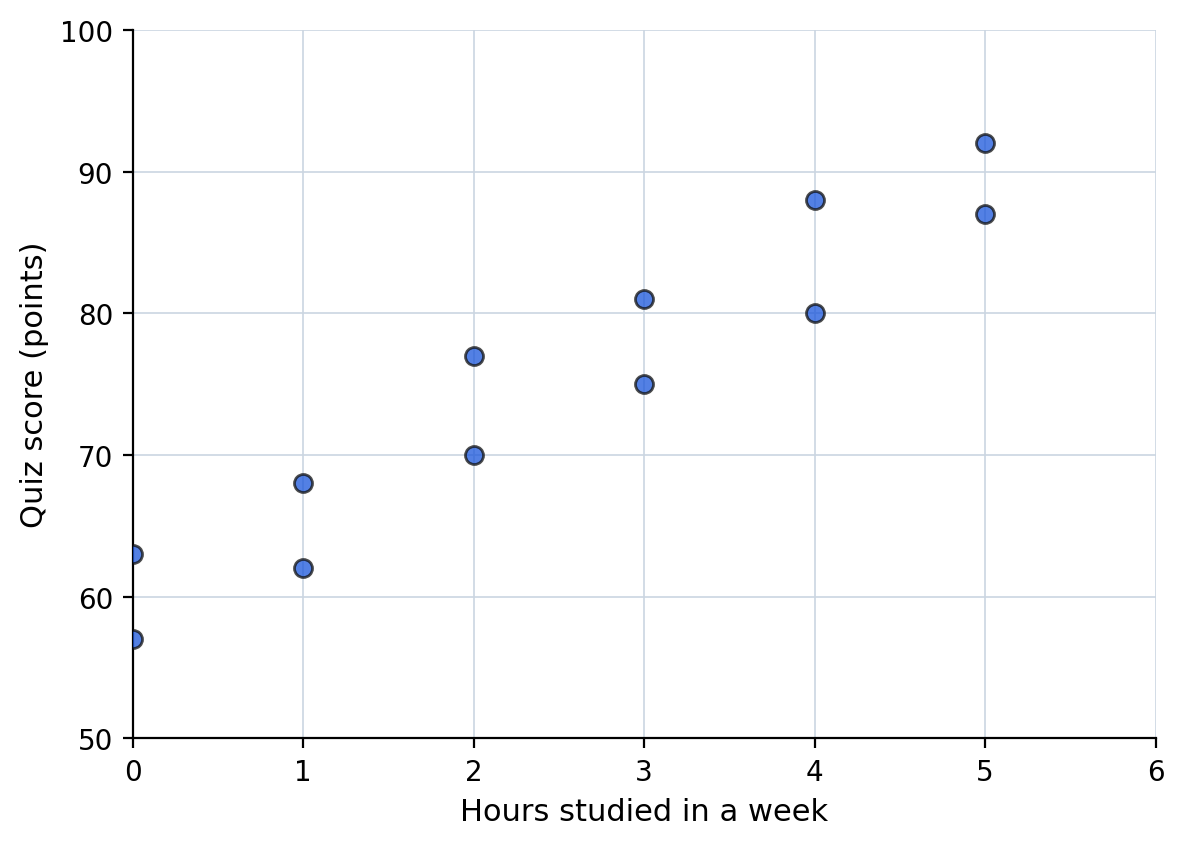
Building it by hand, in five steps
- Decide which quantity is . The independent variable goes on the horizontal axis. Here it is hours studied.
- Choose a scale for each axis that covers the data. Hours run from to , so to in steps of works. Scores run from to , so to in steps of works. The two axes do not have to use the same scale, and usually cannot — one is hours and one is points.
- Label both axes with the quantity and its units. "Hours studied in a week." "Quiz score (points)." An unlabeled axis makes a scatterplot unreadable.
- Plot one point per row of the table. Work down the table in order and check off each row so no pair is plotted twice or skipped.
- Title the graph with what it shows and how many pairs it contains.
A scale that does not start at zero is allowed — say so. The score axis above starts at , because no student scored below and a graph running from to would squash all 12 points into the top half. Cutting the axis is legitimate and it exaggerates how dramatic the climb looks, so a reader deserves to see the axis labels clearly. Never leave the numbers off.
Repeated pairs and shared coordinates
Two students may share an -value, a -value, or both.
- Sharing an -value is ordinary: students C and D both studied hour, so their points sit in a vertical line above at heights and . Keep both.
- Sharing both coordinates means two identical pairs land on the same spot. Two points drawn at look like one. Note the repeat in your table, or mark the point so a reader knows two students are there.
Do not "fix" a vertical stack by nudging a point sideways. Moving a point changes its -value, which is a claim about how long that student studied.
With technology
In a spreadsheet, put the -values in one column and the -values in the next, with each item's two values on the same row. Select both columns and insert an XY (scatter) chart. Then check three things, because software will happily draw something wrong:
- The chart used your first column as . Swapping the columns silently swaps the axes.
- The axes are labeled with quantities and units. Most tools do not add these for you.
- The number of plotted points equals the number of rows. A missing partner in a row usually drops that item without warning.
The mathematics is identical either way. Technology changes who does the plotting, not what the picture means.
Worked examples
Example 1 — Naming the coordinates
A student studied hours and scored . Write the ordered pair, and say what each coordinate means.
Hours studied is the independent variable, so it is the first coordinate.
Answer: . The is hours studied; the is the quiz score in points.
Example 2 — Choosing scales
The -values of a data set run from to and the -values run from to . Choose a scale for each axis.
Each axis needs to cover its own range with friendly steps.
Answer: Horizontal axis from to in steps of ; vertical axis from to in steps of . The two axes use different scales because they measure different quantities.
Example 3 — Reading a point off the graph
On the study-time scatterplot, one point sits at and . What does it say?
Read the coordinates in order.
Answer: One student studied hours that week and scored points on the quiz.
Example 4 — Two points in a vertical line
Students C and D both studied hour, scoring and . How does the scatterplot show this?
Same , different .
Answer: Two separate points sit directly above , at heights and . Both are kept; neither is moved sideways, because moving one would misreport how long that student studied.
Example 5 — Counting the points
A class collects paired values from 20 students, but 3 students are missing the second measurement. How many points appear on the scatterplot?
Only complete pairs can be plotted.
Answer: 17 points.
Example 6 — A spreadsheet check
A student makes a scatter chart and finds the graph has hours on the vertical axis. What happened, and how is it fixed?
The tool takes the first selected column as .
Answer: The columns were in the wrong order, so the dependent variable was read as . Put hours studied in the first column and the score in the second, then redraw, and label both axes.
Guided practice
- What does one point on a scatterplot represent?
- A student read for minutes and scored out of . Write the ordered pair, taking minutes as the independent variable.
- The -values of a data set run from to and the -values run from to . Give a workable scale for each axis.
- Two students both practiced hours. How should their two points be drawn?
- Name the two labels a scatterplot's axes must carry.
- A data set has 20 rows, and 4 rows are missing the second measurement. How many points can be plotted?
Independent practice
Items 41 through 44 use the hot chocolate data: for each of 10 school days, the noon temperature in degrees Fahrenheit and the number of cups of hot chocolate the school store sold.
| Temperature (°F) | 20 | 25 | 30 | 35 | 40 | 45 | 50 | 55 | 60 | 65 |
|---|---|---|---|---|---|---|---|---|---|---|
| Cups sold | 116 | 92 | 94 | 75 | 77 | 54 | 53 | 36 | 35 | 18 |
- Write the 10 ordered pairs, taking temperature as the independent variable.
- Give a workable scale for each axis, and state the label each axis should carry.
- Draw the scatterplot of the hot chocolate data on a grid.
- How many items are in this data set? Explain how you know it satisfies the limit for this chapter.
- A student plots the study-time data but puts quiz score on the horizontal axis and hours studied on the vertical axis. Is the graph wrong? Explain what changes and what does not.
- Explain why the vertical axis of the study-time scatterplot may start at instead of , and state what a reader must be shown so the choice is not misleading.
- Application. Measure or estimate the length of your shoe in centimeters and your height in centimeters. Describe how you and 15 classmates would organize those numbers into a table and then into a scatterplot, naming which quantity you would put on each axis and why.
- Reasoning. A student says two points that share an -value must be an error, because "a graph can only have one for each ." Explain why a scatterplot is not required to be a function, and what the vertical stack actually means.
Exit ticket 17.3
- Write the ordered pair for an item whose independent value is and whose dependent value is .
- Give one reason a scatterplot's two axes usually need different scales.
- A spreadsheet chart puts the dependent variable on the horizontal axis. What went wrong?
- Explain in one sentence why a scatterplot keeps every individual pair rather than grouping the data.
Lesson 17.4 — Positive, Negative, or No Relationship
Three descriptions, and only three
Once the points are plotted, the analysis question is simple to state: as increases, what tends to happen to ? This standard asks for a qualitative answer, chosen from exactly three descriptions.
- A positive linear relationship: as increases, tends to increase. The points trend upward from lower left to upper right and lie roughly along a line.
- A negative linear relationship: as increases, tends to decrease. The points trend downward from upper left to lower right and lie roughly along a line.
- No relationship: as increases, does not tend to do either. The points scatter with no consistent direction.
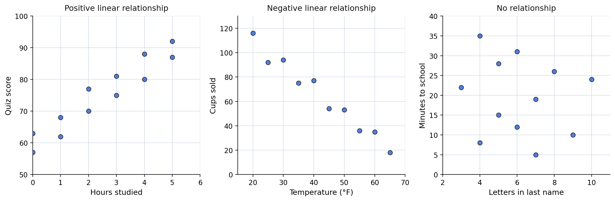
Notice the word tends. A relationship is a statement about the overall pattern, never about every single pair. In the study data, the student who studied hours and scored outscored the student who studied hours and scored . That one reversal does not undo the trend, because the relationship describes the cloud of points, not any two of them.
Three words this chapter does not use. You will not be asked how strong a relationship is as a number, and you will not compute a correlation coefficient. Positive linear, negative linear, no relationship — those three descriptions are the whole vocabulary here.
Reading the trend from the points
Here is a negative linear relationship in full.
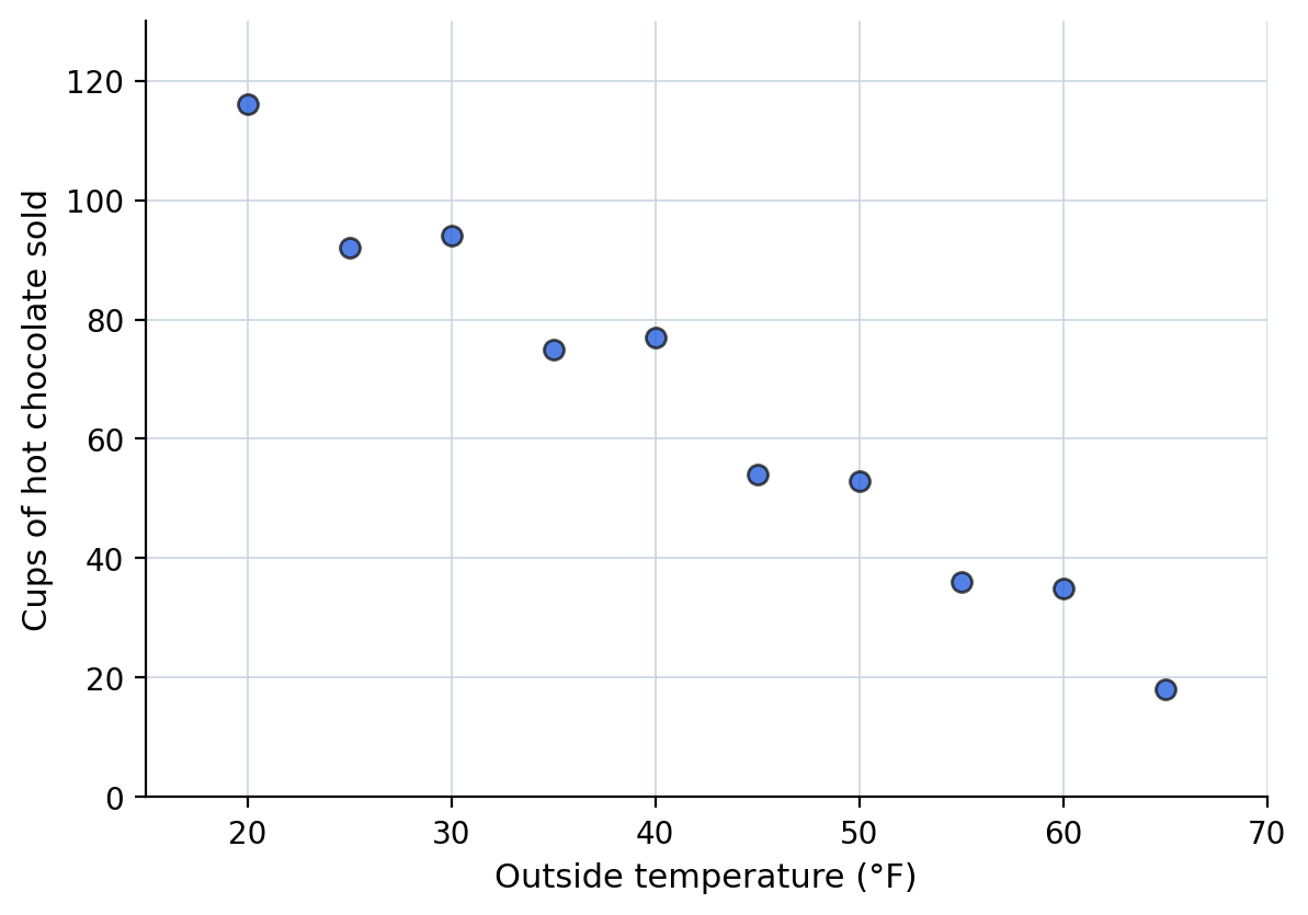
Work left to right. At °F the store sold cups. By °F sales are down near . By °F they are down to . Each step to the right brings a lower point overall, so the relationship is negative linear.
Now one with no relationship.
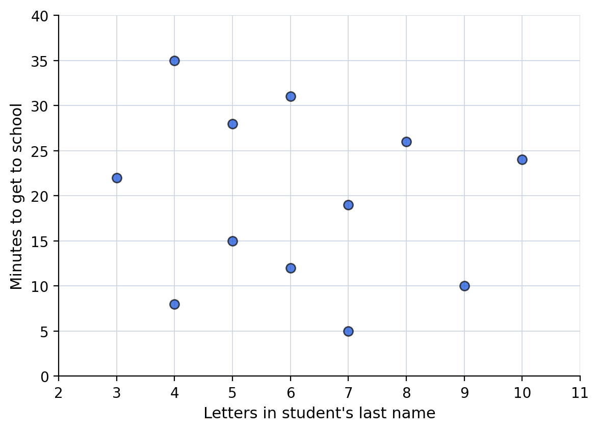
Above there is a point at minutes and another at . Above there is a point at and another at . Moving right does not push the points up or down; the tall and short values are mixed at every . That is what no relationship looks like, and it is a real, reportable result. "We found no relationship" is an answer, not a failure.
Justifying your answer
Bullet (e) of the standard asks you to analyze and justify the relationship, which means naming the evidence. A justification has three parts.
- Name the relationship in the standard's language: positive linear, negative linear, or no relationship.
- Point at the evidence in the plot — the direction the cloud runs, with specific points cited.
- Say what it means in context, using the actual quantities and units.
Weak: "It goes up." Strong: "The relationship is positive linear. The points climb from at the left to at the right, and each step right brings generally higher scores. In context, eighth graders in this class who studied more hours tended to score higher on the quiz."
A justification for "no relationship" works the same way and names the absence of direction: "There is no relationship. At the values are and minutes, and at they are and , so high and low values appear at both small and large . Nothing about the length of a last name tells you anything about a commute."
Correlation is not causation
This is the most important sentence in the chapter: a relationship between two quantities does not prove that one causes the other.
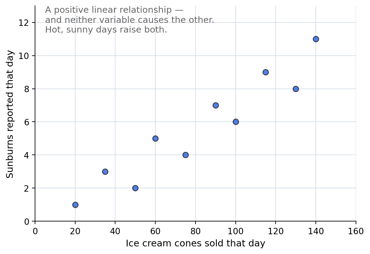
Those ten days show a clear positive linear relationship. Cones sold climbs from to , and sunburns climb from to . Nobody thinks eating ice cream burns your skin, and nobody thinks a sunburn makes you buy a cone. A third quantity — hot, sunny weather — pushes both up at once. A quantity like that, which is not on either axis but drives both, is called a lurking variable.
Three honest explanations exist for any relationship you find, and a scatterplot cannot tell you which one is true:
- really does cause .
- really does cause . (More studying may raise scores; it is also possible that students who are already doing well are the ones willing to study more.)
- Something else causes both, or the pattern is a coincidence of these particular items.
So report what you actually saw. "Students who studied more tended to score higher" is supported by the plot. "Studying causes higher scores" is not — that claim needs an experiment, in which the study time is assigned rather than merely observed.
Worked examples
Example 1 — Naming the relationship
The points climb steadily from lower left to upper right. Which relationship is it?
As increases, increases.
Answer: A positive linear relationship.
Example 2 — Justifying a negative relationship
Describe and justify the relationship in the hot chocolate data.
Read the plot from left to right and cite points.
Answer: Negative linear. The points fall from on the left to on the right, and each step toward warmer temperatures brings generally fewer cups. In context, on warmer days the school store sold fewer cups of hot chocolate.
Example 3 — Recognizing no relationship
Twelve points are plotted for letters in a last name against minutes to school. Above the values are and ; above they are and . What is the relationship?
Both a very high and a very low value appear at a small and again at a large .
Answer: No relationship. The points do not trend up or down, so the number of letters in a student's last name gives no information about the commute.
Example 4 — One reversal does not break a trend
In the study data, a student who studied hours scored while a student who studied hours scored . Does this disprove the positive linear relationship?
A relationship describes the whole cloud, not one comparison.
Answer: No. Individual pairs may run against the trend. Across the whole set, the scores climb from the high fifties at hours to the low nineties at hours, so the relationship is still positive linear.
Example 5 — Correlation and causation
A newspaper reports that towns that sold more ice cream had more sunburns, and concludes that ice cream causes sunburns. What is wrong?
Both quantities rise on hot, sunny days.
Answer: The scatterplot shows a positive linear relationship, not a cause. A lurking variable — hot, sunny weather — raises both quantities at once. The honest report is that the two tend to rise together.
Example 6 — Rewriting an overclaim
A student writes, "Our scatterplot proves that studying more makes you score higher." Rewrite the claim so it is supported.
Observation is not experiment.
Answer: "In our class, students who studied more hours tended to score higher on the quiz." To claim that studying causes the higher score, you would have to assign study times rather than record whatever students happened to do.
Guided practice
- Name the three descriptions this chapter uses for the relationship in a scatterplot.
- Points trend downward from upper left to lower right. Name the relationship.
- As increases, shows no consistent direction. Name the relationship.
- Give the three parts of a good justification.
- Explain why one pair that runs against the trend does not change the relationship's name.
- State in one sentence what "correlation is not causation" means.
Independent practice
Items 59 through 62 use the three plots below.
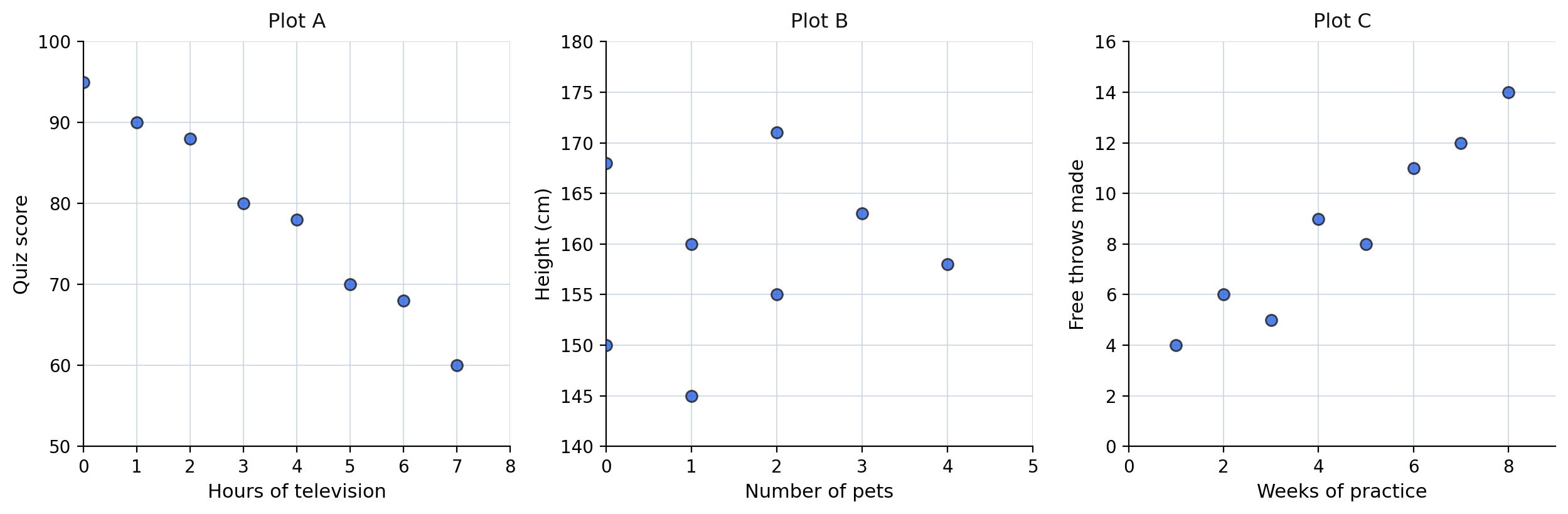
- Name the relationship shown in Plot A, and justify it by citing two points.
- Name the relationship shown in Plot B, and justify it.
- Name the relationship shown in Plot C, and justify it by citing two points.
- For Plot C, write one sentence describing the relationship in context, using the quantities and their units.
- For each pair of quantities, predict whether a scatterplot would most likely show a positive linear relationship, a negative linear relationship, or no relationship, and give a one-sentence reason. a) Hours of practice and free throws made b) Age of a used car and its price c) A student's height and that student's house number d) Outside temperature and cups of hot chocolate sold
- Rewrite this weak justification so it names the relationship, cites evidence, and speaks in context: "It kind of goes down."
- Application. For ten summer days, a shop's cones sold and the town's reported sunburns both rise together. Name the relationship, then explain why the shop should not conclude that ice cream causes sunburns. Name the lurking variable.
- Error analysis. A student writes, "The plot of hours studied and quiz score has no relationship, because one student studied hours and beat a student who studied hours." Identify the error and give the correct description with a justification.
- Reasoning. A scatterplot of hours of sleep and reaction time shows a negative linear relationship. Give three different explanations for the pattern — one in which sleep causes the change, one in which the causation runs the other way, and one involving a lurking variable.
Exit ticket 17.4
- Points trend upward from lower left to upper right. Name the relationship.
- A scatterplot's points scatter with no direction. What do you report, and is that a failed investigation?
- Give one sentence of justification for a negative linear relationship between temperature and cups of hot chocolate sold, citing two points from this lesson's data.
- Explain why a scatterplot alone cannot prove that one quantity causes the other.
Lesson 17.5 — Sketching the Line of Best Fit
What the line is for
When the points in a scatterplot show a linear relationship, you can draw a single straight line that summarizes the trend. That line is the line of best fit, also called a trend line: the line that comes as close as possible to the overall pattern of the points.
In this course you sketch the line. You do not compute it. You look at the cloud, lay a straightedge where the trend runs, and draw. The result is a judgment, and two careful students may sketch slightly different lines from the same data. That is expected and it is fine, because the point of the line is to describe a trend, not to be exact.
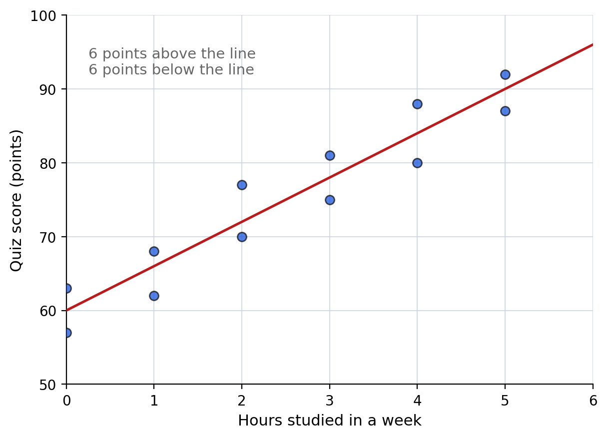
Notice what the line does not do. It does not pass through all the points — no straight line could. It does not connect the points in order. It runs through the middle of them.
What makes a sketch good
Four tests, in order of importance:
- It follows the direction of the trend. An upward cloud gets an upward line.
- It runs through the middle of the cloud, with roughly as many points above it as below. The line above has points above and below.
- It stays close to the points overall. Every point should be near the line, not just a few.
- It is a single straight line, drawn edge to edge across the data, not a curve and not a series of segments.
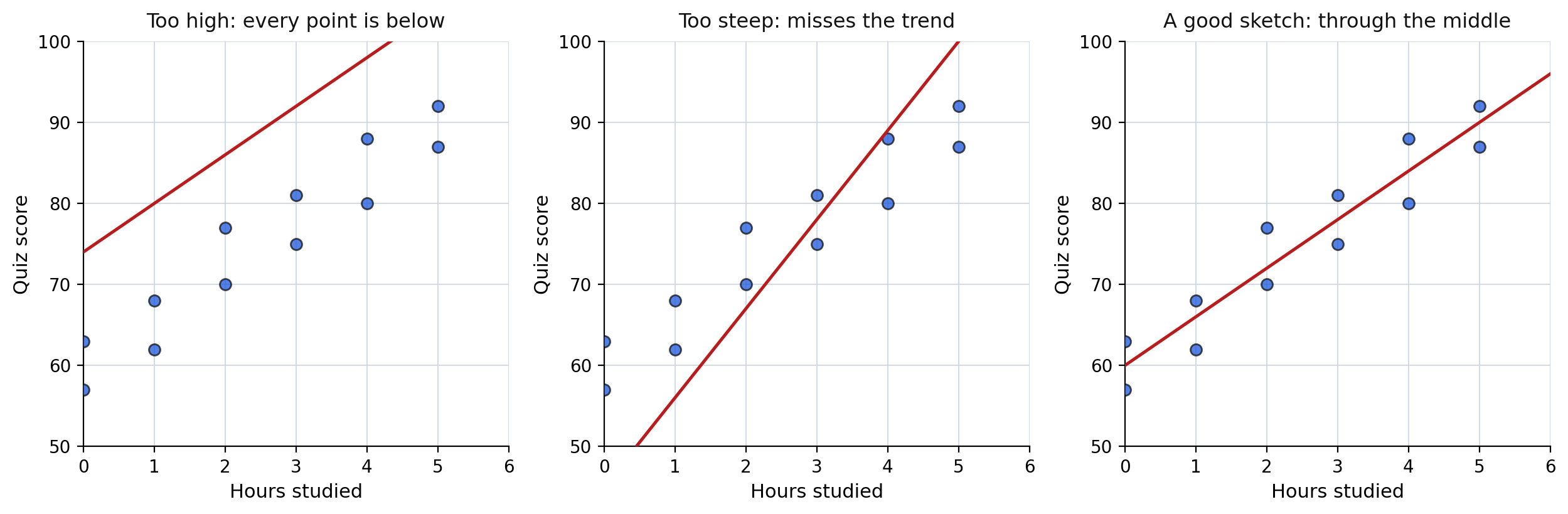
The first line has the right direction but sits above every point — above, below. The second passes through the cloud but is far too steep, missing low at the left end and high at the right. The third satisfies all four tests.
And when the plot shows no relationship, do not sketch a line at all. A trend line drawn on a directionless cloud invents a trend that the data do not contain.
The line is a linear function, and you already know its parts
A line of best fit is a straight line, so it can be written in the slope-intercept form from Chapter 8:
Both parts mean something in context.
- The slope is the rate of change: the amount changes for each increase of in . Its sign matches the relationship — positive slope for a positive linear relationship, negative slope for a negative one.
- The y-intercept is the value the line gives at . It has a real meaning only when is inside or near the data.
For the study-time data, a reasonable sketched line is
The slope says that each additional hour of study is associated with about more points on the quiz. The y-intercept says the line predicts about points for a student who studied hours — and really is in this data set, so that number is meaningful. Say associated with, not "causes." Nothing about drawing a line changes what Lesson 17.4 said.
For the hot chocolate data, a reasonable sketched line is
The slope says that for each additional degree of temperature, sales drop by about cups. Here the intercept is a warning rather than a fact: the data start at °F, so nobody measured what happens at °F.
Using the line to estimate
Once the line is drawn, you can read a value off it: go across to the you care about, up to the line, and across to the -axis.
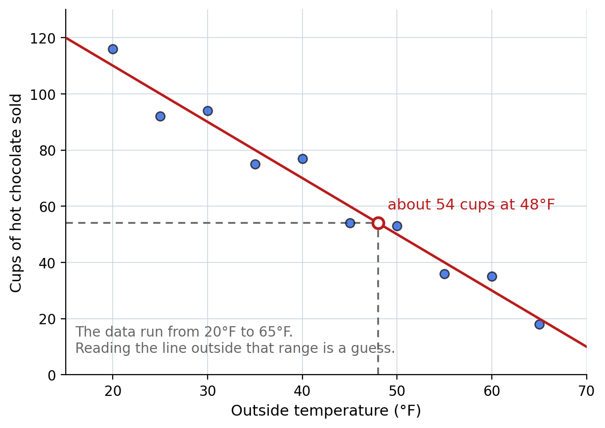
At °F the line is at
so the store might expect about cups. Three cautions, all of which belong in your answer:
- It is an estimate, not a fact. The line came from a sketch, and the real days scatter above and below it. On a °F day the store actually sold cups and on a °F day it sold — close to the line, not on it.
- Say "about." Reporting cups exactly claims a precision the sketch does not have.
- Do not read the line far outside the data. The temperatures collected run from °F to °F. Ask the same line about a °F day and it answers cups, which is impossible. A line has no idea where your data stopped, so you have to keep track.
Reading a value from inside the range of the data is called interpolation and is reasonably safe. Reading far outside it is extrapolation, and it is unreliable — sometimes visibly absurd, as above, and sometimes wrong in ways you cannot see.
Worked examples
Example 1 — Judging a sketch
A line drawn on an upward-trending cloud has all points below it. Is it a good line of best fit?
Count above and below.
Answer: No. The direction is right, but points lie above and below, so the line sits above the cloud instead of running through its middle. It should be drawn lower.
Example 2 — Reading the slope in context
The sketched line for the study data is . What does the slope mean?
Slope is the change in per increase of in .
Answer: Each additional hour studied is associated with about more points on the quiz.
Example 3 — Reading the y-intercept in context
What does the in mean, and is it meaningful here?
The y-intercept is the value at .
Answer: The line estimates about points for a student who studied hours. It is meaningful here because the data actually include students at hours, who scored and .
Example 4 — Estimating inside the data
Use to estimate the score of a student who studied hours.
Substitute .
Answer: About points. This is an estimate read from a sketched line, and hours is inside the range of the data, from to hours.
Example 5 — Estimating outside the data
Use to estimate cups sold at °F, then judge the answer.
Substitute .
Answer: The line gives cups, which is impossible — a store cannot sell a negative number of cups. The data only ran from °F to °F, so °F is far outside the range and the line should not be used there.
Example 6 — When not to sketch
A scatterplot of letters in a last name against minutes to school shows no relationship. Should you sketch a line of best fit?
A line asserts a direction.
Answer: No. There is no trend to summarize, and drawing a line would suggest a pattern the data do not show. The correct report is that there is no relationship.
Guided practice
- What does a line of best fit summarize?
- Give the two most important tests of a good sketched line of best fit.
- In , which number tells you the direction of the relationship?
- The sketched line for the hot chocolate data is . What does the slope mean in context?
- Use to estimate the quiz score of a student who studied hours.
- Should you sketch a line of best fit on a scatterplot that shows no relationship? Explain.
Independent practice
- A line is sketched on an upward cloud of points with points below it and above. State what is wrong and how to fix it.
- Using the study-time line : a) Estimate the score for a student who studied hour. b) Estimate the score for a student who studied hours. c) The actual scores at hours were and . Explain why neither equals your estimate.
- Using the hot chocolate line : a) Estimate cups sold at °F. b) Estimate cups sold at °F. c) The actual sales at °F and °F were and cups. Compare each with your estimate.
- The study data run from to hours. Use to estimate the score of a student who studied hours, then explain why that estimate should not be trusted. Mention the maximum possible score.
- Explain the difference between interpolation and extrapolation, and say which one is more trustworthy and why.
- Two students sketch slightly different lines of best fit for the same scatterplot, and their estimates at differ by points. Is one of them wrong? Explain.
- Application. A gardener records the height of a bean plant every two days for 20 days and sketches the line , where is days since planting and is height in centimeters. Estimate the height on day , state what the slope means in context, and explain why the same line should not be used to estimate the height on day .
- Reasoning. Explain why the y-intercept of a sketched line of best fit is sometimes meaningful and sometimes not, using for the study data and for the hot chocolate data as your two examples.
- Error analysis. A student sketches a good line of best fit through the study data and then writes, "This proves that studying hours will get you a ." Identify two separate problems with the sentence and rewrite it correctly.
Exit ticket 17.5
- State the test that involves counting points above and below the line.
- Use to estimate cups sold at °F.
- Explain in one sentence why an estimate read from a sketched line should be reported with the word "about."
- The data run from to . Explain why an estimate at is unreliable.
Chapter 17 Review
Vocabulary. data cycle · statistical question · univariate data · bivariate data · ordered pair · independent variable · dependent variable · scatterplot · positive linear relationship · negative linear relationship · no relationship · justification · lurking variable · correlation is not causation · line of best fit · slope · y-intercept · interpolation · extrapolation
Part A — Formulating questions (8.PS.3a)
- Which of these questions could a scatterplot answer? For each that could not, say why. a) How many minutes did each eighth grader exercise yesterday? b) Is there a relationship between minutes of exercise and resting heart rate? c) Is there a relationship between favorite sport and minutes of exercise? d) Is there a relationship between the age of a used car and its price?
- Rewrite "Do bigger backpacks weigh more?" as a sharp question a scatterplot could answer. Name the population, both quantities with units, and the time frame.
- Write your own bivariate question about your class, and name which quantity you would put on each axis and why.
Part B — Determining and collecting the data (8.PS.3b)
- Name the best collection method for each, and name the two numbers recorded per item. a) Whether taller students have longer arm spans b) Whether warmer days bring fewer cups of hot chocolate sold c) Whether students who sleep more spend fewer minutes on homework d) Whether a steeper ramp makes a toy car roll farther
- A class collects paired values from 24 students. State the problem and one acceptable fix.
- A class collects study hours from 15 students, but 2 were absent on quiz day. How many points can be plotted, and why should the 2 unmatched study times not be paired with someone else's score?
Part C — Organizing and representing data in a scatterplot (8.PS.3c)
Items 97 through 100 use these paired values: for each of 8 students, the number of weeks of free-throw practice and the number of free throws made out of 20.
| Weeks of practice | 1 | 2 | 3 | 4 | 5 | 6 | 7 | 8 |
|---|---|---|---|---|---|---|---|---|
| Free throws made | 4 | 6 | 5 | 9 | 8 | 11 | 12 | 14 |
- Write the 8 ordered pairs, taking weeks of practice as the independent variable.
- Give a workable scale for each axis and the label each axis should carry.
- Draw the scatterplot on a grid.
- Explain why the point for week sits below the point for week , and why that does not make the table wrong.
Part D — Describing the relationship (8.PS.3d)
Items 101 through 104 use the two plots below.
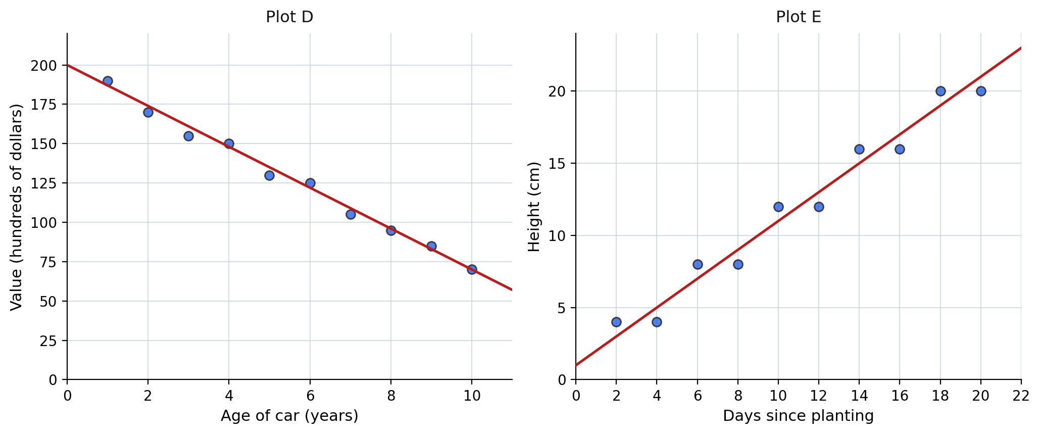
- Name the relationship shown in Plot D.
- Name the relationship shown in Plot E.
- Name the relationship you would expect between a student's height and that student's house number, and explain your reasoning.
- A scatterplot's points show no consistent direction. State what you report and whether a line of best fit should be drawn.
Part E — Analyzing and justifying (8.PS.3e)
- Justify your answer to item 101 by citing two points from Plot D and describing the relationship in context.
- Justify your answer to item 102 by citing two points from Plot E and describing the relationship in context.
- A student writes, "The plot proves that getting older makes a car cheaper." Rewrite the claim so the scatterplot supports it, and explain what would be needed to claim causation.
- Reasoning. On ten summer days, ice cream cones sold and sunburns reported both rise together. Name the relationship, name the lurking variable, and explain in two sentences why neither quantity causes the other.
Part F — Sketching the line of best fit (8.PS.3f)
- List the four tests of a well-sketched line of best fit.
- Plot D's sketched line is , where is the car's age in years and is its value in hundreds of dollars. a) Estimate the value of a -year-old car. b) What does the slope mean in context? c) Explain why the line should not be used to estimate the value of a -year-old car.
- Plot E's sketched line is , where is days since planting and is height in centimeters. a) Estimate the plant's height on day . b) What does the slope mean in context? c) The data run from day to day . Is your estimate in part (a) interpolation or extrapolation?
Part G — Mixed application and reasoning
- Walk through all four stages of the data cycle for the question "For eighth graders in our class, is there a relationship between hours of sleep last night and minutes spent on homework last night?" Write one sentence per stage, and name the graph you would draw.
Standards coverage check — Chapter 17
| Knowledge and Skill | Where it is taught | Where it is practiced |
|---|---|---|
| 8.PS.3a — formulate questions that require the collection or acquisition of data with a focus on scatterplots | 17.1, 17.2 | Items 1–6, 8, 11–14, 17; 18–25, 29, 31–33; Review Part A, items 91–93; item 112 |
| 8.PS.3b — determine the data needed to answer a formulated question and collect or acquire data of no more than 20 items using various methods | 17.2 | Items 7, 9, 12; 22–23, 26–30, 34; Review Part B, items 94–96; item 112 |
| 8.PS.3c — organize and represent numeric bivariate data using scatterplots with and without the use of technology | 17.3 | Items 10, 15–16; 35–52; Review Part C, items 97–100 |
| 8.PS.3d — make observations about a set of data points in a scatterplot as having a positive linear relationship, a negative linear relationship, or no relationship | 17.4 | Items 53–55, 57–64, 68–70; Review Part D, items 101–104 |
| 8.PS.3e — analyze and justify the relationship of the quantitative bivariate data represented in scatterplots | 17.4, 17.5 | Items 56, 58, 62, 64–67, 71; 85–86; Review Part E, items 105–108; item 112 |
| 8.PS.3f — sketch the line of best fit for data represented in a scatterplot | 17.5 | Items 72–90; Review Part F, items 109–111 |
Two limits from the standard are respected in every item above: no data set exceeds 20 items, and every relationship is described qualitatively as positive linear, negative linear, or no relationship. The line of best fit is always sketched and always reported as an estimate.
Answer keys for every set in this chapter are in Appendix A.