Chapter 16 — The Data Cycle and Circle Graphs
Standard: 6.PS.1 — The student will apply the data cycle (formulate questions; collect or acquire data; organize and represent data; and analyze data and communicate results) with a focus on circle graphs.
By the end of this chapter you will be able to:
- Formulate questions that require the collection or acquisition of data with a focus on circle graphs (6.PS.1a)
- Determine the data needed to answer a formulated question and collect the data, or acquire existing data, using various methods (6.PS.1b)
- Determine the factors that will ensure that the data collected is a sample that is representative of a larger population (6.PS.1c)
- Organize and represent data using circle graphs, with and without the use of technology tools (6.PS.1d)
- Analyze data represented in a circle graph by making observations and drawing conclusions (6.PS.1e)
- Compare data represented in a circle graph with the same data represented in other graphs, including bar graphs, pictographs, and line plots (dot plots), and justify which graphical representation best represents the data (6.PS.1f)
Lessons: 16.1 The Data Cycle · 16.2 Formulating Good Questions · 16.3 Collecting Data and Representative Samples · 16.4 Making a Circle Graph · 16.5 Analyzing Circle Graphs · 16.6 Choosing the Best Representation
Lesson 16.1 — The Data Cycle
Where numbers come from
Every graph you have ever seen started as a question somebody cared about. Someone wondered which school lunch students actually like, or how sixth graders get to school, and then went and found out. Data are the facts, measurements, or responses collected to answer such a question.
Statisticians do not gather data at random and hope something interesting appears. They follow a repeating process called the data cycle, which has four phases:
- Formulate questions.
- Collect or acquire data.
- Organize and represent data.
- Analyze data and communicate results.
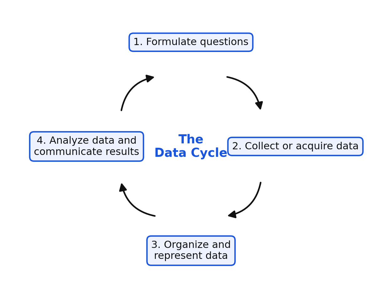
Notice the arrows in the figure return to the start. That is why it is a cycle and not a list. Answering one question almost always raises the next one, and the next question sends you back to phase 1.
The four phases, one at a time
Phase 1 — Formulate questions. You decide exactly what you want to know, and you word the question so that data can actually answer it. This is where most projects succeed or fail.
Phase 2 — Collect or acquire data. You decide what data would answer the question, then either gather it yourself or acquire data someone else has already gathered. Common methods are observation, measurement, surveys, and experiments.
Phase 3 — Organize and represent data. Raw responses are hard to read, so you organize them into a table and then represent them with a graph. In this chapter the graph is usually a circle graph.
Phase 4 — Analyze data and communicate results. You study the representation, make observations, draw conclusions, and report what you found to people who can use it.
One project, four phases
Mr. Ortiz's class wanted to help the cafeteria plan its menu. Here is the whole cycle in one table.
| Phase | What the class did |
|---|---|
| Formulate questions | Wrote the question: "What is the favorite lunch of sixth graders at our school?" |
| Collect or acquire data | Asked all 120 sixth graders to choose exactly one lunch from four choices, and recorded the tallies |
| Organize and represent data | Built a table of counts and percents, then drew a circle graph |
| Analyze data and communicate results | Observed that pizza filled almost half the circle, concluded pizza should be served more often, and presented the graph to the cafeteria manager |
The cafeteria manager then asked a new question: "Does the answer change for seventh graders?" The cycle starts again.
Worked examples
Example 1 — Naming a phase
A class writes the question "What is the most common way sixth graders get to school?" Which phase of the data cycle is this?
The class is deciding what it wants to know and putting it in words.
Answer: Formulate questions.
Example 2 — Naming a phase
Students stand at the school entrance for a week and record how each arriving student traveled. Which phase is this?
They are gathering the facts themselves, by watching.
Answer: Collect or acquire data, using observation.
Example 3 — Naming a phase
The students turn their tallies into percents and draw a circle graph. Which phase is this?
Making the data readable is phase 3.
Answer: Organize and represent data.
Example 4 — Naming a phase
The students write, "Nearly half of sixth graders ride the bus, so the school should add a second bus route," and present it at a staff meeting. Which phase is this?
They are drawing a conclusion and reporting it.
Answer: Analyze data and communicate results.
Example 5 — Why the cycle repeats
After the presentation, a teacher asks whether students who walk live closer than one mile from school. Explain what happens next in the data cycle.
The new question cannot be answered with the data already collected, so the class returns to phase 1.
Answer: The class formulates the new question, then collects new data about distance from school, represents it, and analyzes it. The cycle begins again.
Guided practice
- Name the four phases of the data cycle in order.
- Which phase are you in when you decide to survey students instead of measuring something?
- Which phase includes drawing a circle graph?
- A student says the data cycle ends as soon as the graph is finished. Correct the statement.
- In which phase would you write, "Two out of three students chose soccer, so the club should meet twice a week"?
Independent practice
- Name the phase for each action. a) Recording the number of pages each student read last night b) Writing "Which after-school club do sixth graders prefer?" c) Presenting a circle graph at a school board meeting d) Turning a tally chart into a table of percents
- These phases are scrambled. Put them in the correct order: organize and represent data; formulate questions; analyze data and communicate results; collect or acquire data.
- A class debates whether to survey one homeroom or every sixth grader. Which phase of the cycle are they working in?
- Write one question about your class that would require collecting data to answer.
- Application. The school store wants to know which snack to stock. Describe what the store manager would do in each of the four phases. Use one sentence per phase.
- Application. A class collects data on favorite pets, makes a circle graph, and finds that dogs fill the largest slice. A student then asks, "Do the fifth graders agree?" Explain which phase the class returns to and what they must do next.
- Reasoning. Explain why the data cycle is drawn as a circle instead of a straight line from start to finish.
Exit ticket 16.1
- Name the four phases of the data cycle in order.
- Which phase includes choosing between a survey and an experiment?
- A student draws a circle graph of class data. Which phase is that?
- Explain, in your own words, why analyzing data comes after representing it.
Lesson 16.2 — Formulating Good Questions
Statistical questions
Some questions have exactly one answer. "How tall is our principal?" has one answer, and you get it by measuring one person once. That is not a statistical question.
A statistical question is one you expect to answer with data that vary — data that differ from person to person, object to object, or day to day. "How tall are the sixth graders at our school?" is statistical, because different students give different answers.
| Question | Statistical? | Why |
|---|---|---|
| How many minutes did I read last night? | No | One value, from one person, on one night |
| How many minutes do sixth graders read each night? | Yes | Answers vary across students |
| What is my favorite fruit? | No | One person, one answer |
| What is the favorite fruit of students in our class? | Yes | Answers vary across the class |
Questions that fit a circle graph
A circle graph shows how a whole is divided into parts. That means a question fits a circle graph when three things are true.
- The responses are categories, not measurements. Favorite fruit works. Height in inches does not.
- Every response is counted exactly once. Each person picks one category, so the parts add to the whole.
- The categories cover everyone. Adding an "other" category is often what makes this true.
Choose one. The phrase "choose exactly one" belongs in almost every survey question that will become a circle graph. If a student may choose two favorite fruits, the parts will add to more than the whole, and the circle graph will not make sense.
Sharpening a question
Vague questions produce data you cannot use. Compare these.
| Weak question | Problem | Stronger question |
|---|---|---|
| Do people like fruit? | Only yes or no; no categories to compare | Which one fruit — apple, banana, orange, or grape — do sixth graders choose as their favorite? |
| What do students do after school? | Responses are unlimited and will not group | Which one activity — sports, homework, screen time, or chores — do sixth graders spend the most time on after school? |
| How much do students read? | Measurement, not category | Which one range best describes your nightly reading: under 15 minutes, 15–30 minutes, or over 30 minutes? |
Notice that the third example turns a measurement into categories by grouping. That is a legitimate move, and it is what lets reading time appear in a circle graph.
Worked examples
Example 1 — Statistical or not
Is "How many pets does Jamal have?" a statistical question?
Jamal has one number of pets, so there is nothing to vary.
Answer: No. It has a single answer and does not require collecting varying data.
Example 2 — Statistical or not
Is "How many pets do students in our class have?" a statistical question?
Different students report different numbers.
Answer: Yes. The answers vary, so data must be collected.
Example 3 — Fits a circle graph?
Would "How tall is each sixth grader, in inches?" work for a circle graph?
Heights are measurements with many different values, and they do not form parts of a whole.
Answer: No. A circle graph needs categories that combine into a whole; height data is better shown in a line plot.
Example 4 — Fixing a question
Improve the question "What sports do you like?" so it can be shown in a circle graph.
The word sports is plural and open-ended, so responses will overlap and never group.
Answer: "Which one sport — soccer, basketball, baseball, or swimming — is your favorite?" Each student chooses exactly one, from a fixed list.
Example 5 — Adding "other"
A class offers only apple, banana, and orange as choices, but three students like grapes best. What should the question include, and why?
Without a category for everyone, some students cannot answer honestly and the parts will not add to the whole.
Answer: Add an "other" category. Then every student is counted once and the parts add to the whole.
Guided practice
- Is "What is the favorite color of students in our grade?" a statistical question? Explain.
- Is "What color is the classroom door?" a statistical question? Explain.
- Why should a survey question that will become a circle graph say "choose exactly one"?
- Rewrite "Do you like music?" as a question that could be shown in a circle graph.
- Name one reason to include an "other" category in a list of choices.
Independent practice
- Label each question statistical or not statistical. a) How many minutes did Mia practice piano on Tuesday? b) How many minutes do sixth graders practice an instrument each day? c) What is the favorite school subject of students in our class? d) What is the sixth grade lunch period start time?
- Explain why "What is the height of each student in our class, in inches?" is a poor fit for a circle graph.
- Rewrite this question so each response is counted exactly once: "Which after-school clubs do you like?"
- A survey asks, "What is your favorite pet: dog, cat, or fish?" Twenty-five students answer, but four of them keep birds and none of the choices fits. Explain the problem and fix the question.
- Write a statistical question about your class that would produce four categories suitable for a circle graph. List the four categories.
- Application. The yearbook staff wants to choose a cover color. Write a question they could survey with, list four choices, and explain why your question will produce data that fits a circle graph.
- Reasoning. A student writes, "Which of these do you like: pizza, tacos, or salad? Circle all that apply." Explain why the results cannot be shown correctly in a circle graph, and describe the smallest change that fixes it.
Exit ticket 16.2
- Is "How many siblings do sixth graders have?" a statistical question? Explain in one sentence.
- Name one requirement a question must meet before its data can be shown in a circle graph.
- Rewrite "What music do you like?" so it fits a circle graph.
- Explain why "circle all that apply" ruins a circle graph.
Lesson 16.3 — Collecting Data and Representative Samples
Deciding what data you need
Before you collect anything, ask: what exactly would answer my question? If the question is "Which one lunch do sixth graders choose as their favorite?", the data you need is one lunch choice from each sixth grader. Not their names, not their lunch period — one choice each.
Once you know what you need, you choose a method.
| Method | What you do | Good for |
|---|---|---|
| Observation | Watch and record what happens without asking | How students arrive at school |
| Measurement | Use a tool to find an amount | Height, temperature, time |
| Survey | Ask people a question and record their answers | Opinions, preferences, habits |
| Experiment | Change one thing on purpose and record the result | Which paper airplane design flies farther |
You may also acquire data instead of collecting it: the school office, an almanac, or a published data set may already have what you need. Acquired data saves time, but you should know who collected it and how.
Populations and samples
The population is the entire group you want to describe. A sample is the part of the population you actually collect data from.
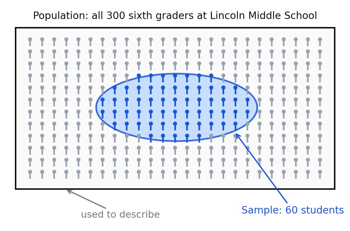
Sampling is normal and often necessary. You cannot survey every sixth grader in Virginia. What matters is whether your sample is a representative sample — one that reflects the larger population, so that conclusions drawn from the sample are likely to be true of the population.
Factors that make a sample representative
- Selection is random, not convenient. Every member of the population should have the same chance of being chosen. Surveying whoever is standing next to you is convenient, not random.
- The sample is large enough. Four students cannot represent three hundred. Larger samples smooth out unusual answers.
- The sample matches the population's makeup. If the grade is half boys and half girls, and spread across four homerooms, the sample should reflect that.
- The setting does not push the answer. Asking about favorite sport at basketball tryouts will overstate basketball.
- The question is neutral. "Don't you agree pizza is best?" leads people toward one answer.
A sample that fails these tests is a biased sample. Its results may still be true of the people you asked, but they should not be extended to the whole population.
Worked examples
Example 1 — Choosing a method
You want to know how sixth graders travel to school. Which method fits best, and why?
You can watch students arrive and record how each one got there, without asking anyone.
Answer: Observation. It records what actually happens rather than what students say they do.
Example 2 — Identifying population and sample
A school has 300 sixth graders. A class surveys 60 of them, chosen by drawing names. Name the population and the sample.
The group you want to describe is all sixth graders; the group you asked is the 60.
Answer: Population: all 300 sixth graders. Sample: the 60 students surveyed.
Example 3 — Spotting bias
To find the favorite sport of all sixth graders, Dana surveys the students at soccer practice. Is this sample representative?
Students at soccer practice are far more likely than average to choose soccer.
Answer: No. The setting favors one answer, so the sample is biased toward soccer.
Example 4 — Fixing a biased sample
Describe a better way for Dana to collect the same data.
The sample must give every sixth grader an equal chance and should span all homerooms.
Answer: Draw names at random from a list of all sixth graders, or survey a random group of students from every homeroom, so the sample reflects the whole grade.
Example 5 — Sample size
Ben surveys 5 of the 300 sixth graders and reports that 60% of the grade prefers tacos. What is wrong?
Three students out of five is 60%, but five students cannot speak for 300.
Answer: The sample is too small. A few unusual answers change the percent enormously, so the result should not be extended to the population.
Guided practice
- Name the four collection methods listed in this lesson.
- A class wants to know the average height of sixth graders. Which method should they use?
- A school has 240 seventh graders. A class surveys 40 of them. Name the population and the sample.
- Explain why surveying only your friends is not a representative sample of your grade.
- Name two factors that help make a sample representative.
Independent practice
- Name the best collection method for each question. a) How long does each student's paper airplane stay in the air under two different wing designs? b) How many students buy lunch on Friday? c) What is the favorite book genre of sixth graders? d) How warm is the classroom at 9 a.m. each day?
- A student wants to know the favorite lunch of all 400 students in a school and surveys 8 students in the library. Give two reasons this sample is not representative.
- Explain the difference between a population and a sample in your own words.
- Rewrite this survey question so it is neutral: "Wouldn't you rather have longer recess than more art class?"
- A class wants data on how sixth graders spend Saturday. They find a national survey of teenagers online. Name one advantage and one disadvantage of acquiring that data instead of collecting their own.
- Application. The principal wants to know which one school event sixth graders like most, and there are 300 sixth graders in six homerooms. Describe a sampling plan, including how many students you would ask and how you would choose them, and explain why your plan is representative.
- Reasoning. Two classes survey the same grade about favorite fruit and get noticeably different percents. Neither class made an arithmetic mistake. Give two reasons their results could differ, and explain which class's result you would trust more and why.
Exit ticket 16.3
- Name the population and the sample: a club surveys 30 of the 500 students in a school.
- Which method would you use to find the favorite movie genre of sixth graders?
- Give one reason a sample of 5 students is a weak sample for a grade of 250.
- Explain what makes a sample representative of a population.
Lesson 16.4 — Making a Circle Graph
What a circle graph shows
A circle graph, also called a pie chart, represents a whole data set as a full circle. Each sector, or slice, represents one category, and the size of the sector shows what part of the whole that category makes up.
Because the whole circle is the whole data set, two facts are always true:
- The percents of all the sectors add to .
- The central angles of all the sectors add to .
From counts to percents
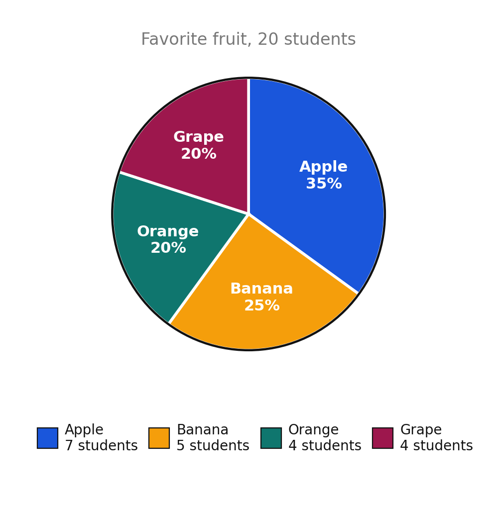
Suppose 20 students each name one favorite fruit: 7 choose apple, 5 choose banana, 4 choose orange, and 4 choose grape.
Write each count as a fraction of the total, then convert to a percent:
The other three work the same way. Organize everything in a table before you draw anything.
| Category | Count | Fraction of total | Percent |
|---|---|---|---|
| Apple | 7 | ||
| Banana | 5 | ||
| Orange | 4 | ||
| Grape | 4 | ||
| Total | 20 |
The percent column adds to . Always check this before drawing.
Why 20 students and not 17. In this course, totals are chosen so the comparisons have denominators of 12 or less, or denominators that are factors of 100 — such as 4, 5, 10, 20, 25, 50, and 100. With 17 students, is not a clean percent, and the graph becomes guesswork.
From percents to angles
A full circle is , so each category's central angle is that category's fraction of :
For the fruit data:
Check: . The angles account for the whole circle.
Drawing the graph by hand
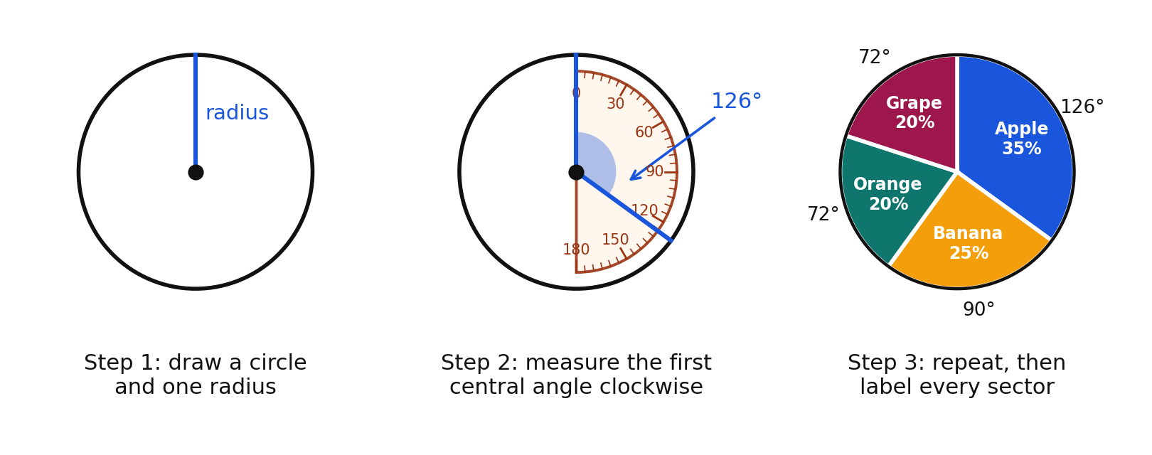
- Draw a circle and mark its center. Draw one radius, usually straight up.
- Place the protractor's center on the circle's center with its zero line on that radius. Measure the first angle and draw the new radius.
- Move the protractor's zero line to the radius you just drew and measure the next angle. Repeat.
- Label every sector with its category and percent, and give the graph a title that includes the total.
With technology. In a spreadsheet, type the categories in one column and the counts in the next, select both columns, and insert a pie chart. The software computes the angles for you. Then turn on data labels showing percents and add the same title. The mathematics does not change; only who does the multiplying does.
Worked examples
Example 1 — Counts to percents and angles
Ten students name one pet: 4 dog, 3 cat, 2 fish, 1 bird. Find each percent and central angle.
Angles: , , , .
Check: and .
Answer: Dog , ; cat , ; fish , ; bird , .
Example 2 — A total of 8
A bag holds 8 marbles: 3 red, 2 blue, 2 green, 1 yellow. Find each percent and angle.
Angles: , , .
Check: and .
Answer: Red , ; blue , ; green , ; yellow , .
Example 3 — A total of 50
A library records 50 checkouts: 20 mystery, 15 fantasy, 10 nonfiction, 5 poetry. Build the table.
Angles: , , , , which sum to .
Answer:
| Genre | Count | Percent | Angle |
|---|---|---|---|
| Mystery | 20 | ||
| Fantasy | 15 | ||
| Nonfiction | 10 | ||
| Poetry | 5 | ||
| Total | 50 |
Example 4 — Finding a missing percent
A circle graph has sectors labeled , , , and one unlabeled sector. What percent is the unlabeled sector?
The labeled sectors total , and the whole is .
Answer:
Example 5 — Catching an error
A student's circle graph is labeled , , , and . Explain why the graph must be wrong.
Answer: The percents add to , but a circle graph's sectors must add to exactly . At least one percent is wrong.
Guided practice
- Twenty students say how they get to school: 10 walk, 5 bus, 3 car, 2 bike. Find the percent for each category.
- Find the central angle for each category in question 1.
- Write as a percent and as a central angle.
- A circle graph shows sectors of , , and , plus one more sector. Find the missing percent.
- What central angle represents of a circle?
Independent practice
- Fifty students vote for an elective: art 20, music 15, drama 10, dance 5. Make a table showing count, percent, and central angle for each, and show that your percents and angles each check.
- Eight students choose a snack: pretzels 4, popcorn 2, fruit 1, cheese 1. Find each percent and central angle.
- One hundred people report how they commute: 45 bus, 32 walk, 18 car, 5 bike. Find each percent, and explain why the percents are easy to find for a total of 100.
- Explain why the percents in any single circle graph must add to exactly .
- Find the error: a student reports sectors of , , , and for a survey of 20 students. Explain what is wrong and describe how to check the work.
- Application. At recess, 20 students choose one activity: soccer 8, basketball 5, tag 4, reading 3. Build the full table of percents and angles, then describe in words how you would draw the graph with a protractor.
- Reasoning. A class of 17 students each names one favorite color. Explain why this total makes a circle graph hard to build by hand, and suggest a total that would work better.
Exit ticket 16.4
- Four out of 20 students chose grapes. Write this as a percent and as a central angle.
- Five out of 25 students walk to school. What percent is that?
- A circle graph has sectors of , , and . What is the missing percent?
- Explain how to turn a count out of a total into a central angle.
Lesson 16.5 — Analyzing Circle Graphs
Observations and conclusions
Analyzing a graph has two different jobs, and mixing them up causes trouble.
An observation is something you can read directly off the graph. "The bus sector is the largest" is an observation.
A conclusion is a judgment you reach by reasoning from the observations. "The school should add a bus route" is a conclusion. Conclusions can be wrong even when the observations are right, so a conclusion should always name the observation it rests on.
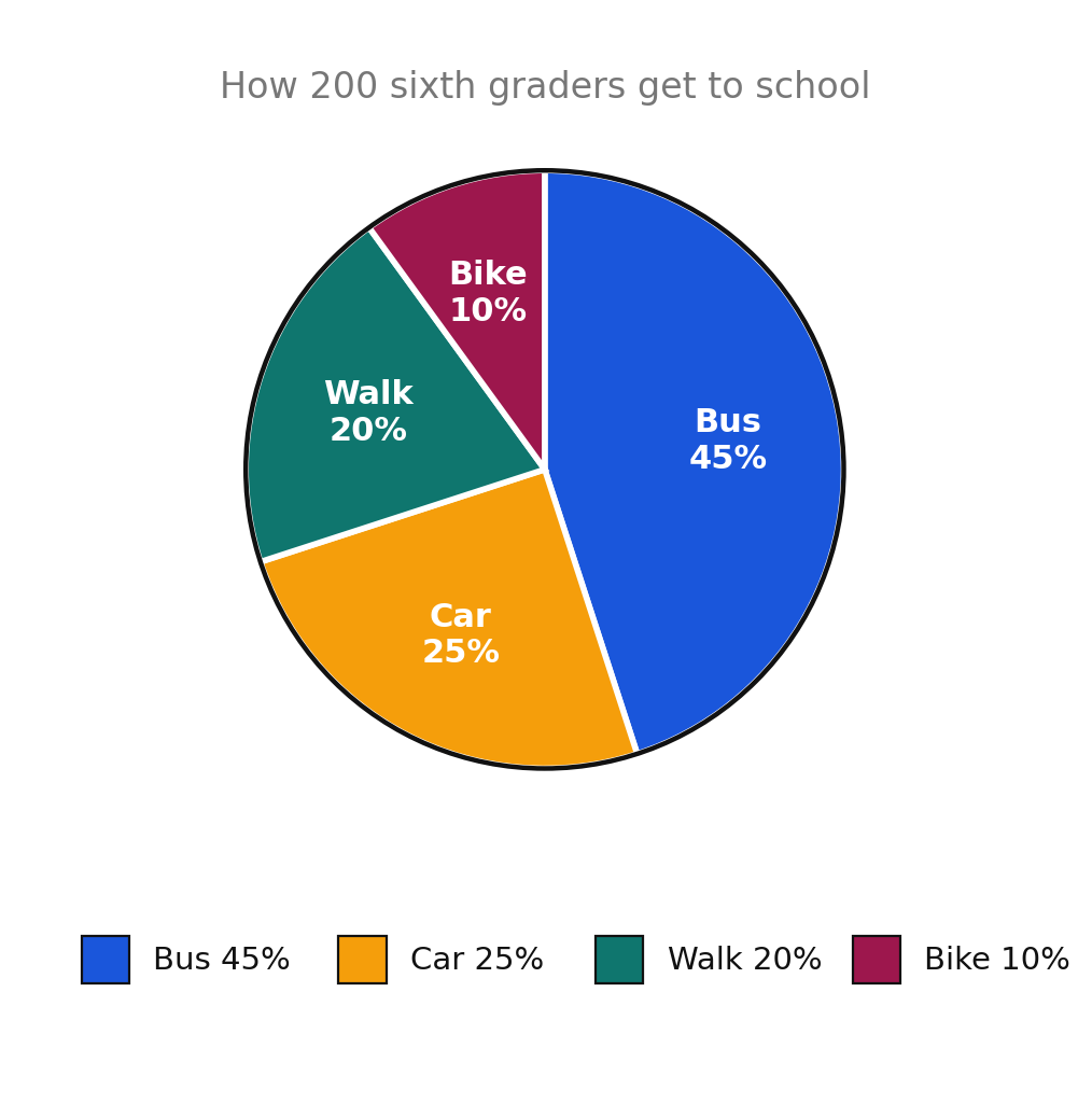
Reading counts out of percents
A circle graph shows parts of a whole. If the title tells you the whole, you can recover every count:
For the graph above, with a total of 200 students:
| Category | Percent | Count out of 200 |
|---|---|---|
| Bus | ||
| Car | ||
| Walk | ||
| Bike | ||
| Total |
Check: .
Three questions worth asking
- Which sectors are largest and smallest? Rank them.
- How do sectors combine? Percents of the same whole can be added. Walk and bike together are , or 60 students.
- How do sectors compare? Subtract to compare. Bus exceeds car by of the students, which is students.
Percent points are not counts. Saying "the bus sector is 20% larger" is vague. Say "the bus sector is 20 percentage points larger, which is 40 more students," and no reader can misunderstand you.
What a circle graph will not tell you
A circle graph without a stated total shows only parts of the whole, never how big the whole is. So a sector of a 20-student survey stands for 10 students, while a sector of a 200-student survey stands for 50 students — the smaller-looking sector represents far more people. Before comparing two circle graphs, check both totals.
Worked examples
Use the transportation graph above: 200 students, bus , car , walk , bike .
Example 1 — Largest and smallest
Which method is most common, and which is least common?
Compare sector percents: .
Answer: Bus is most common; bike is least common.
Example 2 — Percent to count
How many students ride the bus?
Answer: 90 students
Example 3 — Combining sectors
How many students walk or bike?
Answer: 60 students
Example 4 — Comparing sectors
How many more students ride the bus than ride in a car?
Answer: 40 more students
Example 5 — Observation versus conclusion
Label each statement as an observation or a conclusion, and judge whether the conclusion is supported. a) "The bus sector is larger than the car sector." b) "Most sixth graders in this school live far away."
Statement a can be read straight from the graph. Statement b goes beyond the graph, which says nothing about distance.
Answer: a) Observation, supported by the graph. b) Conclusion, and not supported — the graph shows how students travel, not where they live.
Guided practice
A circle graph titled "Pets Owned by 80 Students" shows dog , cat , fish , bird .
- Which pet is most common?
- How many students own a dog?
- What percent own a cat or a fish, and how many students is that?
- How many more students own a dog than own a bird?
- Give one observation and one conclusion you could draw from this graph.
Independent practice
A circle graph titled "How Ana Spends Her $40 Monthly Allowance" shows savings , snacks , gifts , games .
- How many dollars does Ana save each month?
- How much does she spend on snacks?
- How much does she spend on gifts and games combined?
- How much more does she put into savings than into snacks?
- Decide whether each statement is true or false, using the graph. a) Ana spends more on snacks than on gifts. b) Ana spends half her allowance on games and gifts together. c) Savings is the largest category.
- Application. A circle graph titled "Books Read by a Grade of 400 Students" shows fiction , nonfiction , graphic novels , poetry . Find the number of students in each category, verify your counts add to 400, and write one conclusion the librarian could act on.
- Reasoning. School A's circle graph shows of 20 students chose soccer. School B's shows of 200 students chose soccer. A student says School A has more soccer fans because its sector is bigger. Explain the error using counts.
Exit ticket 16.5
A circle graph titled "60 Minutes of Homework" shows math , reading , science , other .
- Which subject takes the largest share of the time?
- How many minutes go to reading?
- How many minutes go to science and other combined?
- Write one conclusion supported by this graph, and name the observation it rests on.
Lesson 16.6 — Choosing the Best Representation
Four ways to show the same data
Twenty students each named one favorite sport: soccer 8, basketball 5, baseball 4, swimming 3.
| Sport | Count | Percent |
|---|---|---|
| Soccer | 8 | |
| Basketball | 5 | |
| Baseball | 4 | |
| Swimming | 3 | |
| Total | 20 |
Angles for the circle graph: , , , . These sum to .
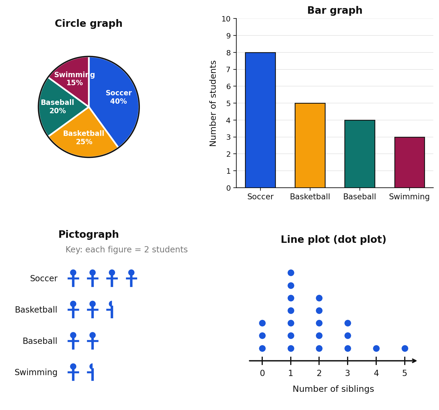
A bar graph uses the height or length of bars to show counts. The bars sit on a numbered scale, so exact counts are easy to read and compare.
A pictograph uses a repeated symbol, with a key telling how many each symbol stands for. Using a key of 2 students, soccer needs symbols, basketball needs symbols, baseball needs symbols, and swimming needs symbols.
A line plot, also called a dot plot, stacks one dot for each value above a number line. It shows numerical data — like number of siblings — including gaps, clusters, and repeats.
A circle graph shows each category as part of the whole.
Matching the graph to the question
| If your question is about... | Use | Because |
|---|---|---|
| What share of the whole each category takes | Circle graph | Sectors are parts of one whole |
| Comparing exact counts across categories | Bar graph | Bars sit on a numbered scale |
| A quick, friendly display for a poster | Pictograph | Symbols are easy to read at a glance |
| The shape of a set of numerical values, including repeats and gaps | Line plot (dot plot) | Every value is plotted on a number line |
Two limits are worth stating plainly.
- A circle graph cannot show exact counts unless the total is written on it, and it cannot show numerical data such as heights or scores.
- A pictograph with a key greater than 1 forces partial symbols, and half a symbol is harder to read precisely than a bar.
Justifying a choice
A good justification names the question, names the graph, and says what feature of the graph answers the question. "A circle graph is best, because the question asks what fraction of the class chose soccer, and a circle graph shows each category as a part of the whole." That sentence is the model to imitate.
Worked examples
Use the favorite-sport data above.
Example 1 — Part of a whole
Which representation best answers "What fraction of the class chose soccer?"
The question is about a share of the whole class.
Answer: The circle graph, because its sectors show each category as a part of one whole; soccer's sector is of the circle.
Example 2 — Exact counts
Which representation best answers "How many more students chose soccer than baseball?"
You need the exact counts 8 and 4, then their difference.
Answer: The bar graph, because the numbered scale gives exact counts, and students can be read directly.
Example 3 — Numerical data
A class records the number of siblings each of 20 students has. Which representation fits, and which does not?
Siblings counts are numerical values, not categories, and many students share the same value.
Answer: A line plot (dot plot) fits, because it shows every value on a number line with repeats stacked. A circle graph is a poor fit, because the values are numerical rather than categories of a whole.
Example 4 — Pictograph key
Build the pictograph rows for the sport data using a key of 1 symbol = 2 students.
Answer: Soccer 4 symbols; basketball 2 and a half symbols; baseball 2 symbols; swimming 1 and a half symbols.
Example 5 — Writing a justification
The school newspaper wants a headline graphic showing that soccer is chosen by nearly half the class. Which representation, and why?
The claim is about a share of the whole.
Answer: A circle graph, because the reader can see at a glance that the soccer sector fills nearly half the circle, which is exactly the claim the headline makes.
Guided practice
- Which graph best shows what fraction of a class chose each lunch option?
- Twenty students record their quiz scores from 0 to 10. Which graph best shows the scores?
- A pictograph uses a key of 1 symbol = 5 students. How many symbols represent 20 students?
- Can a circle graph tell you the exact number of students in a category? Explain.
- Which graph would you choose to compare the exact number of members in four clubs? Why?
Independent practice
- Name the best representation for each question, and give a one-sentence reason. a) What percent of the class walks to school? b) How many more students play piano than guitar? c) How many pets does each student in the class own, showing every value? d) A poster for younger students showing how many books each grade read
- Using a key of 1 symbol = 2 students, find the number of symbols for counts of 8, 5, 4, and 3.
- A circle graph of 20 students shows soccer , basketball , baseball , swimming . Find the count for each category so a bar graph could be drawn.
- Explain why a circle graph is a poor choice when students may choose more than one favorite sport.
- Use the line plot in the figure, showing the number of siblings for 20 students. Which number of siblings is most common, and how many students have three or more siblings?
- Application. A news article claims, "Half of all sixth graders ride the bus." Which representation would best support the claim, and which would best show exactly how many students each category holds? Justify both choices.
- Reasoning. The same data appears in a circle graph and a bar graph. Explain how the two graphs give different first impressions, and describe one question each graph answers better than the other.
Exit ticket 16.6
- Which graph best shows each category as a share of the whole?
- Which graph best shows exact counts on a numbered scale?
- With a key of 1 symbol = 2 students, how many symbols represent 7 students?
- Explain why a line plot, not a circle graph, is the right choice for showing the number of siblings each student has.
Chapter 16 Review
Vocabulary. data · data cycle · statistical question · observation · measurement · survey · experiment · population · sample · representative sample · biased sample · circle graph · sector · bar graph · pictograph · line plot (dot plot) · conclusion
Part A — Formulating questions (6.PS.1a)
- Which of these are statistical questions? a) How many pets does Mr. Lee own? b) How many pets do sixth graders own? c) What is the favorite season of students in our class? d) What time does school start?
- Rewrite "What sports do you like?" so its data could be shown in a circle graph.
- Explain why a survey question for a circle graph should ask students to choose exactly one option.
- Write a statistical question about your grade whose data would fit a circle graph, and list four choices for it.
Part B — Collecting data and representative samples (6.PS.1b, 6.PS.1c)
- Name the best method — observation, measurement, survey, or experiment — for each. a) The temperature of the classroom each hour b) The favorite music genre of sixth graders c) How many students wear sneakers on Monday d) Whether plants grow taller under a lamp or by a window
- A school has 500 students. A club surveys 50 of them. Name the population and the sample.
- Give two reasons that surveying students at basketball tryouts is a biased way to find the favorite sport of the whole grade.
- Name three factors that help make a sample representative of a larger population.
Part C — Making circle graphs (6.PS.1d)
- Twenty-five students choose one lunch: pizza 10, sandwich 5, salad 5, pasta 5. Find the percent for each category and show the percents add to .
- Ten students choose a pet: dog 4, cat 3, fish 2, bird 1. Find each central angle and show the angles add to .
- A circle graph shows sectors of , , and , plus one more sector. Find the missing percent and its central angle.
- Explain why a survey of 20 students produces easier circle-graph work than a survey of 17 students.
Part D — Analyzing circle graphs (6.PS.1e)
A circle graph titled "Favorite Season, 200 Students" shows summer , fall , winter , spring .
- How many students chose summer?
- How many chose winter or spring combined?
- How many more students chose summer than chose fall?
- Write one observation and one conclusion based on this graph, and state which observation supports your conclusion.
Part E — Comparing representations (6.PS.1f)
- Name the best representation for each question and justify your choice in one sentence. a) What share of the class chose each field trip? b) How many more students chose the museum than the zoo? c) How many minutes each of 20 students spent reading, showing every value?
- Using a key of 1 symbol = 5 students, find the number of symbols for counts of 20, 15, and 10.
- Explain one thing a bar graph shows that a circle graph does not, and one thing a circle graph shows that a bar graph does not.
Part F — Mixed application and reasoning
- A class of 20 students surveys itself about favorite juice: orange 8, apple 6, grape 4, other 2. Build a table of counts, percents, and central angles; verify both totals; then write one conclusion.
- A student surveys 6 friends and reports that of the whole grade prefers tacos. Name two problems with this claim and describe how to fix them.
- Walk through all four phases of the data cycle for the question "Which after-school club should the school add?" Write one sentence per phase.
- Two circle graphs both show a sector for soccer. One graph comes from a survey of 20 students and one from a survey of 200. Explain why the two sectors do not represent the same number of students.
Standards coverage check — Chapter 16
| Knowledge and Skill | Where it is taught | Where it is practiced |
|---|---|---|
| 6.PS.1a — formulate questions that require collecting or acquiring data, with a focus on circle graphs | 16.2 | 16.2 all sets; 16.1 items 9–11; Review Part A |
| 6.PS.1b — determine the data needed and collect or acquire it using observations, measurement, surveys, experiments | 16.1, 16.3 | 16.1 all sets; 16.3 all sets; Review Part B |
| 6.PS.1c — determine factors ensuring the sample represents a larger population | 16.3 | 16.3 all sets; Review Part B |
| 6.PS.1d — organize and represent data using circle graphs, with and without technology | 16.4 | 16.4 all sets; Review Part C, item 20 |
| 6.PS.1e — analyze data in a circle graph by making observations and drawing conclusions | 16.5 | 16.5 all sets; Review Part D, item 20 |
| 6.PS.1f — compare circle graphs with bar graphs, pictographs, and line plots (dot plots) and justify the best representation | 16.6 | 16.6 all sets; Review Part E, item 23 |
Answer keys for every set in this chapter are in Appendix A.