Chapter 17 — The Data Cycle and Histograms
Standard: 7.PS.2 — The student will apply the data cycle (formulate questions; collect or acquire data; organize and represent data; and analyze data and communicate results) with a focus on histograms.
By the end of this chapter you will be able to:
- Formulate questions that require the collection or acquisition of data with a focus on histograms (7.PS.2a)
- Determine the data needed to answer a formulated question and collect it, or acquire existing data, using observations, measurement, surveys, and experiments (7.PS.2b)
- Determine how sample size and randomness make a sample representative of a larger population (7.PS.2c)
- Organize and represent numerical data using histograms, with and without the use of technology (7.PS.2d)
- Investigate and explain how using different intervals changes the way a histogram represents the same data (7.PS.2e)
- Compare data shown in a histogram with the same data shown in dot plots, circle graphs, and stem-and-leaf plots, and justify which representation best answers a given question (7.PS.2f)
- Analyze histograms by making observations and drawing conclusions, and describe patterns a histogram reveals that the raw data list hides (7.PS.2g)
Lessons: 17.1 The Data Cycle · 17.2 Asking a Question and Collecting Data · 17.3 Samples, Sample Size, and Randomness · 17.4 Building a Histogram · 17.5 Choosing Intervals and Comparing Representations
The interval convention for this whole chapter. Every interval is written , read "at least and less than ." The lower endpoint belongs to the interval; the upper endpoint belongs to the next interval. So the value 30 goes in , never in . This one rule removes every argument about where a boundary value lands, and it is used in every table, figure, and answer in this chapter.
Lesson 17.1 — The Data Cycle
What you already know, pointed at a new graph
In Grade 6 you learned the data cycle — the four-stage process statisticians follow, over and over, whenever they want to answer a question with data (the facts, measurements, or responses collected to answer that question). The four stages have the same names this year:
- Formulate questions.
- Collect or acquire data.
- Organize and represent data.
- Analyze data and communicate results.
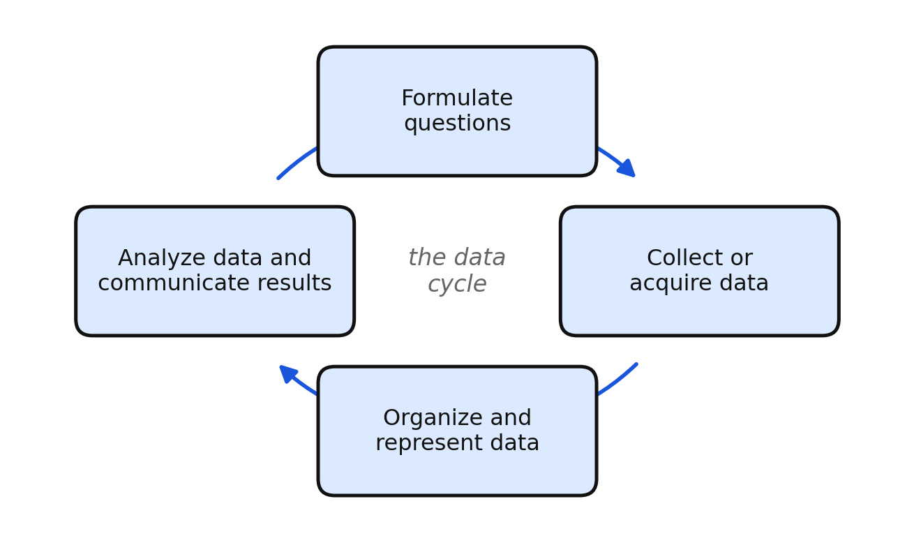
The arrows return to where they started. That is why it is a cycle and not a checklist. Answering one question almost always raises the next one, and the next question sends you back to the first stage.
What is different this year
Last year the focus was the circle graph, and the data were categorical data — responses that fall into named groups, like pizza, sandwich, salad. This year the focus is the histogram, and the data are numerical data — responses that are measurements or counts, like 37 minutes, 62 inches, 18 sit-ups.
That single change ripples through all four stages:
| Stage | Grade 6, circle graphs | Grade 7, histograms |
|---|---|---|
| Formulate questions | "Which one lunch do students choose?" | "How many minutes do students read each night?" |
| Collect or acquire data | Record one choice per student | Record one measurement per student |
| Organize and represent data | Counts, percents, central angles, circle graph | Counts grouped into equal-width intervals, frequency table, histogram |
| Analyze and communicate | Which category holds the biggest share | Where the values pile up, how spread out they are, whether there are gaps |
A circle graph answers what share of the whole. A histogram answers how the numbers are distributed. Neither one is better in general. They answer different questions, which is the point of Lesson 17.5.
One project, four stages
Ms. Reyes's class wanted to argue for a longer independent reading block. Here is the whole cycle in one table.
| Stage | What the class did |
|---|---|
| Formulate questions | Wrote the question: "How many minutes did each seventh grader at our school read last night?" |
| Collect or acquire data | Asked 24 randomly chosen seventh graders to report their minutes to the nearest minute |
| Organize and represent data | Grouped the 24 values into intervals of width 10 and drew a histogram |
| Analyze data and communicate results | Observed that the tallest bar sat at and that only 2 students read 50 minutes or more, then presented the graph to the principal |
The principal asked a new question: "Does this change on weekends?" The cycle starts again.
Worked examples
Example 1 — Naming a stage
A class writes the question "How many minutes do seventh graders at our school spend on homework each night?" Which stage is this, and will the data be numerical or categorical?
The class is deciding what it wants to know and putting it in words. The answers will be counts of minutes.
Answer: Formulate questions. The data will be numerical.
Example 2 — Naming a stage
The class times how long each of 30 students takes to run 100 meters and records the seconds. Which stage is this, and by what method?
They are gathering the facts themselves with a stopwatch.
Answer: Collect or acquire data, by measurement.
Example 3 — Naming a stage
The class groups the times into intervals of width 2 seconds, builds a frequency table, and draws a histogram. Which stage is this?
Making the numbers readable is the third stage.
Answer: Organize and represent data.
Example 4 — Naming a stage
The class writes, "Most runners finish between 16 and 20 seconds, so the sprint unit should start there," and presents it to the PE teacher. Which stage is this?
They are drawing a conclusion from the graph and reporting it.
Answer: Analyze data and communicate results.
Example 5 — Why the cycle repeats
After the presentation, the PE teacher asks whether the times improve after four weeks of practice. Explain what happens next in the data cycle.
The old data cannot answer a question about change, because it was collected once.
Answer: The class returns to the first stage, formulates the new question, then collects a second set of times after four weeks, represents both sets, and compares them. The cycle begins again.
Guided practice
- Name the four stages of the data cycle in order.
- Which stage are you in when you decide to group measurements into intervals of width 5 and draw a histogram?
- A class writes "How tall is each seventh grader in our school, in centimeters?" Which stage is this, and will the data be numerical or categorical?
- A student says the data cycle ends as soon as the histogram is finished. Correct the statement.
- In which stage would you write, "Half the class reads fewer than 20 minutes a night, so the reading block should be lengthened"?
Independent practice
- Name the stage for each action. a) Timing how long each student can hold a plank, in seconds b) Writing "How many books did each seventh grader read last month?" c) Grouping heights into intervals of width 5 centimeters and drawing a histogram d) Telling the coach that most sprinters finish between 15 and 18 seconds
- These stages are scrambled. Put them in the correct order: organize and represent data; analyze data and communicate results; formulate questions; collect or acquire data.
- A class debates whether to measure every seventh grader or only a sample of 40. Which stage of the cycle are they working in?
- Write one question about your class whose answers would be numerical, so that a histogram could display them.
- Label each numerical or categorical, then state which ones a histogram could display. a) Favorite pizza topping b) Minutes of sleep last night c) Number of siblings d) Method of travel to school
- Application. The school nurse wants to know whether seventh graders get enough sleep on school nights. Describe what she would do in each of the four stages, one sentence per stage.
- Reasoning. Explain why the data cycle is drawn as a loop rather than a straight line, using an example in which a finished histogram raises a brand-new question.
Exit ticket 17.1
- Name the four stages of the data cycle in order.
- Which stage includes choosing the width of the intervals for a histogram?
- Is "the number of pages each student read this week" numerical or categorical, and could a histogram display it?
- Explain in your own words why analyzing data comes after representing it.
Lesson 17.2 — Asking a Question and Collecting Data
Statistical questions that produce numbers
Some questions have exactly one answer. "How many minutes did Ellis read last night?" is answered by asking one person about one night. There is nothing to graph.
A statistical question is one you expect to answer with data that vary from person to person, object to object, or day to day. "How many minutes did each seventh grader read last night?" is statistical, because different students give different answers.
For a histogram you need one more thing: the answers must be numerical. A histogram is built on a number line, so the responses have to be numbers that can be placed on one.
| Question | Statistical? | Numerical? | Fits a histogram? |
|---|---|---|---|
| How many minutes did Ellis read last night? | No | Yes | No — only one value |
| How many minutes did each seventh grader read last night? | Yes | Yes | Yes |
| What is your favorite school subject? | No | No | No |
| What is the favorite school subject of seventh graders? | Yes | No | No — the answers are categories |
Sharpening the question
A sharp statistical question names three things. Leave any one of them out and the data you collect will not be usable.
- The population — exactly whose answers you want. "Seventh graders at Lakeside Middle School," not "kids."
- The quantity and its units — exactly what number each response is. "Minutes, to the nearest minute," not "how much."
- The time frame or condition — when or under what conditions. "Last night," not "usually."
| Weak question | What is missing | Sharper question |
|---|---|---|
| Do students sleep enough? | A number; a population; a time frame | How many hours of sleep, to the nearest half hour, did each seventh grader at our school get last night? |
| How far do students live from school? | Units; a population; a precision | How many miles, to the nearest tenth of a mile, does each seventh grader at our school live from the building? |
| Are backpacks heavy? | A number; a population | What is the mass, in kilograms to the nearest tenth, of each seventh grader's backpack on a Monday morning? |
Ranges are not measurements. A survey that offers "a little, some, a lot" produces categories, not numbers. You cannot place "some" on a number line, so you cannot build a histogram from it. Ask for the number itself and group it later — grouping is your job in stage 3, not the respondent's job in stage 2.
Deciding what data you need, then getting it
Before collecting anything, ask: what exactly would answer my question? If the question is "How many sit-ups can each seventh grader do in one minute?", the data you need is one count per student, taken under the same one-minute rule. Not their names. Not their opinion about sit-ups. One count each, collected the same way every time.
Then choose a method.
| Method | What you do | Good for |
|---|---|---|
| Observation | Watch and record what happens, without asking | Number of cars passing the school between 8:00 and 8:15 |
| Measurement | Use a tool to find an amount | Height in centimeters, mass in kilograms, time in seconds |
| Survey | Ask people a question and record their answers | Minutes of sleep, minutes of reading, number of siblings |
| Experiment | Change one thing on purpose and record the result | Whether a warm-up routine lowers sprint times |
You may also acquire data instead of collecting it. The school office, a state database, a census table, or a published study may already hold what you need. Acquiring saves enormous effort when the population is large — you are not going to measure every seventh grader in Virginia yourself. But you inherit someone else's decisions, so before you use acquired data, ask two questions: Who collected it, and from whom? and When was it collected, and by what method?
Worked examples
Example 1 — Statistical or not
Is "How many minutes did Priya exercise on Tuesday?" a statistical question?
Priya exercised one amount on Tuesday, so there is nothing to vary.
Answer: No. It has a single answer and does not require collecting data that vary.
Example 2 — Fits a histogram?
Would "What is each seventh grader's favorite sport?" work for a histogram?
The responses are names of sports, which are categories, not numbers.
Answer: No. The data are categorical, and a histogram displays numerical data grouped on a number line. A bar graph would fit this question.
Example 3 — Sharpening a question
Improve the question "How tall are students?" so its data could be shown in a histogram.
It names no population, no units, and no precision.
Answer: "What is the height, in centimeters to the nearest centimeter, of each seventh grader at our school?" Now every response is a single number, collected the same way.
Example 4 — Choosing a method
You want to know how many students enter the gym between 7:45 and 8:00 each morning for a week. Which method fits best, and why?
You can stand at the door and count without asking anyone anything.
Answer: Observation. It records what actually happens rather than what people report.
Example 5 — Collect or acquire
A class wants the heights of all seventh graders in their school division, about 3,000 students. What should they do?
Measuring 3,000 students is out of reach for one class, and the division nurse's office already records heights.
Answer: Acquire existing data from the division rather than collect it, then ask who recorded the heights, when, and with what instrument, before drawing any conclusions from them.
Guided practice
- Is "How many minutes did Ellis practice piano on Monday?" a statistical question? Explain.
- Is "How many minutes do seventh graders practice an instrument each day?" a statistical question? Explain.
- Why must a question intended for a histogram ask for a number rather than a choice from a list?
- Rewrite "Do students sleep enough?" as a question that produces numerical data suitable for a histogram.
- Name the three things a sharp statistical question states.
Independent practice
- Label each statistical or not statistical. a) How many text messages did Priya send yesterday? b) How many text messages do seventh graders send in a day? c) What is the favorite sport of students in our class? d) How long, in seconds, can each seventh grader hold a plank?
- For each, say whether the data are numerical or categorical, and whether a histogram could display them. a) Favorite ice cream flavor b) Height in centimeters c) Number of siblings d) Eye color
- Sharpen the question "How far do students live from school?" so that it names a population, units, and a precision.
- Name the best collection method — observation, measurement, survey, or experiment — for each. a) The mass of each student's backpack in kilograms b) The number of students entering the gym between 7:45 and 8:00 c) The number of hours of sleep each student got last night d) Whether a five-minute warm-up routine lowers sprint times
- A class wants the heights of all seventh graders in Virginia. Explain why they must acquire data rather than collect it, and name two questions they should ask about data they did not collect themselves.
- Application. The PE teacher wants to know how many sit-ups seventh graders can do in one minute. Write the sharpened question, name exactly what data are needed, name the collection method, and explain why that method fits.
- Reasoning. A survey asks, "About how long do you read each night: a little, some, or a lot?" Explain why these responses cannot be put in a histogram, then rewrite the question so that they can, and explain what job you have moved from the respondent to yourself.
Exit ticket 17.2
- Is "How many minutes do seventh graders spend on homework each night?" a statistical question that produces numerical data? Explain in one sentence.
- Name the four collection methods.
- Rewrite "Are students tall?" so that a histogram could display the answers.
- Explain why a histogram cannot display the answers to "What is your favorite subject?"
Lesson 17.3 — Samples, Sample Size, and Randomness
Population and sample
The population is the entire group you want to describe. A sample is the part of the population you actually collect data from.
Sampling is normal and usually necessary. If the population is all 480 seventh graders in a school, measuring every one of them costs days you do not have. So you measure some of them, and then you say something about all of them. That last step is the risky one, and it only works when your sample is a representative sample — one whose values reflect the larger population well enough that conclusions drawn from the sample are likely to be true of the population.
Two things push a sample toward being representative: randomness and sample size. They are not interchangeable, and you need both.
Randomness
A random sample is one in which every member of the population has the same chance of being chosen. You get randomness by using a chance device that does not know anything about the people: numbered slips drawn from a container, a random number generator applied to a numbered roster, or randomly generated digits matched to a student list.
A convenience sample is one chosen because it was easy to reach — the students in your homeroom, the people already standing in the hallway, whoever answers first. Convenience samples are fast, and they are almost always tilted.
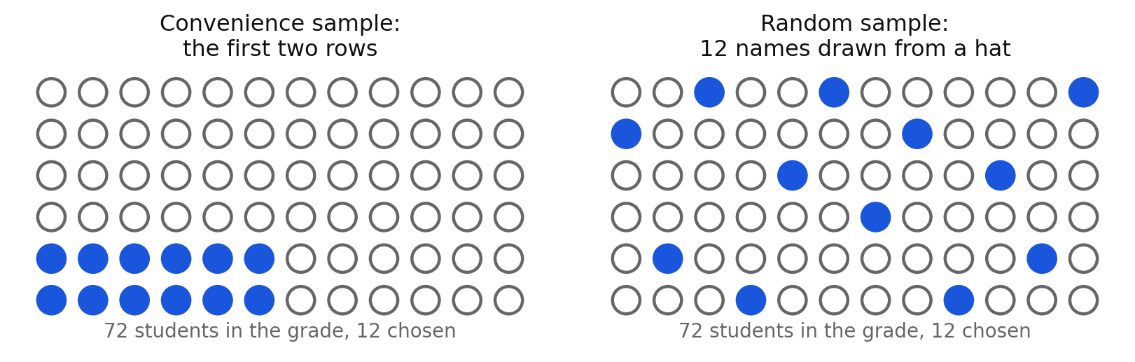
A sample chosen in a way that systematically favors certain values is a biased sample. Its results may be perfectly true of the people you asked. They just should not be extended to the population.
Here is a clear example. Suppose you want to know how fast the seventh grade runs 100 meters, and you time 10 members of the track team. Every one of those times is accurate. But track team members practice sprinting, so their times are faster than the grade's times, and the sample is biased toward fast. Reporting the track team's average as the grade's average would tell the reader something false, and no amount of careful stopwatch work fixes it. The problem is in who was chosen, not in how they were measured.
Sample size
The sample size is the number of members in the sample. Larger samples are steadier. In a sample of 5, one unusual value swings the whole picture; in a sample of 60, the same unusual value barely moves it. If you double a small sample, single odd values stop dominating and the sample's shape starts to look like the population's shape.
But be careful with this idea, because it is easy to overstate:
A large sample chosen badly is still biased. Size fixes noise, not tilt. If you survey 250 of 600 students, but all 250 are leaving an evening concert, your sample is enormous and still biased — concertgoers practice music more than the average student, so reported practice minutes will run high. Randomness decides whether the sample points at the right answer; size decides how tightly it points. You need both.
A checklist for a sampling plan
Before you collect anything, write down four things:
- The population, stated exactly, and where the list of its members comes from.
- The sample size, and why it is large enough for the population.
- The selection method, and what makes it random rather than convenient.
- The coverage, meaning whether every part of the population — every homeroom, every lunch period, every team and non-team student — could be selected.
Worked examples
Example 1 — Population and sample
A school has 480 seventh graders. A class measures the arm span of 60 of them, chosen by drawing names. Name the population and the sample.
The group to be described is all seventh graders; the group actually measured is the 60.
Answer: Population: all 480 seventh graders. Sample: the 60 students measured.
Example 2 — Spotting bias
To find out how many minutes seventh graders exercise per day, Dana surveys students leaving basketball practice. Is this sample representative?
Students at basketball practice exercise far more than average.
Answer: No. The setting favors high values, so the sample is biased toward students who exercise a lot, and the reported minutes would be too high.
Example 3 — Sample size
Ben surveys 5 of 300 seventh graders about minutes of homework and reports that the grade averages 90 minutes. Two of his five students had a project due. What is wrong?
Five students cannot absorb an unusual pair of values.
Answer: The sample is too small. With only 5 values, two unusually high ones pull the result far off, so the number should not be extended to 300 students. A much larger random sample would keep single unusual values from dominating.
Example 4 — Large but biased
Mia surveys 250 of the 600 students in her school about minutes of daily music practice, asking everyone as they leave the winter concert. She argues that 250 out of 600 is a huge sample, so her result must be representative. Is she right?
Concertgoers are mostly band and chorus members, who practice more than students who are not in a music program.
Answer: No. The sample is large but not random, and no member of the population who skipped the concert could be selected. The results will overstate practice time. A better plan draws 250 names at random from the full roster of 600.
Example 5 — Designing a plan
Describe a sampling plan for finding how many minutes seventh graders at a 360-student school sleep on a school night.
You need a list of the whole population and a chance device to pick from it.
Answer: Number the 360 students on the seventh-grade roster from 1 to 360, use a random number generator to produce 60 different numbers in that range, and survey exactly those 60 students. Every student has the same chance of selection, all homerooms can be represented, and 60 is large enough that a few unusual nights will not control the result.
Guided practice
- A school has 360 seventh graders. A class measures 45 of them, chosen by drawing names from a container. Name the population and the sample.
- Explain in your own words what makes a sample representative.
- Why is asking whoever happens to be standing near you not a random sample?
- Which is more likely to represent a grade of 300: 8 students chosen at random, or 60 chosen at random? Explain.
- A student surveys 100 students at a school basketball game about how many minutes they exercise each day. Is the large sample size enough to make it representative? Explain.
Independent practice
- Name the population and the sample for each. a) A club measures the arm span of 30 of the 500 students in a school. b) A coach times 12 of the 48 members of the track team.
- Give two reasons a sample of 5 students is a weak sample for a grade of 300.
- Explain the difference between a random sample and a convenience sample, and give one example of each.
- Describe three different ways to choose a random sample of 40 students from a numbered roster of 400.
- Rewrite the plan "ask everyone in the library after school" so that the sample is random and can include any student in the grade.
- Application. A principal wants to know how many minutes seventh graders spend on homework each night. There are 320 seventh graders spread across eight homerooms. Describe a sampling plan: how many students you would include, how you would choose them, and why your plan is likely to be representative.
- Reasoning. Two students each survey 200 of the 600 students in their school. One draws 200 names at random from the full roster. The other stands outside the band room and asks the first 200 students who come out. Explain why the second sample is biased even though it is just as large, and name the direction in which its results about music practice would be pushed.
Exit ticket 17.3
- A club measures 25 of the 400 students in a school. Name the population and the sample.
- Give one reason a larger sample is usually better than a smaller one.
- Give one reason randomness still matters even when the sample is large.
- A student surveys the chess club to find how many hours seventh graders spend playing sports. Explain why the sample is biased and describe a better plan.
Lesson 17.4 — Building a Histogram
What a histogram is, and what it is not
A histogram is a graph that displays numerical data grouped into equal-width intervals. The height of each bar is the frequency of that interval — the number of data values that fall in it.
Two features define a histogram, and both matter:
- The intervals are equal in width, with no gaps and no overlaps. Every data value lands in exactly one interval.
- The bars touch. The horizontal axis is a number line, and a number line is continuous. There is no empty space between and , so there is no empty space between their bars.
A bar graph looks similar and is a different graph. A bar graph displays categorical data, and its bars are separated by gaps because there is nothing between the category pizza and the category salad. Nothing lives between them, so the picture shows nothing between them.
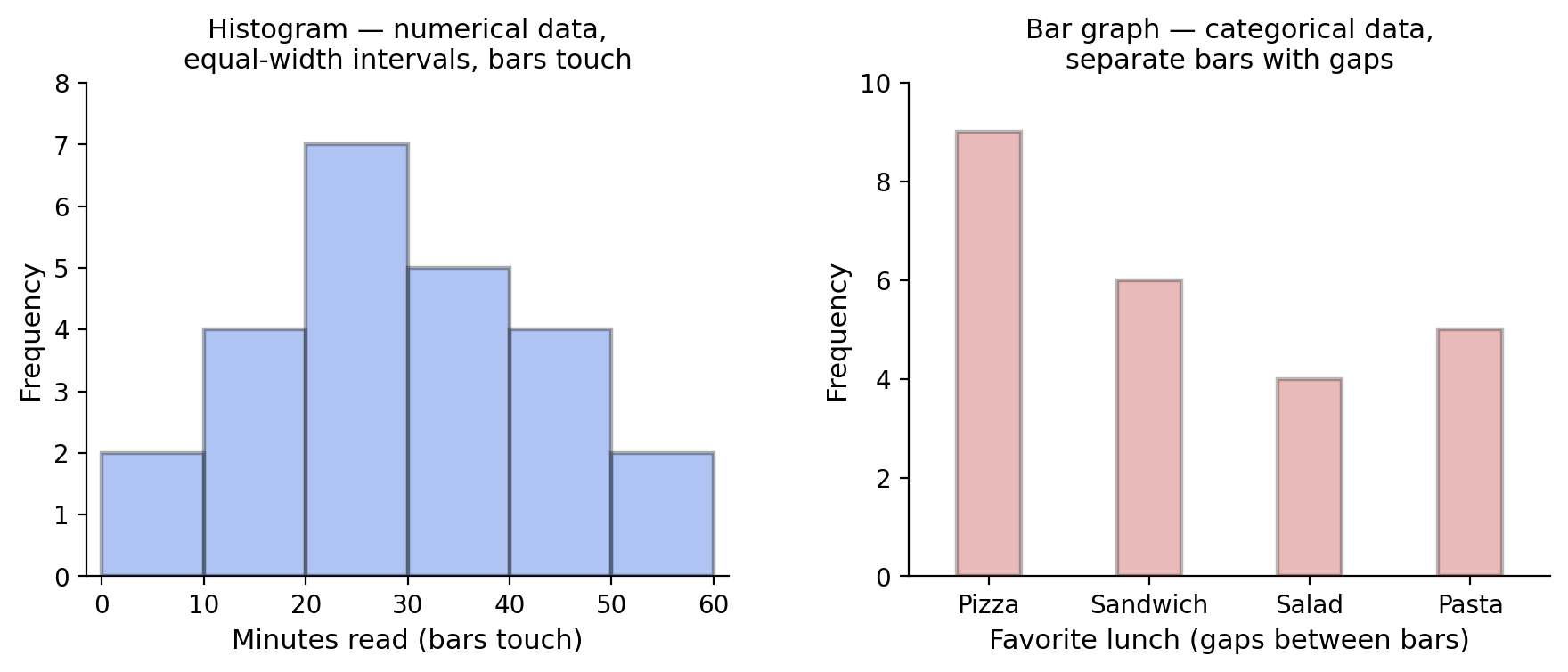
The one-sentence test. If the horizontal axis is a number line, the bars touch and you have a histogram. If the horizontal axis is a list of names, the bars have gaps and you have a bar graph.
A histogram bar of height 0 is legal and meaningful: it says that no value fell in that interval. Do not delete the bar and close the space, because closing the space would hide a real gap in the data.
From a list of numbers to a frequency table
Ms. Reyes's class asked 24 randomly chosen seventh graders how many minutes they read last night. Here are the 24 values, already sorted, which is always worth doing before you tally:
The smallest value is 5 and the largest is 55, so intervals of width 10 running from 0 to 60 will cover everything. Now tally, value by value, using the chapter convention .
| Interval (minutes) | Values in it | Frequency |
|---|---|---|
| 5, 8 | 2 | |
| 12, 15, 15, 18 | 4 | |
| 20, 22, 22, 25, 25, 27, 28 | 7 | |
| 30, 31, 33, 35, 38 | 5 | |
| 40, 42, 45, 48 | 4 | |
| 52, 55 | 2 | |
| Total | 24 |
Check the total before you draw anything: , which matches the 24 values collected. A frequency table whose frequencies do not sum to the size of the data set contains an error, and drawing the graph will not reveal it.
Notice where the convention did its work. The value 20 went into , not . The value 30 went into . If two people tally the same list under different rules, they get different tables from identical data, which is why the rule is stated once and never changed.
Drawing the histogram
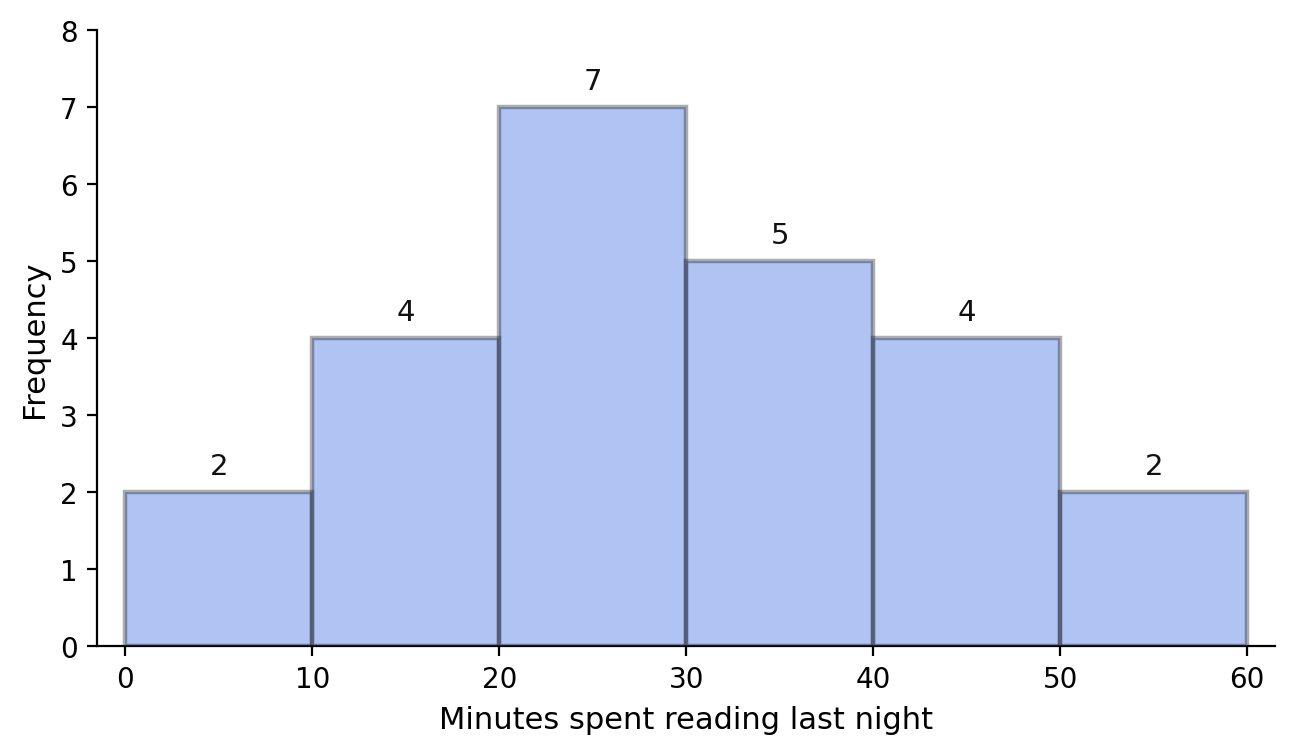
Building it by hand takes four steps.
- Mark the horizontal axis as a number line with a tick at every interval edge: 0, 10, 20, 30, 40, 50, 60. Label the axis with the quantity and its units — "Minutes spent reading last night."
- Scale the vertical axis from 0 to a little above the largest frequency. Here the largest is 7, so a scale to 8 in steps of 1 works. Label it "Frequency."
- Draw each bar across its full interval, from edge to edge, at the height of its frequency. Because each bar spans edge to edge, consecutive bars share a side and touch automatically.
- Title the graph with what it shows and how many values it contains.
With technology. In a spreadsheet, enter the 24 values in one column, enter the interval edges in a second column, and use the frequency or histogram tool to produce the counts and the chart. Then check that the software's counts match your hand tally and that its interval rule matches yours — some tools group as instead of , which shifts boundary values by one interval. The mathematics does not change; only who does the counting does.
Worked examples
Example 1 — Tallying into intervals
Group these 12 values into intervals of width 10 starting at 0: .
Take them in order and place each in the one interval that contains it.
: 3, 7 — that is 2. : 11, 14, 16, 19 — that is 4. : 21, 24, 25, 29 — that is 4. : 33, 38 — that is 2.
Check: , matching the 12 values.
Answer: Frequencies 2, 4, 4, 2.
Example 2 — A value on a boundary
The intervals are and . Where does the value 30 belong, and why?
Read the two intervals as sentences. The first says at least 20 and less than 30, and 30 is not less than 30. The second says at least 30 and less than 40, and 30 is at least 30.
Answer: The value 30 belongs in . Under this convention the lower endpoint is included and the upper endpoint is not, so every value lands in exactly one interval.
Example 3 — Reading totals off a frequency table
Using the reading table above, how many students read fewer than 30 minutes, and how many read 30 minutes or more?
"Fewer than 30" is exactly the first three intervals, because the third one stops just below 30.
"30 or more" is the last three intervals.
Check: , the whole data set.
Answer: 13 students read fewer than 30 minutes; 11 read 30 minutes or more.
Example 4 — Histogram or bar graph
Decide which graph fits, and explain. a) The times, in seconds, of 40 students running 100 meters b) The favorite lunch of 40 students, chosen from four options
Times are numbers on a continuous scale; lunch choices are names.
Answer: a) A histogram, because the data are numerical and can be grouped into equal-width intervals on a number line, so the bars touch. b) A bar graph, because the data are categorical and nothing lies between one category and the next, so the bars have gaps.
Example 5 — Finding a missing frequency
A frequency table for 30 values shows frequencies 4, 9, ___, 5, and 3. Find the missing frequency.
The frequencies must sum to the number of values.
Check: .
Answer: 9
Guided practice
- Group these values into intervals of width 10 starting at 0, and give the frequency of each interval: .
- The intervals are and . In which interval does the value 30 belong? Explain.
- A frequency table has frequencies 5, 8, 6, and 2. How many values are in the data set?
- Explain why the bars of a histogram touch.
- A frequency table for 25 values shows 6, 7, ___, and 4. Find the missing frequency.
Independent practice
Items 54 through 56 use the bus-ride data below: the number of minutes each of 20 students spent riding the bus this morning.
- Make a frequency table for the bus-ride data using intervals of width 10 starting at 0, and show that the frequencies sum to 20.
- Draw the histogram for your table from item 54. Label both axes and mark a tick at every interval edge.
- Using the reading data from this lesson (the 24 values with frequencies 2, 4, 7, 5, 4, 2), find how many students read fewer than 30 minutes and how many read 30 minutes or more. Show that your two answers sum to 24.
- Decide whether a histogram or a bar graph fits each data set, and give a one-sentence reason. a) The favorite pizza topping of 40 students b) The time, in seconds, for each of 40 students to run 100 meters c) The number of books each of 40 students read last month d) The eye color of 40 students
- A student draws a graph of numerical data grouped into intervals but leaves gaps between the bars. Explain what is wrong and what the gaps wrongly suggest to a reader.
- Application. Twenty-four students took a science test. Their scores were . Make a frequency table using intervals of width 10 starting at 50, verify that the frequencies sum to 24, and describe in words what the histogram would look like.
- Reasoning. Two students tally the same 24 values. One places every value equal to an interval's lower endpoint in that interval; the other places such values in the previous interval. Explain how their two frequency tables could differ even though neither miscounted, and explain why a stated convention prevents the problem.
Exit ticket 17.4
- Group these values into intervals of width 10 starting at 0 and give each frequency: .
- A frequency table for 18 values shows 4, 7, ___, and 2. Find the missing frequency.
- Name the two features that make a graph a histogram rather than a bar graph.
- In which interval does the value 40 belong, or ? Explain.
Lesson 17.5 — Choosing Intervals and Comparing Representations
The same data, different intervals
Here is something that surprises people: you can change what a histogram looks like without changing a single data value. All you have to do is regroup.
A PE teacher recorded the number of sit-ups each of 24 students completed in one minute:
Group them two ways. Same 24 values both times.
| Width 10 | Frequency | Width 20 | Frequency | |
|---|---|---|---|---|
| 2 | 10 | |||
| 8 | 12 | |||
| 4 | 2 | |||
| 8 | Total | 24 | ||
| 2 | ||||
| Total | 24 |
Both totals are 24, as they must be. The width-20 frequencies are just the width-10 frequencies added in pairs: and , with the last 2 alone.
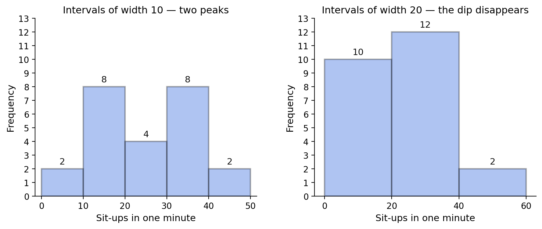
Look at what happened. At width 10 the data show two peaks — a cluster of 8 students in the teens and another cluster of 8 in the thirties, with a dip of only 4 students between them. At width 20 those two clusters are merged into one interval each side of the dip, the dip vanishes, and the graph tells a story of a single group of students bunched in the middle. The second graph is not a lie. It is a coarser view, and the coarser view lost the most interesting feature of the data.
How many intervals is right?
Two failures sit at opposite ends.
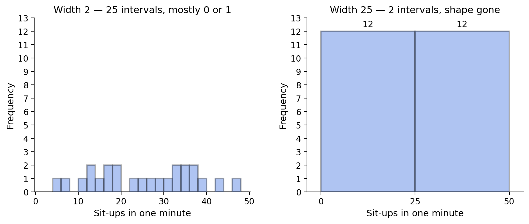
- Too many intervals. At width 2 there are 25 intervals and almost every frequency is 0 or 1. The graph is a picture of the individual values, not of their shape. Random bumps look like features.
- Too few intervals. At width 25 there are only 2 intervals, each holding exactly 12 students. The graph says the data are perfectly even, which is the one thing this data set is not.
A workable rule of thumb for a class-sized data set is five to ten intervals, chosen so that the interval edges are friendly numbers — multiples of 2, 5, 10, or 25. Then look at the graph and ask whether it shows a shape you can describe. If every bar is 0 or 1, widen. If there are only two or three bars, narrow.
Interval width is a choice, and a choice must be reported. Whenever you present a histogram, state the interval width and the convention. A reader who knows the data were grouped in tens can imagine regrouping them; a reader who is not told is at the mercy of your choice.
Four ways to show the same twenty numbers
A basketball player scored the following points in each of her 20 games:
Grouped into intervals of width 10 starting at 0:
| Interval (points) | Frequency | Percent of 20 | Central angle |
|---|---|---|---|
| 2 | |||
| 5 | |||
| 8 | |||
| 4 | |||
| 1 | |||
| Total | 20 |
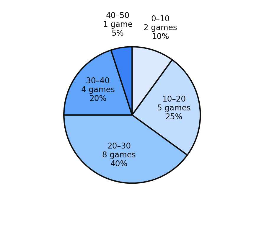
Check both totals: , and , and .
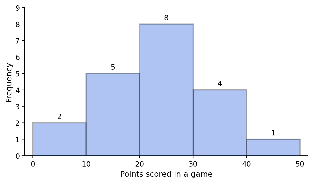
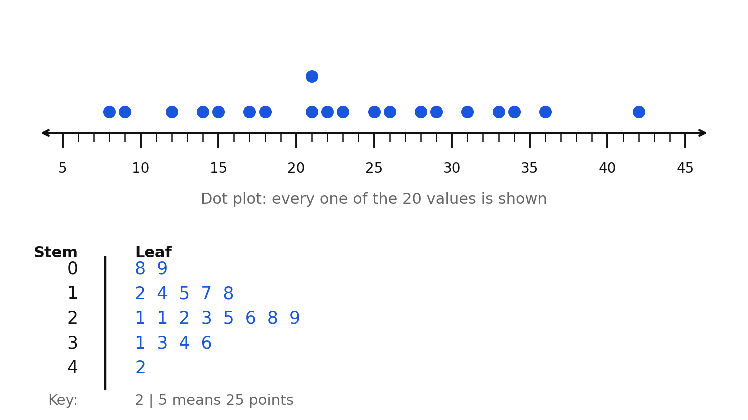
A dot plot, also called a line plot, stacks one dot for each value above a number line. Every value is visible, including the two 21-point games showing as a stack of two.
A stem-and-leaf plot splits each value into a stem (here, the tens digit) and a leaf (the ones digit), and lists the leaves in order beside their stem. Turn the page sideways and the rows form a shape much like the histogram's — but unlike the histogram, every original value can be read back out. The key, " means 25 points," is required; without it the reader cannot tell 25 from 2.5.
A circle graph shows each interval as a share of the whole. It can be built from these numbers, and it does answer share questions cleanly. But it throws away the order of the intervals — nothing about a circle says comes after — and order is most of what numerical data means.
Which representation is best? Best for what?
There is no best graph in general. There is only a best graph for a question.
| Question | Best representation | Why |
|---|---|---|
| How many games had exactly 21 points? | Dot plot | Every value is plotted separately, so repeats are visible and countable |
| What was her highest score, exactly? | Stem-and-leaf plot or dot plot | Both preserve individual values; the histogram only says "one game in " |
| What share of her games fell in each scoring range? | Circle graph | Sectors are parts of one whole, and can be read as nearly half the circle |
| What is the overall shape of her scoring across 200 games? | Histogram | Grouping keeps a large data set readable; 200 dots or 200 leaves would not be |
| Both the shape and the exact values, for 20 two-digit numbers | Stem-and-leaf plot | It is the only one of the four that does both at once, and it works because the set is small |
Stating the tradeoffs plainly:
- A dot plot shows every value, including repeats and gaps, and is easy to read for small data sets. With 200 values the stacks become towers and the plot becomes unusable.
- A stem-and-leaf plot preserves every individual value and shows the shape, which no other representation here does. It needs a key, it needs values with a natural stem, and it breaks down for large or widely spread data sets.
- A circle graph shows parts of a whole and is excellent for share questions. It is a poor choice for showing a numerical distribution, because it does not preserve the order of the intervals and gives no sense of spread.
- A histogram shows the shape of a large data set at a glance — where values pile up, how spread out they are, where the gaps are. In exchange it hides every individual value. A histogram can never tell you whether anyone scored exactly 21.
A good justification names the question, names the graph, and says what feature of the graph answers the question: "A dot plot is best for this question, because the question asks how many games had exactly 21 points, and a dot plot shows every value separately."
What a histogram reveals that the list hides
Look again at the reading data from Lesson 17.4:
Reading the list, you can tell that the smallest value is 5 and the largest is 55. Almost nothing else jumps out. Twenty-four numbers is more than most people can hold in mind at once, and the list has no shape.
The histogram in Lesson 17.4 shows immediately that the values pile up in the twenties, that the pile falls off in both directions, and that only 2 students are in each of the extreme intervals. Those are facts about the data set as a whole, and they were sitting in the list the entire time, invisible.
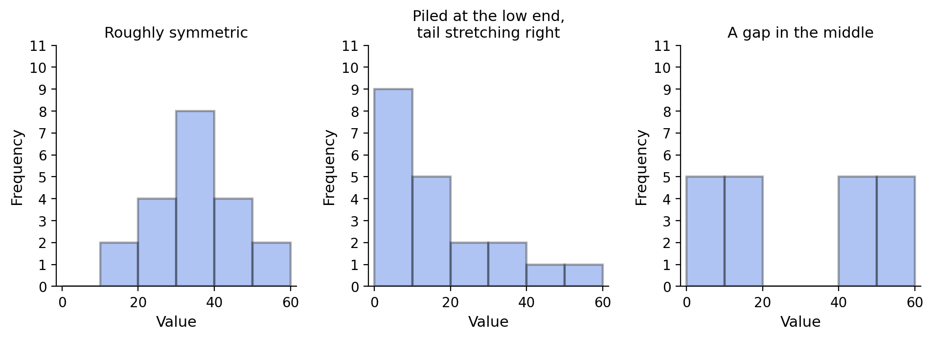
Three features are worth naming, because a histogram makes each of them obvious and a list makes each of them nearly impossible to see:
- A peak is an interval that is taller than its neighbors — where the values pile up. A data set can have one peak, two, or none.
- A gap is an interval with a frequency of 0 that sits between intervals with values in them. The rightmost picture above shows a data set split into two separated groups, which almost always means something real happened.
- Symmetry or skew describes how the two sides compare. In a roughly symmetric shape the left and right sides mirror each other. In a skewed shape the values pile up at one end and trail off toward the other.
Two cautions when you analyze. First, distinguish an observation — something you read directly off the graph, like "the tallest bar is " — from a conclusion, which is a judgment you reason to, like "the reading block should be longer." A conclusion should always name the observation it rests on. Second, a histogram never reports individual values, so no honest conclusion from a histogram mentions one. "Seven students read exactly 25 minutes" cannot be read from a histogram; "seven students read at least 20 and fewer than 30 minutes" can.
Worked examples
Example 1 — Regrouping
Regroup the 24 sit-up values into intervals of width 20 starting at 0, and describe what changes.
Add the width-10 frequencies in pairs: and , and the final 2 stands alone in .
Check: .
Answer: Frequencies 10, 12, 2. The two peaks at and merge with their neighbors, the dip at disappears, and the graph now suggests one middle-heavy group instead of two clusters.
Example 2 — Too many or too few
Explain why intervals of width 2 and intervals of width 25 are both poor choices for the sit-up data.
Width 2 gives 25 intervals across a range of about 42; width 25 gives 2.
Answer: At width 2 nearly every frequency is 0 or 1, so the graph shows individual values rather than a shape. At width 25 both intervals hold exactly 12 students, so the graph reports an even spread and erases the two clusters entirely. Five to ten intervals — here, width 10 — shows the shape without drowning it in detail.
Example 3 — Choosing for an exact-value question
Which representation best answers "In how many games did she score exactly 21 points?"
The question asks about one specific value, twice repeated.
Answer: The dot plot, because it plots every value separately and shows a stack of 2 dots above 21. The histogram cannot answer this at all — it reports only that 8 games fell in .
Example 4 — Choosing for a share question
Which representation best answers "What share of her games were in the range?"
The question asks for a part of a whole.
Answer: The circle graph, because its sectors show each interval as part of one whole, and the sector is of the circle. The histogram gives the same information, but you would have to compute yourself.
Example 5 — A pattern the list hides
Give one pattern the reading histogram shows that the sorted list of 24 values does not show easily, and state it as an observation followed by a conclusion.
The list shows every number and no shape; the histogram shows the shape.
Answer: Observation: the tallest bar is with 7 students, and the bars fall off evenly on both sides, so the values are clustered near the middle rather than spread out. Conclusion: a 30-minute reading block would match what most of the class already does, and it rests on the observation that 13 of the 24 students currently read fewer than 30 minutes.
Guided practice
Items 65 through 67 use the 24 sit-up values from this lesson, whose width-10 frequencies are 2, 8, 4, 8, and 2.
- Regroup the sit-up data into intervals of width 20 starting at 0. Give the frequency of each interval and verify the total.
- Two intervals of the width-10 histogram tie for the largest frequency. Name both intervals and state the frequency.
- Explain in one sentence what the width-20 histogram hides that the width-10 histogram shows.
- Which representation shows every individual value, a histogram or a stem-and-leaf plot? Explain.
- Explain why a circle graph is a poor choice for showing how many minutes each student read.
Independent practice
Items 70 through 73 use the 20 game scores from this lesson: .
- Make a frequency table for the game scores using intervals of width 10 starting at 0, and verify that the frequencies sum to 20.
- Write each interval's frequency from item 70 as a percent of 20, then find the central angle each would have in a circle graph. Show that the percents sum to and the angles sum to .
- Use the stem-and-leaf plot of the game scores. a) What was the highest score? b) In how many games did she score exactly 21 points? c) Name a value that occurs more than once.
- Name the best representation among histogram, dot plot, stem-and-leaf plot, and circle graph for each question, and justify each choice in one sentence. a) What percent of her games fell in the interval? b) What was her exact highest score? c) What is the overall shape of her scoring across 200 games? d) In how many games did she score exactly 21 points?
- Regroup the reading data from Lesson 17.4 (width-10 frequencies 2, 4, 7, 5, 4, 2) into intervals of width 20 starting at 0. Give the new frequencies, verify the total, and state one thing the new grouping hides.
- Application. Use the reading histogram from Lesson 17.4. a) How many students read 30 minutes or more? b) What percent of the 24 students read fewer than 20 minutes? c) Write one conclusion the teacher could act on, and name the observation it rests on.
- Reasoning. A student says, "The width-20 histogram of the sit-up data proves that most students do between 20 and 40 sit-ups, so the class is fairly consistent." Explain what the width-10 histogram shows that makes this conclusion misleading, and rewrite the claim so that it is supported.
Exit ticket 17.5
- Name one thing a dot plot shows that a histogram hides.
- Name one thing a histogram shows better than a dot plot.
- A histogram of 24 values has width-10 frequencies 2, 8, 4, 8, and 2, starting at 0. Give the frequencies if the data are regrouped into intervals of width 20 starting at 0.
- Explain in one or two sentences why changing the interval width changes the look of a histogram even though not one data value has changed.
Chapter 17 Review
Vocabulary. data · data cycle · statistical question · numerical data · categorical data · observation · measurement · survey · experiment · population · sample · sample size · random sample · convenience sample · representative sample · biased sample · histogram · interval · frequency · frequency table · bar graph · dot plot (line plot) · stem-and-leaf plot · circle graph · peak · gap · symmetric · skewed
Interval convention. Every interval in this review is : the lower endpoint is included, the upper endpoint belongs to the next interval.
Part A — Formulating questions (7.PS.2a)
- Which of these are statistical questions whose data are numerical? a) How many minutes did Rosa swim on Tuesday? b) How many minutes does each seventh grader swim at practice? c) What is the favorite stroke of the members of the swim team? d) How tall is each seventh grader, in centimeters?
- Rewrite "Do students carry heavy backpacks?" as a sharp statistical question whose data would fit a histogram.
- Write a statistical question about your grade whose data are numerical. Name the population, the quantity with its units, and the time frame.
Part B — Determining and collecting the data (7.PS.2b)
- Name the best collection method — observation, measurement, survey, or experiment — for each. a) The mass of each backpack, in kilograms b) The number of students entering the gym between 7:45 and 8:00 c) The number of hours of sleep each student got last night d) Whether a five-minute warm-up routine lowers sprint times
- A class wants the heights of all seventh graders in their school division. Explain why they should acquire existing data rather than collect it, and name two questions they should ask about data they did not collect.
Part C — Sample size and randomness (7.PS.2c)
- A school has 480 seventh graders. A class measures the arm span of 60 of them, chosen with a random number generator applied to the numbered roster. Name the population and the sample, and explain why this plan is likely to produce a representative sample.
- Give two reasons that timing 10 members of the track team is a biased way to learn how fast the whole grade runs 100 meters.
- A student surveys 250 of a school's 600 students about minutes of daily music practice, asking everyone as they leave the winter concert. Explain why this large sample is still biased, and state the direction in which its results would be pushed.
Part D — Building histograms (7.PS.2d)
Items 89 through 92 use the homework data: the number of minutes each of 20 students spent on math homework last night.
- Make a frequency table using intervals of width 10 starting at 0, and show that the frequencies sum to 20.
- Describe the histogram you would draw from your table in item 89: what goes on each axis, where the ticks go, and why the bars touch.
- In which interval does the value 30 belong? State the convention you are using.
- A different frequency table, for 26 values, shows 3, 6, ___, 7, and 2. Find the missing frequency.
Part E — Intervals and comparing representations (7.PS.2e, 7.PS.2f)
- Regroup the homework data from item 89 into intervals of width 20 starting at 0. Give the frequencies and verify the total.
- Explain one thing the width-20 grouping in item 93 hides that the width-10 grouping shows.
- Explain why a histogram of the homework data cannot tell you whether any student spent exactly 30 minutes.
- Name the best representation among histogram, dot plot, stem-and-leaf plot, and circle graph for each purpose, and justify each in one sentence. a) Showing every one of 20 values, including repeats b) Showing the overall shape of 250 values c) Showing what share of a class falls in each interval d) Showing both the shape and the exact values of 20 two-digit numbers
- Build a stem-and-leaf plot for the homework data, using the tens digit as the stem. Include a key.
- State one advantage and one limitation of a circle graph built from the intervals of the homework data.
Part F — Analyzing histograms, mixed reasoning (7.PS.2g)
- Using your frequency table from item 89, find how many students spent fewer than 30 minutes on homework and how many spent 40 minutes or more.
- Name one pattern the histogram of the homework data shows that the raw list of 20 numbers does not show easily.
- Two intervals of the width-10 homework table tie for the largest frequency. Name both and state the frequency.
- Walk through all four stages of the data cycle for the question "How many hours of sleep do seventh graders at our school get on a school night?" Write one sentence per stage.
- A student reports, "The histogram shows that 5 students slept exactly 8 hours." Explain what is wrong with this claim.
- Reasoning. Two classes graph the same 24 sit-up values. One uses intervals of width 10 and reports two clusters with a dip between them. The other uses intervals of width 25 and reports a perfectly even spread. Neither class made a counting mistake. Explain how both descriptions can come from the same data, and say which grouping you would trust for describing the class, and why.
Standards coverage check — Chapter 17
| Knowledge and Skill | Where it is taught | Where it is practiced |
|---|---|---|
| 7.PS.2a — formulate questions requiring the collection or acquisition of data, with a focus on histograms | 17.1, 17.2 | 17.1 items 3, 9, 11, 15; 17.2 items 17–24, 27–29, 31–32; Review Part A, items 81–83 |
| 7.PS.2b — determine the data needed and collect or acquire it using observations, measurement, surveys, experiments | 17.2 | 17.1 items 6, 11; 17.2 items 25–27, 30; Review Part B, items 84–85 |
| 7.PS.2c — determine how sample size and randomness ensure a representative sample | 17.3 | 17.3 items 33–48; Review Part C, items 86–88 |
| 7.PS.2d — organize and represent numerical data using histograms, with and without technology | 17.4 | 17.4 items 49–64; Review Part D, items 89–92 |
| 7.PS.2e — investigate and explain how different intervals impact the representation of the data | 17.5 | 17.5 items 65–67, 74, 76, 79–80; Review items 93–94, 104 |
| 7.PS.2f — compare histograms with dot plots, circle graphs, and stem-and-leaf plots, and justify the best representation | 17.5 | 17.4 item 57; 17.5 items 68–73, 77–78; Review Part E, items 95–98 |
| 7.PS.2g — analyze histograms by making observations and drawing conclusions, and describe patterns a raw data list hides | 17.4, 17.5 | 17.4 item 56; 17.5 items 75–76; Review Part F, items 99–104 |
Answer keys for every set in this chapter are in Appendix A.